Mommie Schwarz Master Palette

Palette Analysis
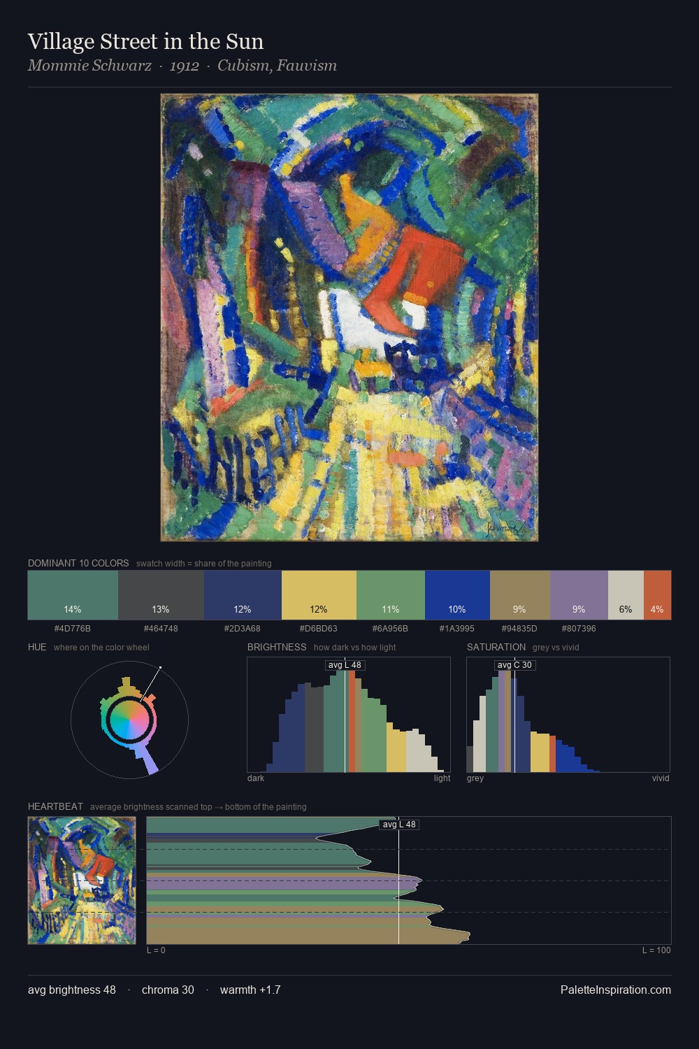
Mommie Schwarz occupies the comfortable middle of the value scale, avoiding both extremes to hold the eye in a sustained middle grey. Cool tones set the register here - the blues and greens easily outweigh any warm accents. Saturation is measured and controlled, giving the palette presence without visual aggression. The dominant colour, #443E36, takes 25.0% of the total area, establishing the overall mood before any other hue is introduced. At 2.5%, #BEB759 carries the palette's sharpest chromatic charge: an accent that earns its place precisely because it is withheld. The value range of 51 units sits in the comfortable middle: enough depth, enough light, neither extreme. The palette has the character of outdoor light: cool, mid-bright, with colour rendered faithfully rather than expressively. This is the light Mommie Schwarz preferred, made measurable.
Example use cases
- ceramics & pottery
- boutique hospitality
- menswear
- heritage food brands
- craft & artisan brands
I Love This!
Copy, export, or download for your project