Modernism Palette 2
Soft Tawny
Soft Low-contrast, gentle chroma - mid-key values and low saturation, approachable and calm.
Tawny Warm orange-brown - a traditional term for the color of tanned leather or lion fur.

Palette Analysis
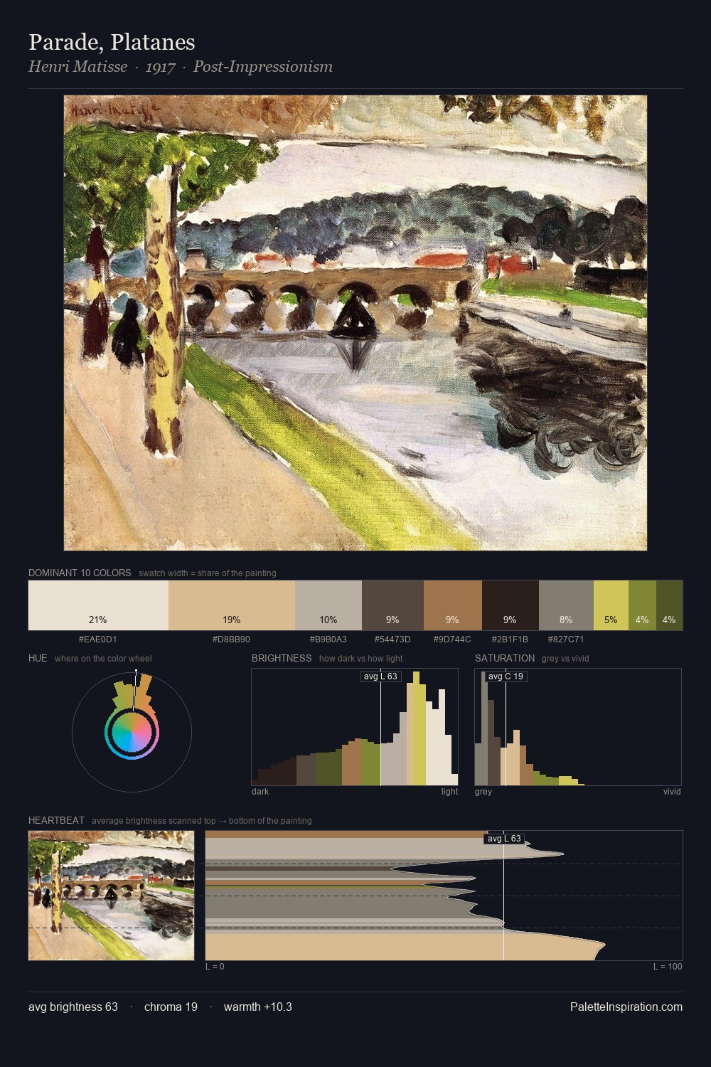
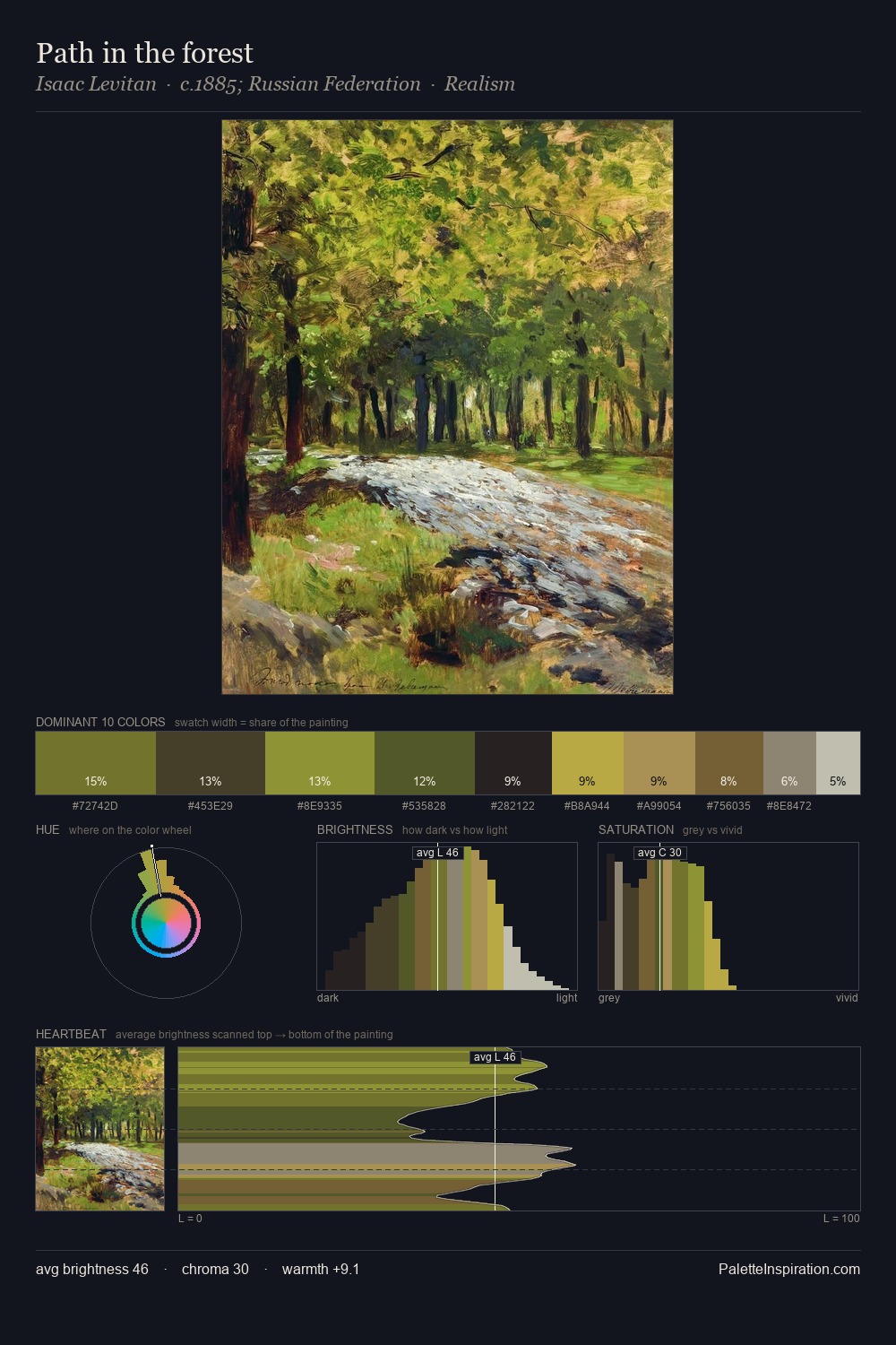
Modernism distributes its values across the middle register, creating harmony without high contrast. Cool hues prevail: blues, greens, and greys anchor the palette's emotional temperature. Chroma hovers near zero; colour declares itself through subtle shifts in hue rather than outright saturation. The dominant colour, #D6D1C6, takes 32.1% of the total area, establishing the overall mood before any other hue is introduced. The highest-chroma note - #748429 - appears at just 3.9%, deployed as a precision accent against the quieter ground. At 60 units of value range, the palette has the tonal breadth to sustain complex spatial readings. High luminosity and cool temperature suggest the plein-air condition: unfiltered daylight and open sky.
Example use cases
- exhibition design
- foundation branding
- estate management
- art education
- museums & galleries
I Love This!
Use This Palette
Copy, export, or download for your project
Copy, export, or download for your project
Copy:
Download:
Share: