Mikalojus Konstantinas Ciurlionis Palette 2

Palette Analysis
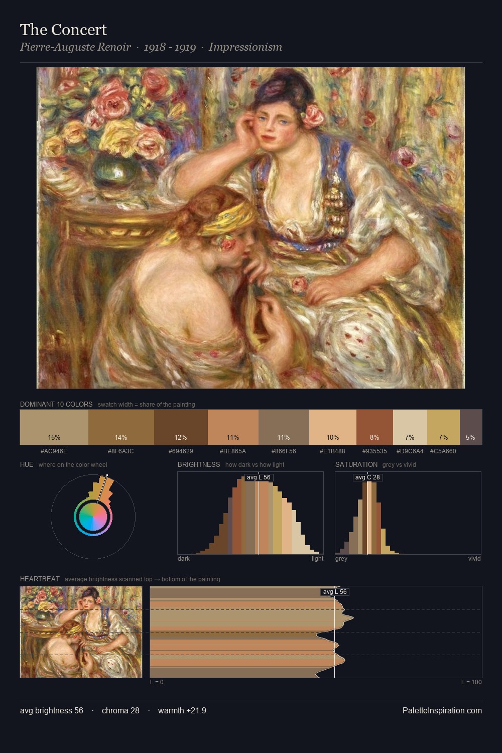
Values in Mikalojus Konstantinas Ciurlionis tilt decisively toward white, giving the palette its luminous character. Cool tones set the register here - the blues and greens easily outweigh any warm accents. Colours are neither washed out nor blazing; they occupy the productive middle ground of the chroma scale. 27.9% of the palette belongs to #D6B87A, a concentration that makes it the unmistakable visual centre. At 10.4%, #D7B288 carries the palette's sharpest chromatic charge: an accent that earns its place precisely because it is withheld. Spanning 38 units on the value axis, the palette achieves the balance between tonal flatness and fragmentation. The mid-to-high key, cool bias, and moderate chroma point to outdoor observation - sky and diffused daylight as the dominant light source. Mikalojus Konstantinas Ciurlionis's palette 2 carries its own internal logic while remaining in conversation with the artist's broader colour intelligence.
Example use cases
- publishing
- corporate identity
- consumer apps
- hospitality
- design agencies
I Love This!
Copy, export, or download for your project
Related Palettes

Mikalojus Konstantinas Ciurlionis Palette 1
Gleaming Cream

Mikalojus Konstantinas Ciurlionis Palette 3
Soft Ecru

Mikalojus Konstantinas Ciurlionis Palette 4
Gleaming Champagne

Mikalojus Konstantinas Ciurlionis Palette 5
Pale Topaz

Mikalojus Konstantinas Ciurlionis Palette 6
Veiled Tawny

Mikalojus Konstantinas Ciurlionis Palette 7
Veiled Vellum