Melchor Pérez de Holguín Palette 3
Palette Analysis
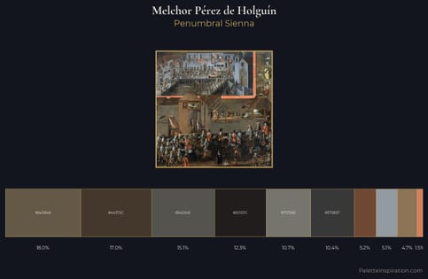
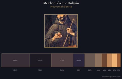
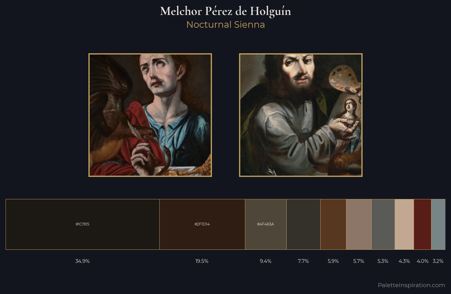
Darkness anchors Melchor Pérez de Holguín; light is rationed, creating dramatic contrast rather than open air. Warm and cool are kept in productive tension, creating the kind of chromatic harmony that sustains the eye. Chroma hovers near zero; colour declares itself through subtle shifts in hue rather than outright saturation. The dominant colour, #1C1915, takes 34.9% of the total area, establishing the overall mood before any other hue is introduced. Only 4.0% is devoted to #591D18, yet that small allocation delivers the palette's entire chromatic tension. At 53 units across the value scale, the palette keeps contrast readable without letting it dominate. This tonal restraint is characteristic of the Melchor Pérez de Holguín approach: colour serves light, not the reverse. Palette 3 sits within the larger chromatic argument that Melchor Pérez de Holguín's complete body of work advances.
Example use cases
- theater design
- jewelry brands
- tobacco-adjacent retail
- event branding
- film & entertainment
I Love This!
Copy, export, or download for your project