Medieval Art Palette 1
Pale Fawn
Pale High-key and low-chroma - delicate, bleached, washed with light.
Fawn Light warm tan - the color of a young deer, soft and golden-brown.

Palette Analysis
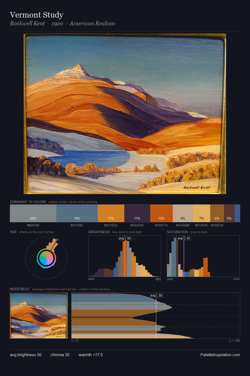
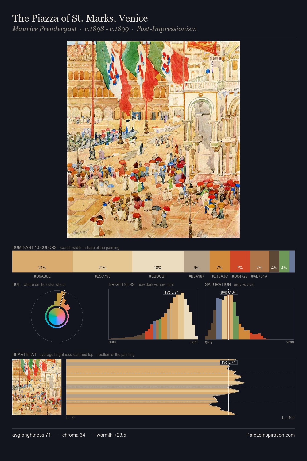
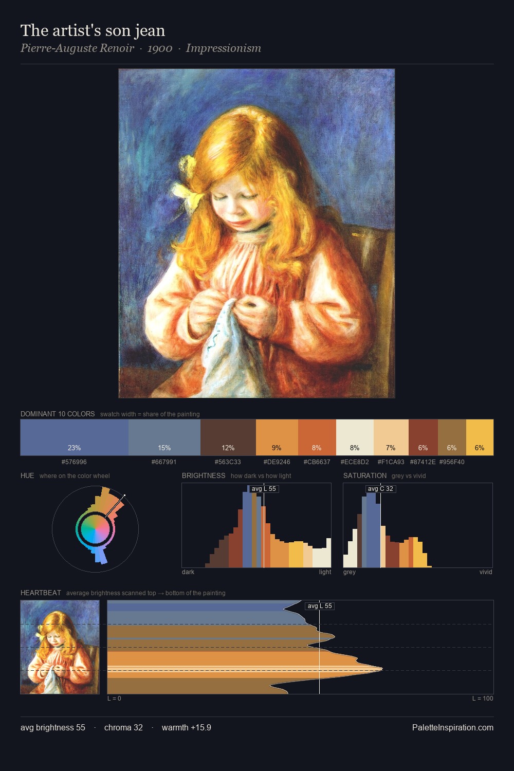
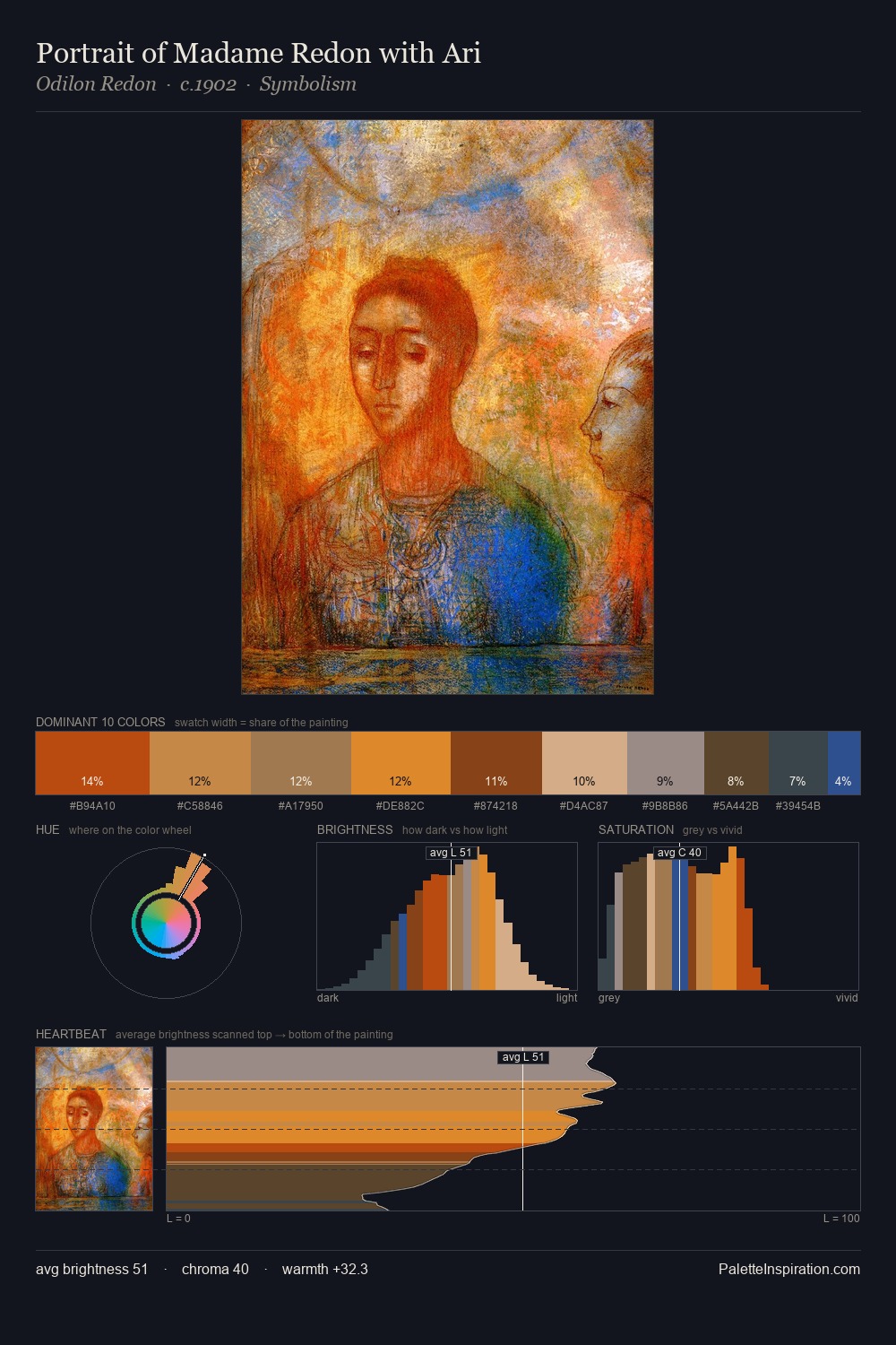
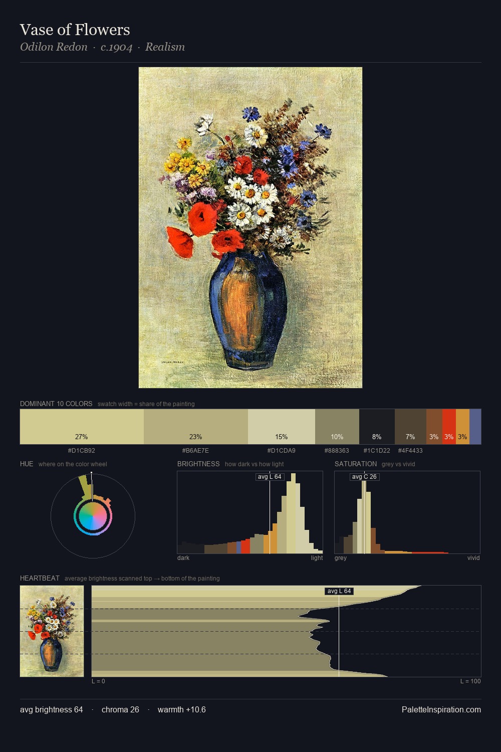
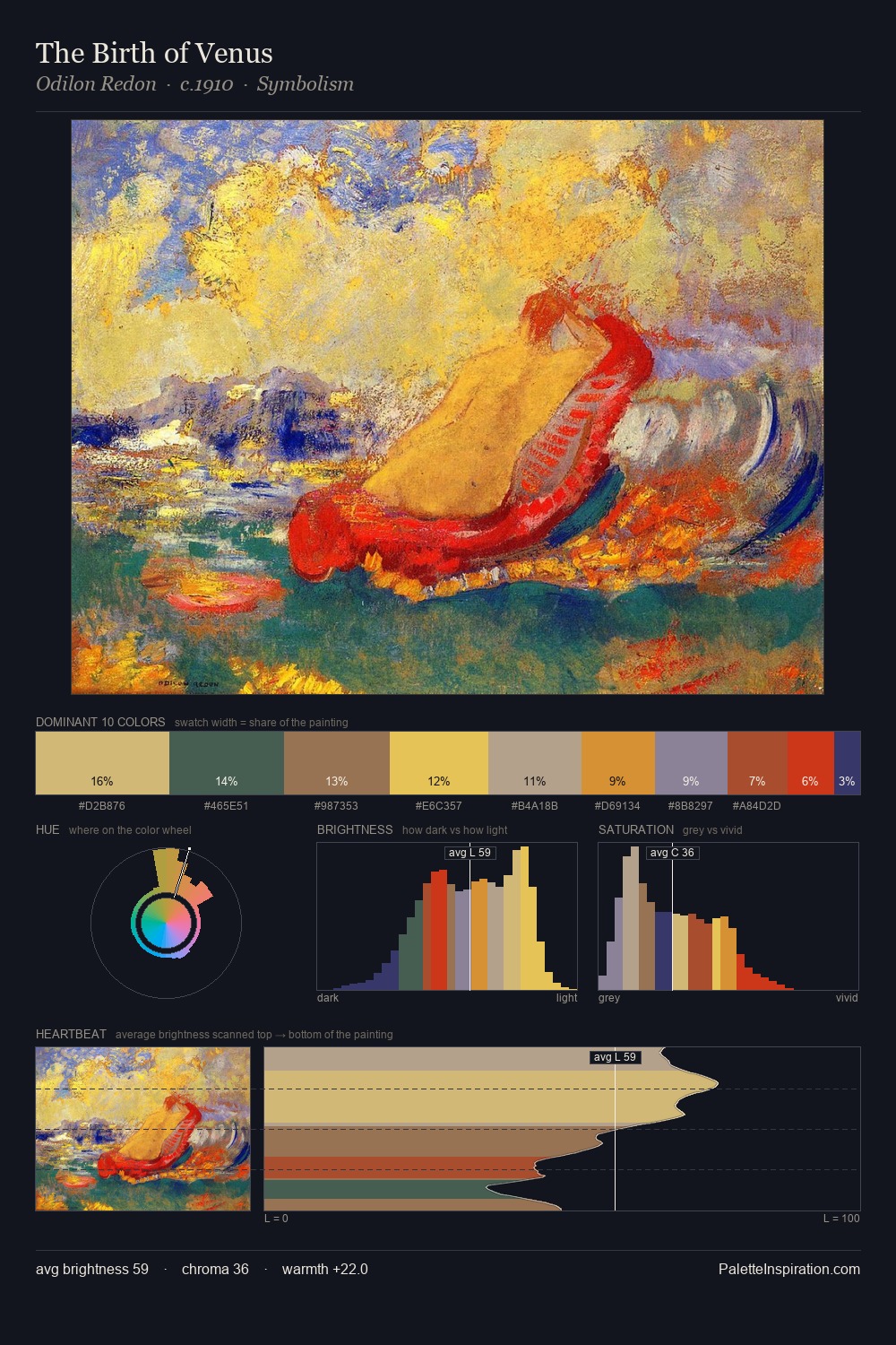
Medieval Art occupies the comfortable middle of the value scale, avoiding both extremes to hold the eye in a sustained middle grey. The palette orchestrates warmth above all else - reds, ambers, and siennas take the lead. Chroma is moderate: colours carry enough saturation to be read as colour, but the palette stops well short of garish intensity. The most saturated colour, #DA4C2A, is reserved to 7.0% of the surface, where it acts as a focal punctuation. Value range is moderate at 51 units - enough contrast for legibility, not so much as to fragment the tonal unity.
Example use cases
- art galleries
- creative studios
- consumer goods
- lifestyle media
- professional services
I Love This!
Use This Palette
Copy, export, or download for your project
Copy, export, or download for your project
Copy:
Download:
Share: