Matthias Grünewald Palette 1
Muted Gamboge
Muted Deliberately desaturated - chroma pulled toward gray, the restraint of tonal painting.
Gamboge Deep golden yellow - a traditional warm pigment, rich amber-gold.
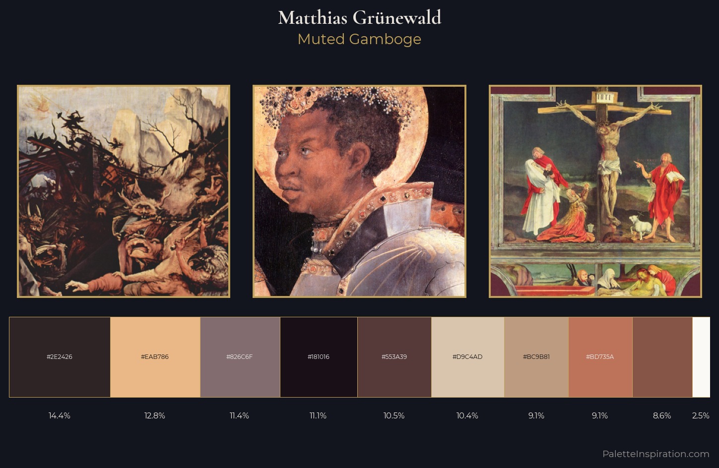
Palette Analysis
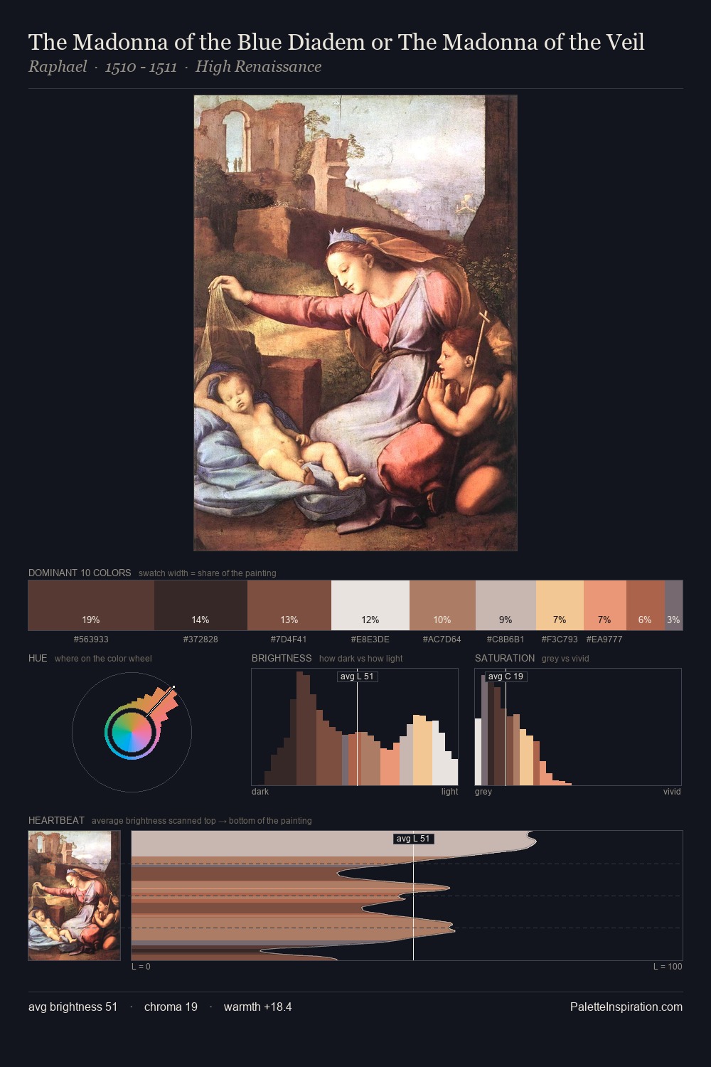
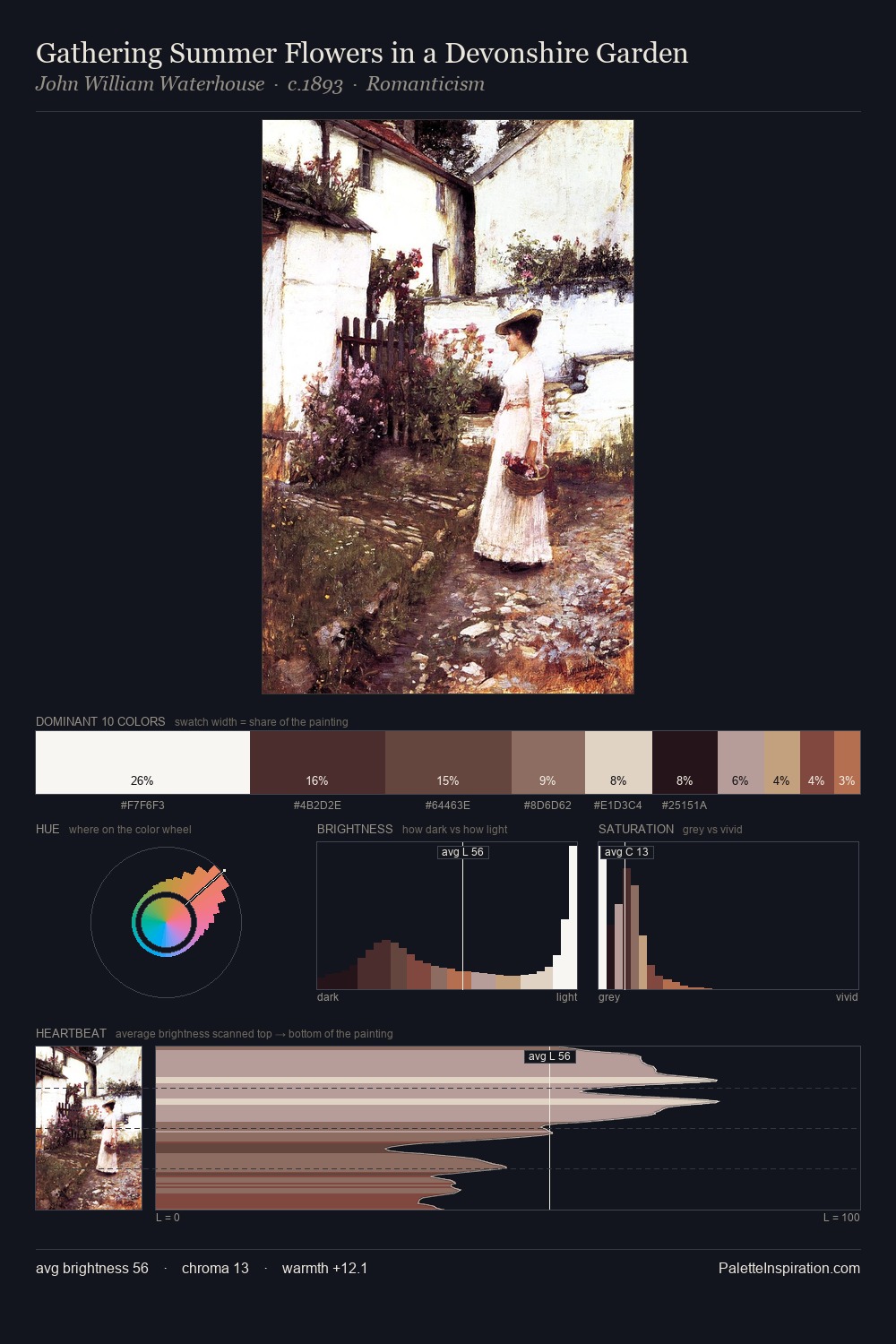
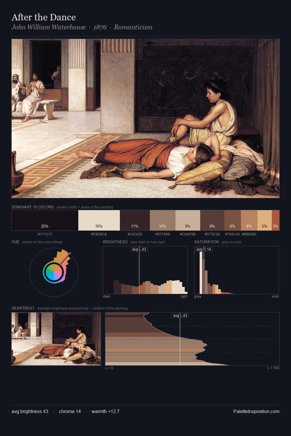
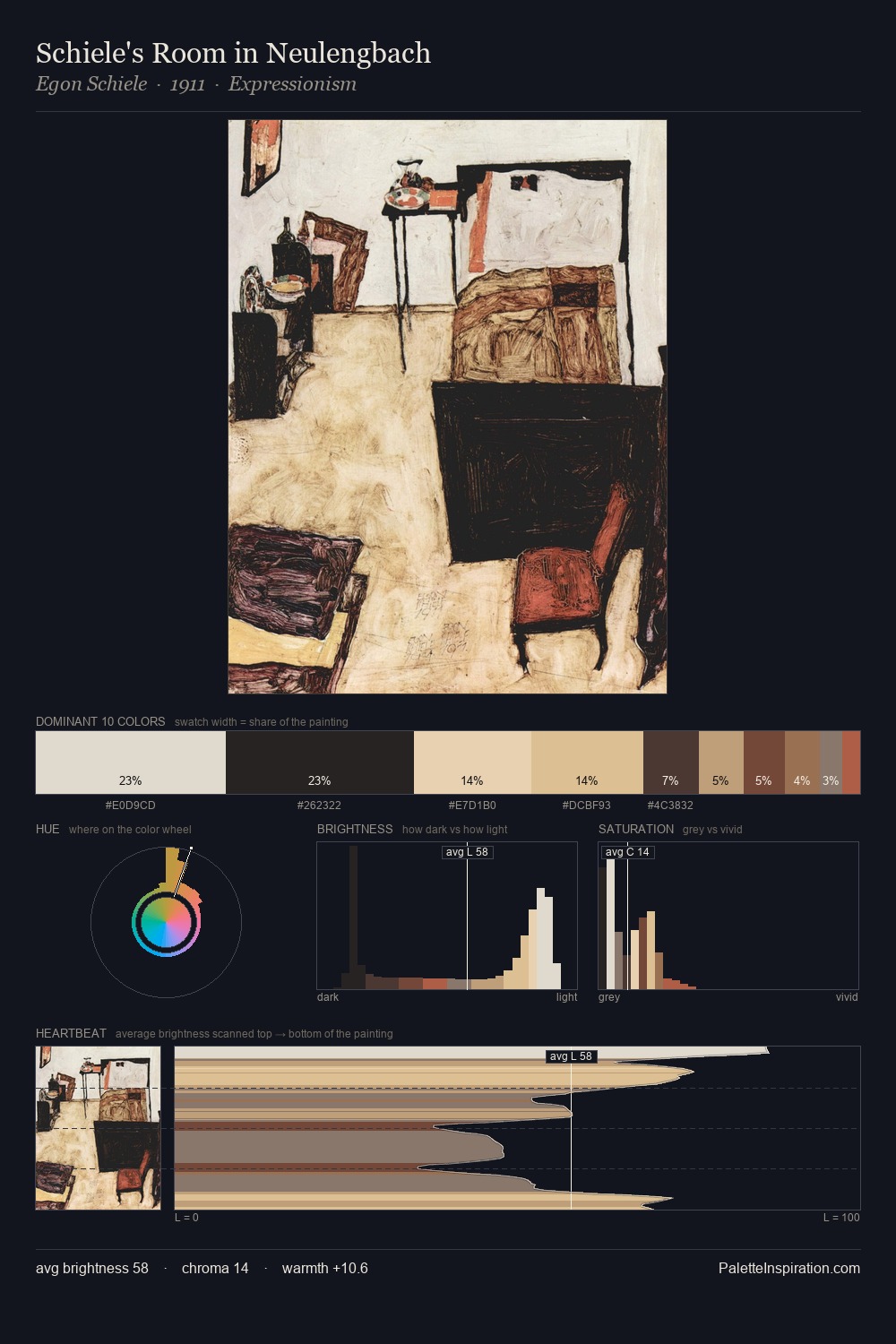
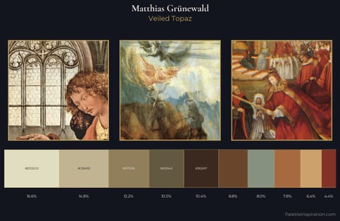
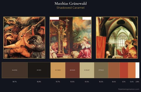
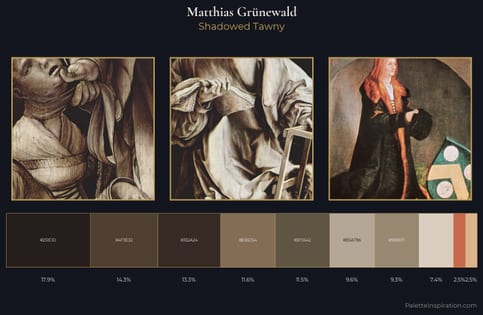
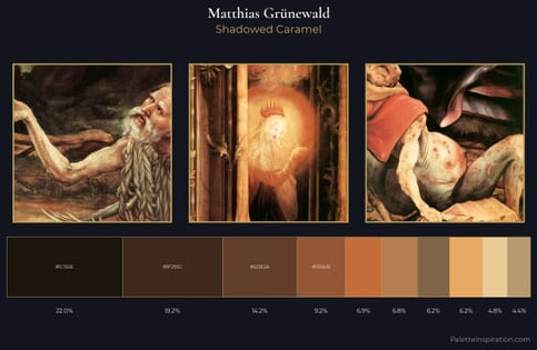
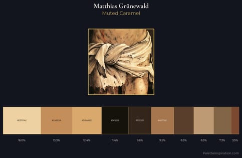
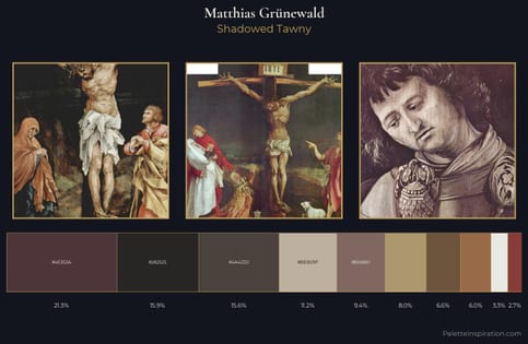
Matthias Grünewald occupies the comfortable middle of the value scale, avoiding both extremes to hold the eye in a sustained middle grey. Matthias Grünewald orchestrates warmth above all else - reds, ambers, and siennas take the lead. All colours lean toward grey, building depth through value rather than colour punch. The most saturated colour, #FBF9F6, is reserved to 2.5% of the surface, where it acts as a focal punctuation. From deepest dark to palest light, the palette traverses 79 units of the value scale - a span that creates natural depth. Palette 1 sits within the larger chromatic argument that Matthias Grünewald's complete body of work advances.
Example use cases
- ceramics & pottery
- boutique hospitality
- menswear
- heritage food brands
- craft & artisan brands
I Love This!
Use This Palette
Copy, export, or download for your project
Copy, export, or download for your project
Copy:
Download:
Share: