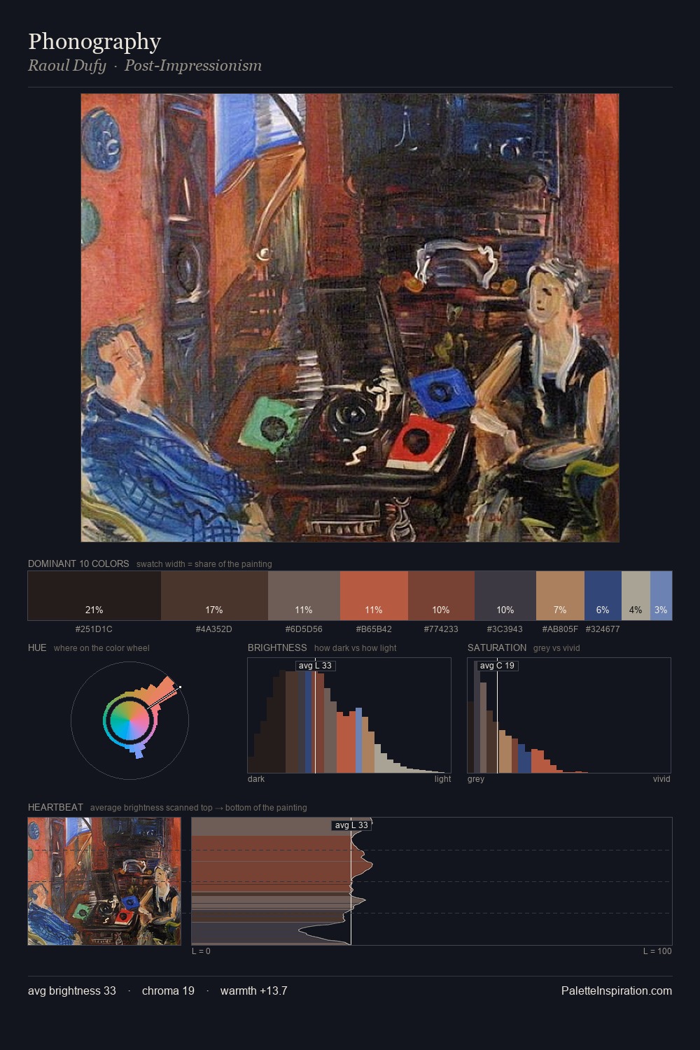
Mario Nuzzi Palette 4

Palette Analysis
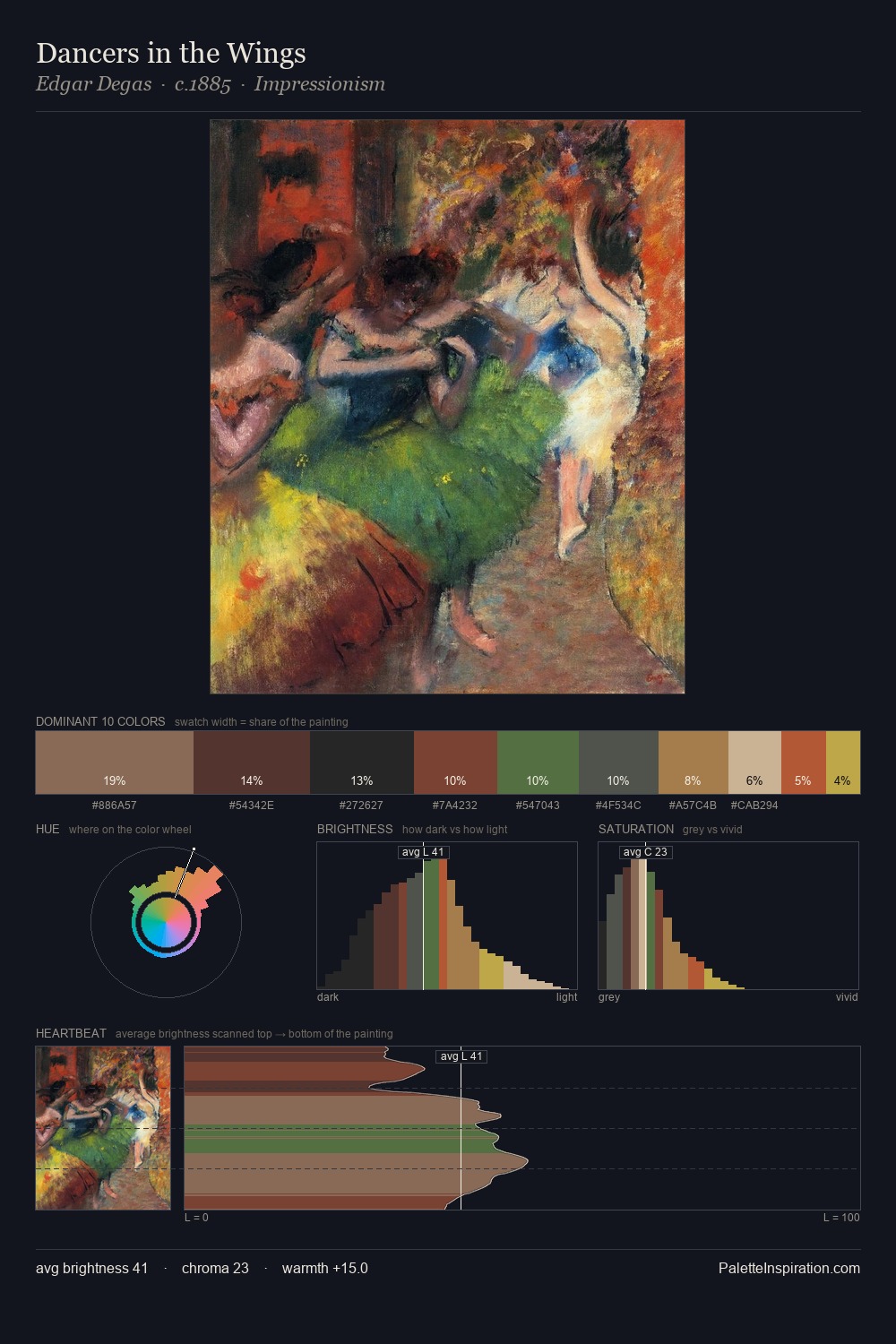
Mario Nuzzi is built on dark foundations, with values clustered toward shadow. Cool tones set the register here - the blues and greens easily outweigh any warm accents. All colours lean toward grey, building depth through value rather than colour punch. #14181B at 27.8% of the palette: an overwhelming presence that pulls all other colours into its gravitational field. At 3.7%, #794034 carries the palette's sharpest chromatic charge: an accent that earns its place precisely because it is withheld. A value spread of 58 units gives the palette both depth and air - shadows are genuinely dark, lights genuinely light. Together these qualities place Mario Nuzzi firmly in the tonal tradition - concerned with mood and atmosphere rather than chromatic display. Palette 4 sits within the larger chromatic argument that Mario Nuzzi's complete body of work advances.
Example use cases
- publishing
- corporate identity
- consumer apps
- hospitality
- design agencies
I Love This!
Copy, export, or download for your project