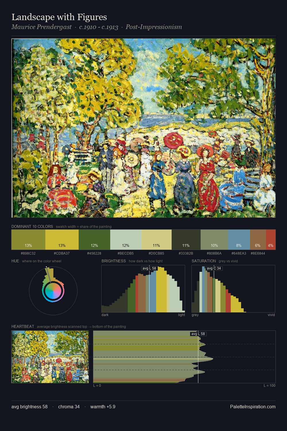
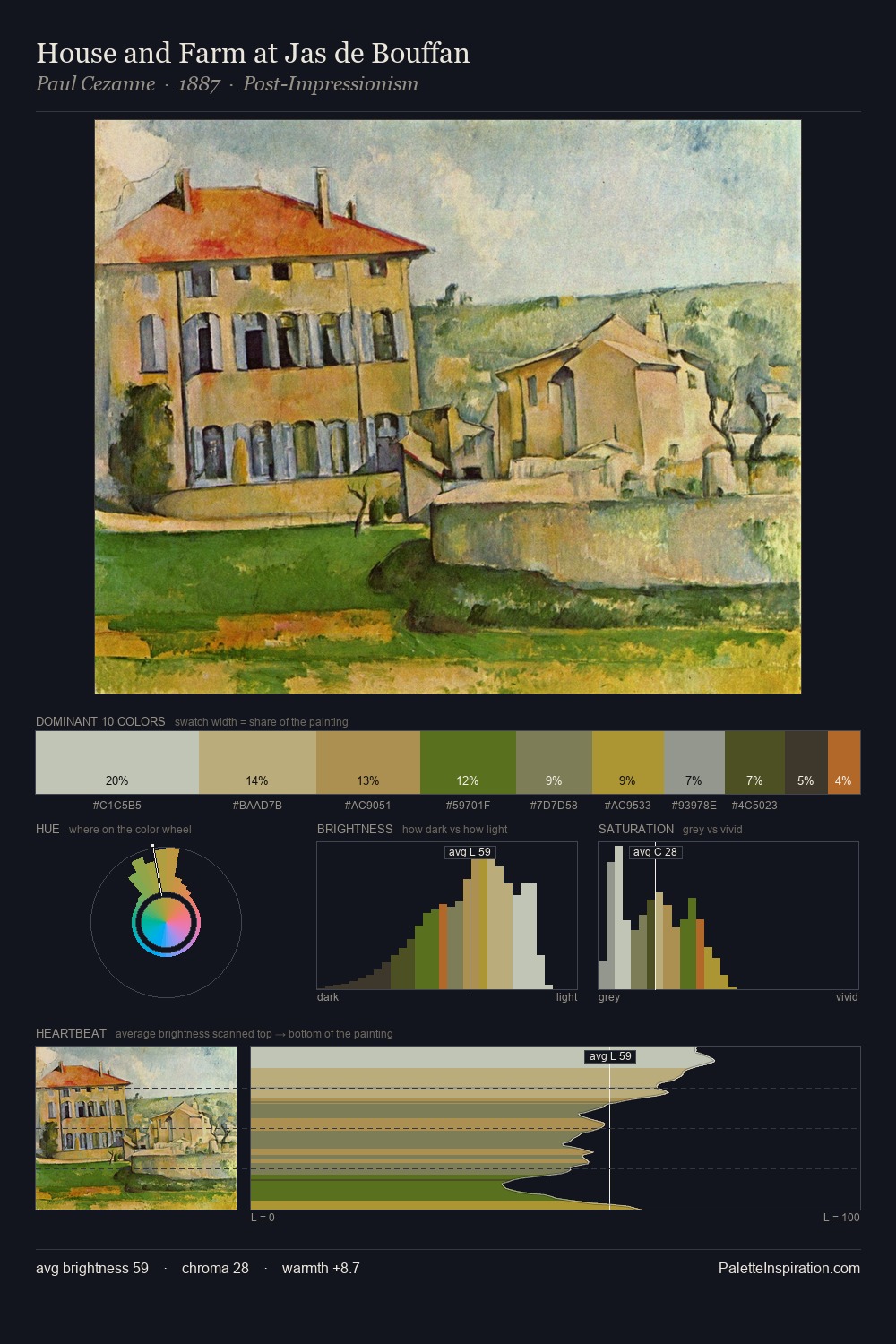
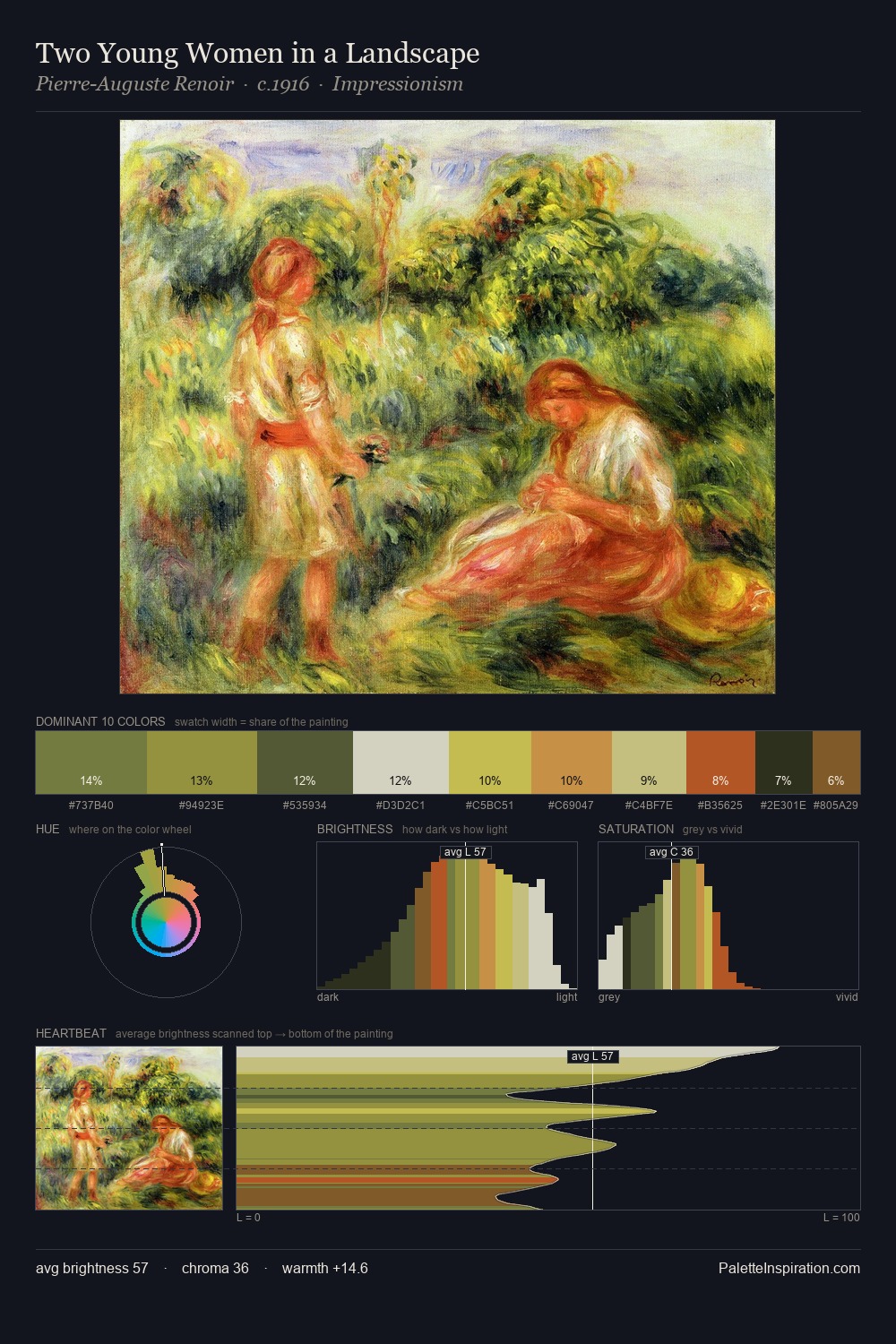
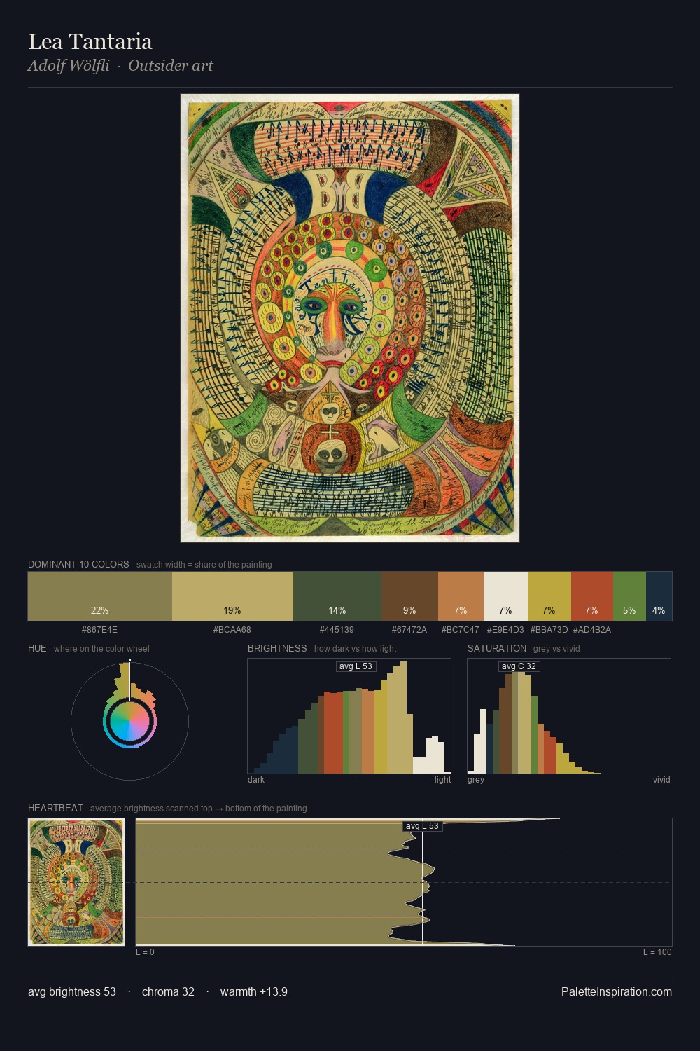
Marianne North Palette 8

Palette Analysis
Marianne North occupies the comfortable middle of the value scale, avoiding both extremes to hold the eye in a sustained middle grey. Marianne North builds on cool foundations: the palette favours the blue-cyan-green arc. Mid-saturation across the board: the palette has colour character without chromatic excess. The most saturated colour, #B04D31, is reserved to 4.9% of the surface, where it acts as a focal punctuation. At 47 units across the value scale, the palette keeps contrast readable without letting it dominate. The palette has the character of outdoor light: cool, mid-bright, with colour rendered faithfully rather than expressively. Palette 8 sits within the larger chromatic argument that Marianne North's complete body of work advances.
Example use cases
- publishing
- corporate identity
- consumer apps
- hospitality
- design agencies
I Love This!
Copy, export, or download for your project