Maria van Oosterwijck Palette 1

Palette Analysis
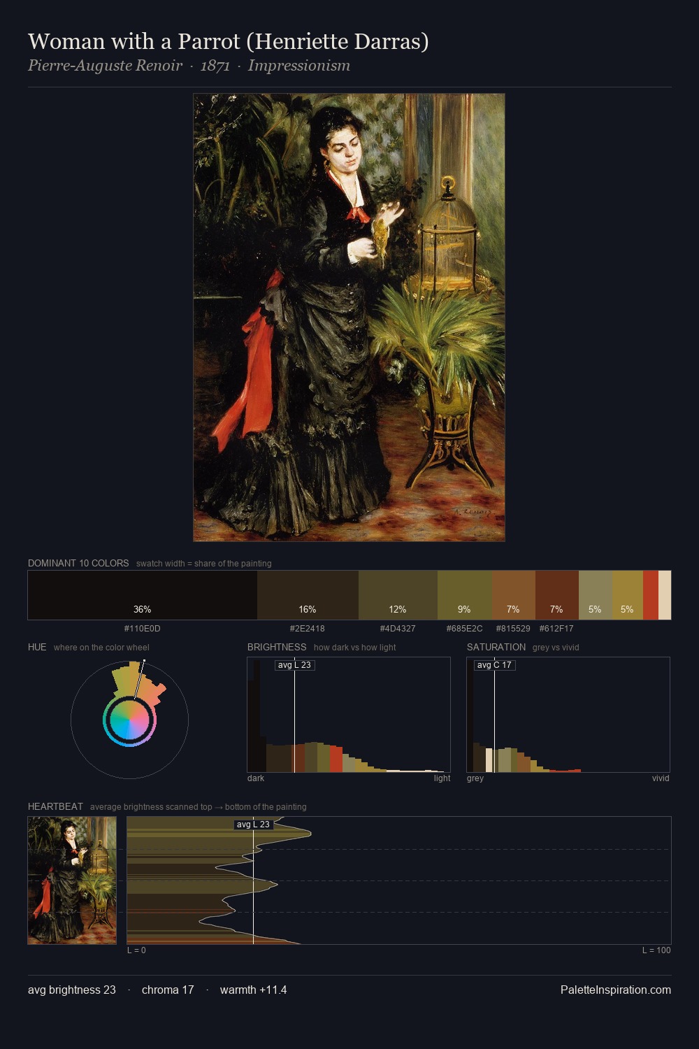
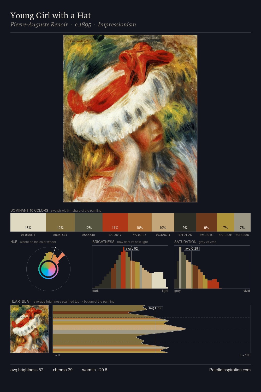
Darkness anchors Maria van Oosterwijck; light is rationed, creating dramatic contrast rather than open air. Cool tones set the register here - the blues and greens easily outweigh any warm accents. Saturation is deliberately withheld - the beauty here lies in the near-monochromatic gradations rather than colour difference. #121009 claims 29.4% of the surface, functioning as the work's tonal foundation. The highest-chroma note - #5C3216 - appears at just 7.8%, deployed as a precision accent against the quieter ground. A value spread of 70 units gives the palette both depth and air - shadows are genuinely dark, lights genuinely light. Together these qualities place Maria van Oosterwijck firmly in the tonal tradition - concerned with mood and atmosphere rather than chromatic display. In the context of Maria van Oosterwijck's full range of palettes, group 1 represents one movement in an ongoing chromatic dialogue.
Example use cases
- theater design
- jewelry brands
- tobacco-adjacent retail
- event branding
- film & entertainment
I Love This!
Copy, export, or download for your project