Marc Chagall Master Palette

Palette Analysis
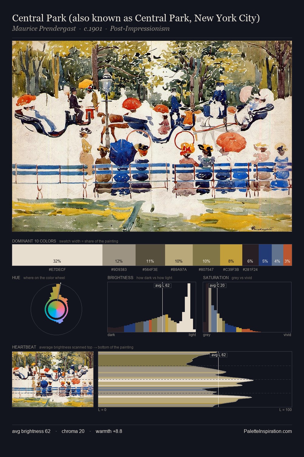
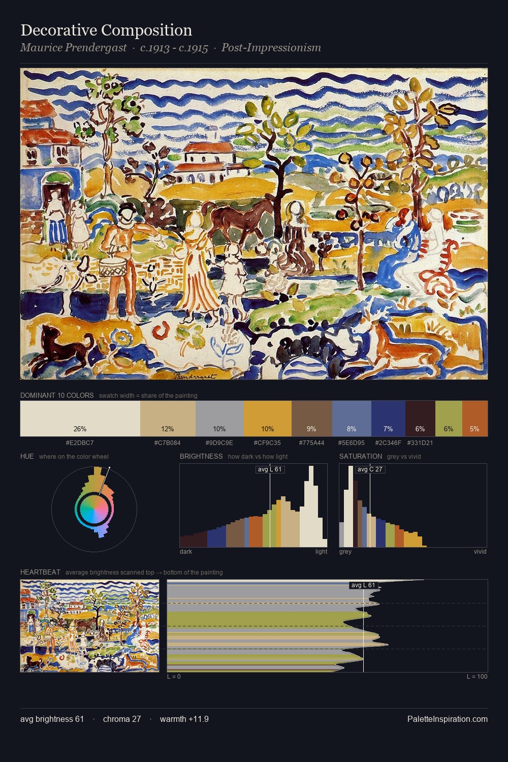
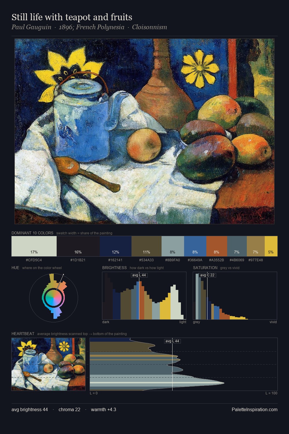
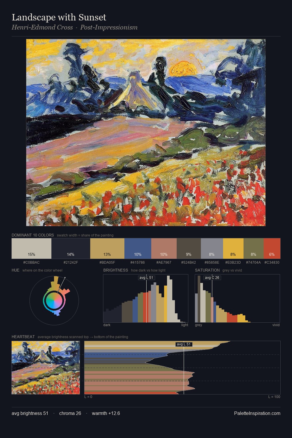
Marc Chagall distributes its values across the middle register, creating harmony without high contrast. Marc Chagall tilts toward cool - blues and silver-greys carry the structural weight. The absence of saturated colour is itself an expressive choice: this is a palette of restraint and atmosphere. At 26.7%, #292928 functions less as a colour accent and more as a complete atmospheric environment. #1D2862 delivers the chromatic peak at only 3.4% - a small shot of colour with outsized visual impact. At 60 units of value range, the palette has the tonal breadth to sustain complex spatial readings. The mid-to-high key, cool bias, and moderate chroma point to outdoor observation - sky and diffused daylight as the dominant light source. These proportions encode Marc Chagall's instinctive sense of how much of each quality the eye can hold.
Example use cases
- music labels
- luxury hospitality
- editorial photography
- leather goods
- premium streaming
I Love This!
Copy, export, or download for your project