Mabuse Palette 7

Palette Analysis
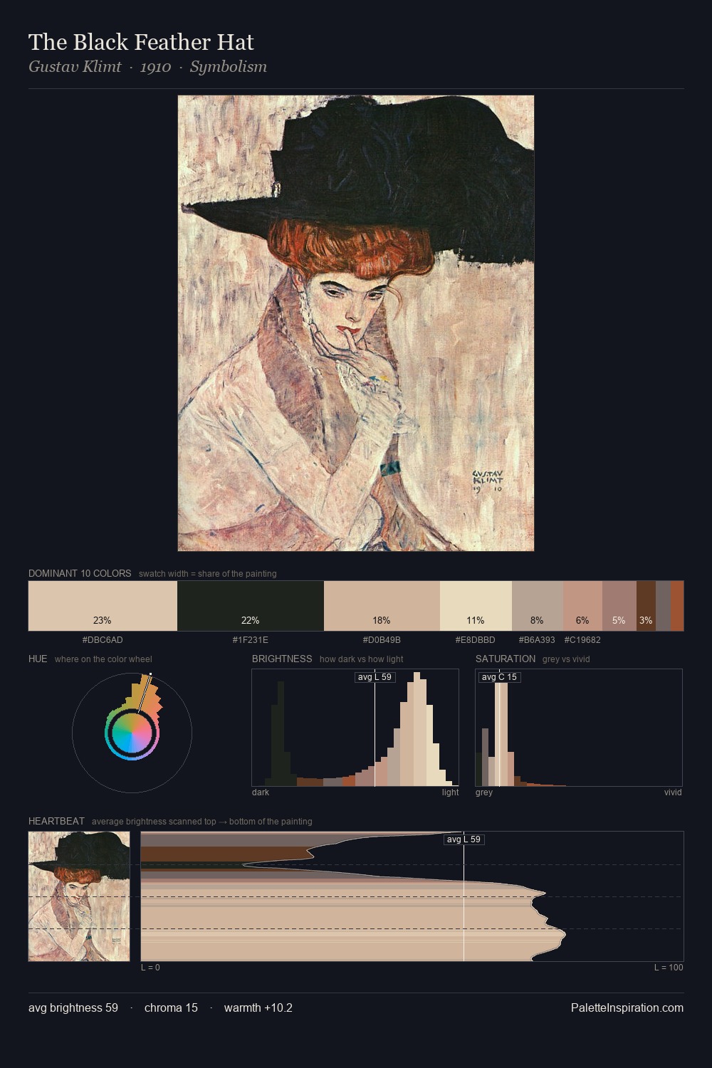
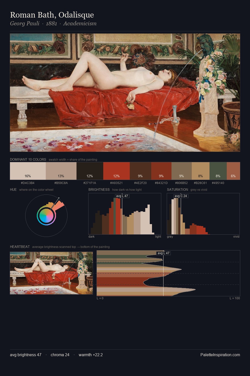
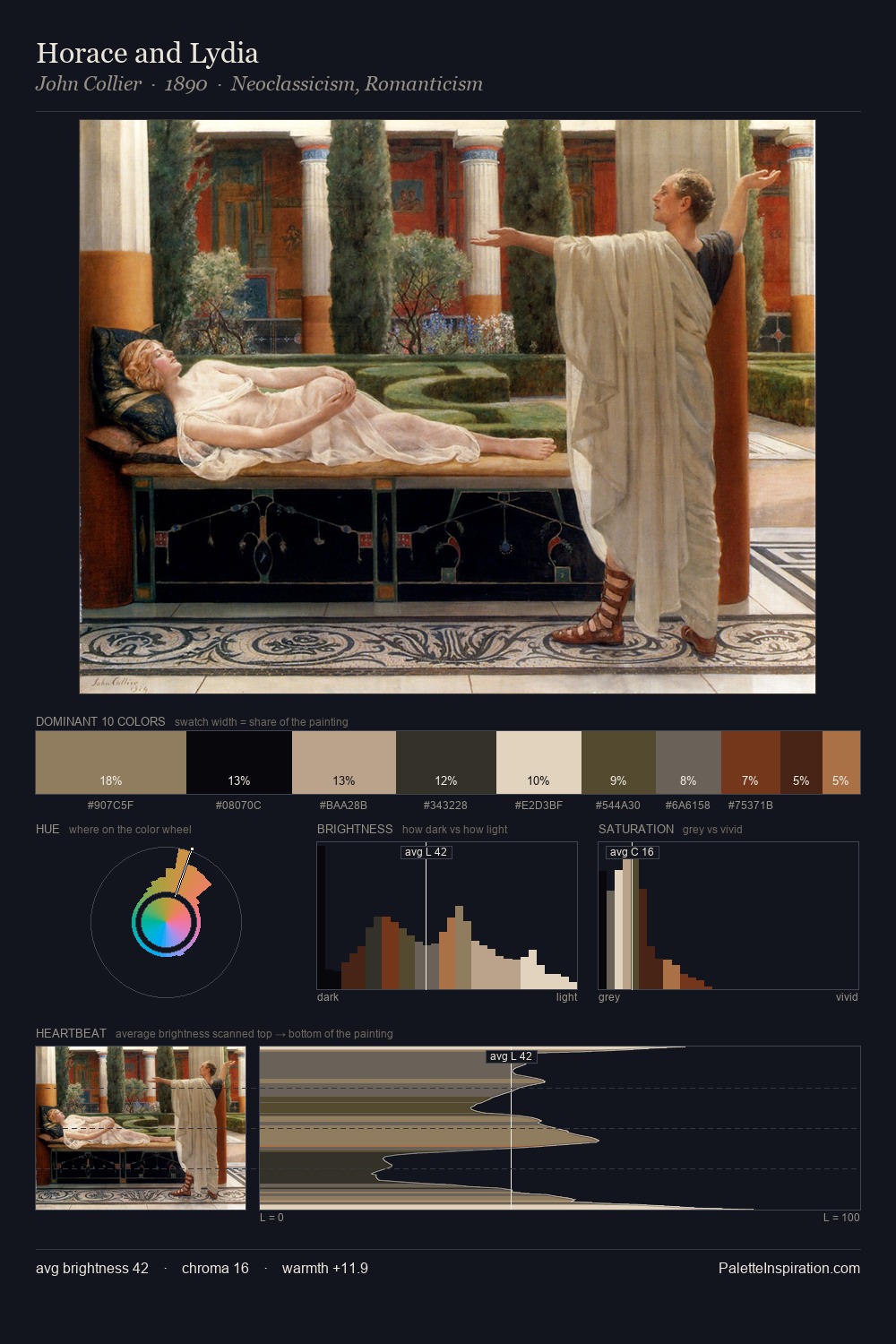
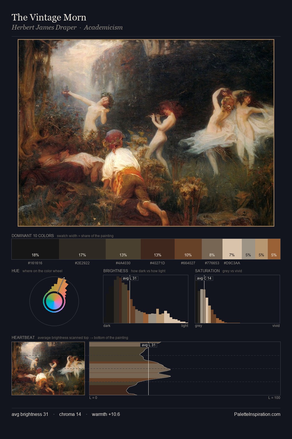
Values in Mabuse rest in the mid-range - neither dramatically lit nor steeped in shadow. The palette achieves thermal balance - reds and blues, ochres and greens, each holding the other in check. Saturation is deliberately withheld - the beauty here lies in the near-monochromatic gradations rather than colour difference. 30.8% of the palette belongs to #1D1913, a concentration that makes it the unmistakable visual centre. #C0967F delivers the chromatic peak at only 7.8% - a small shot of colour with outsized visual impact. From deepest dark to palest light, the palette traverses 60 units of the value scale - a span that creates natural depth. Mabuse's palette 7 carries its own internal logic while remaining in conversation with the artist's broader colour intelligence.
Example use cases
- theater design
- jewelry brands
- tobacco-adjacent retail
- event branding
- film & entertainment
I Love This!
Copy, export, or download for your project