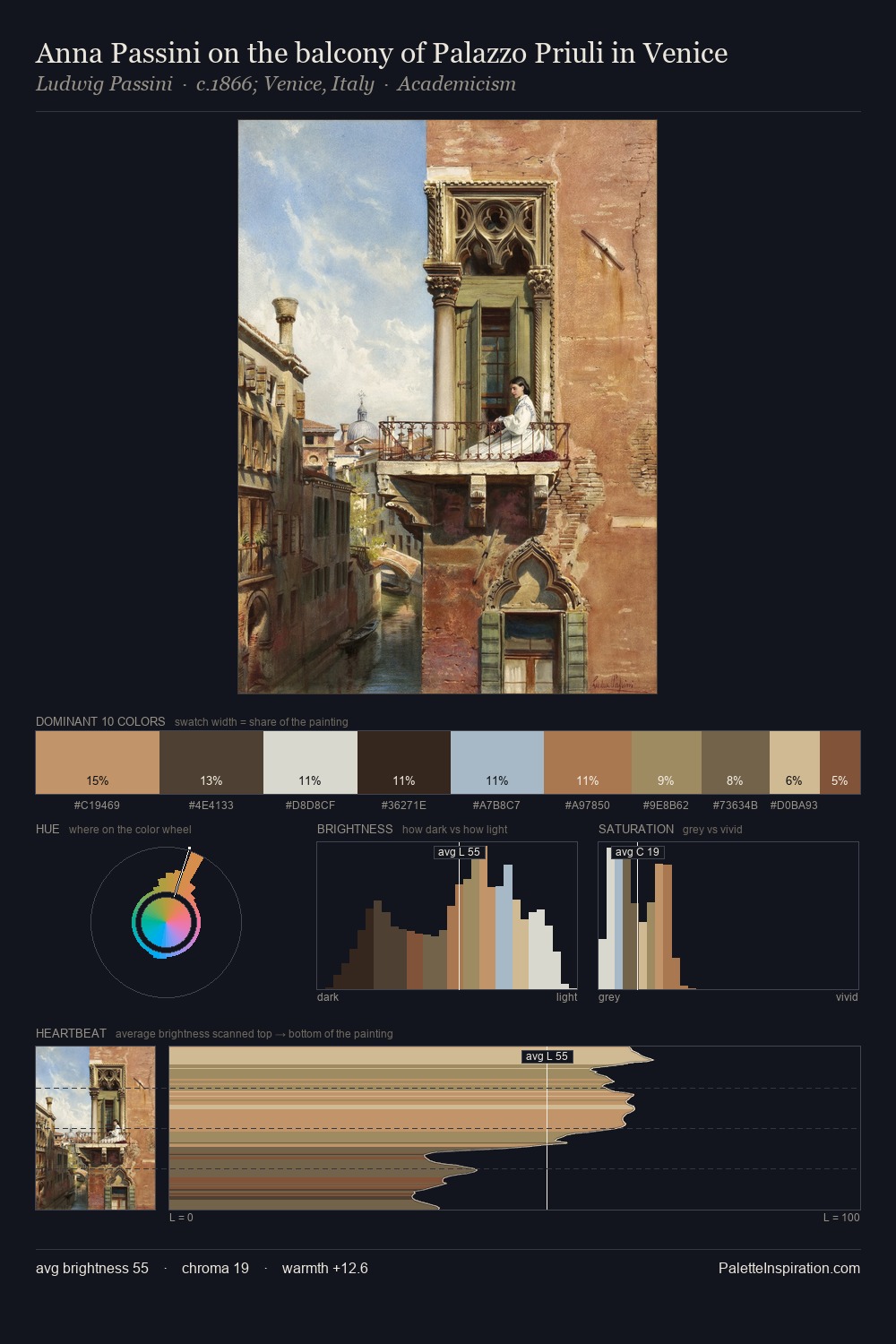
Mabuse Palette 1
Pale Topaz
Pale High-key and low-chroma - delicate, bleached, washed with light.
Topaz Golden yellow - the color of topaz gemstone, warm and slightly saturated.

Palette Analysis
Mabuse is high in key: pale, luminous, and filled with optical air. Temperature reads distinctly warm: the reds and earth tones from Mabuse carry the compositional weight. All colours lean toward grey, building depth through value rather than colour punch. At 9.8%, #6D4F37 carries the palette's sharpest chromatic charge: an accent that earns its place precisely because it is withheld. The full value range is 68 units: broad enough to build convincing three-dimensional form. Palette 1 sits within the larger chromatic argument that Mabuse's complete body of work advances.
Example use cases
- craft & artisan brands
- specialty coffee
- home goods
- lifestyle retail
- ceramics & pottery
I Love This!
Use This Palette
Copy, export, or download for your project
Copy, export, or download for your project
Copy:
Download:
Share: