Luke Fildes Palette 5

Palette Analysis
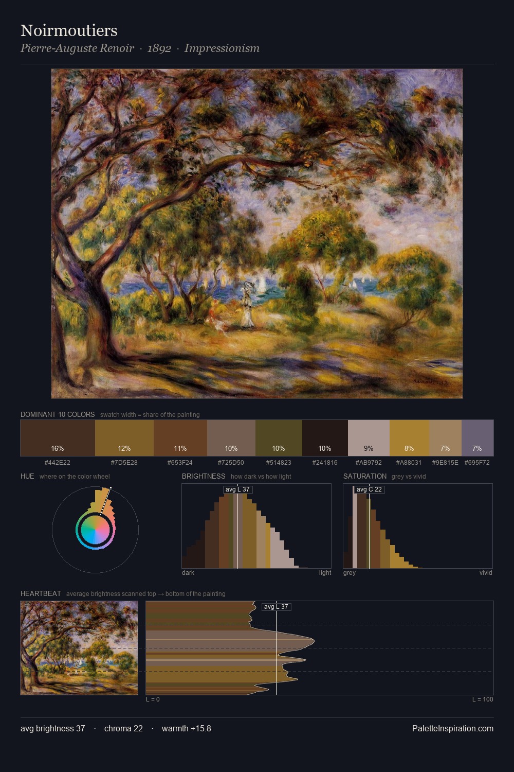
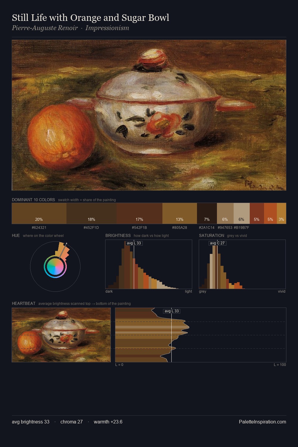
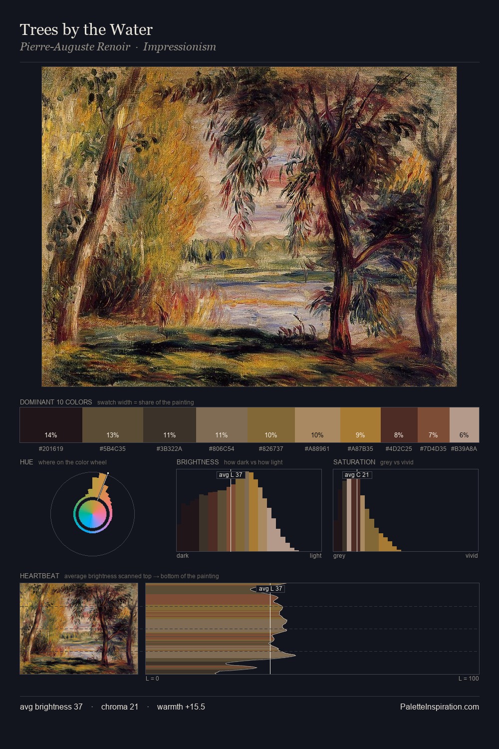
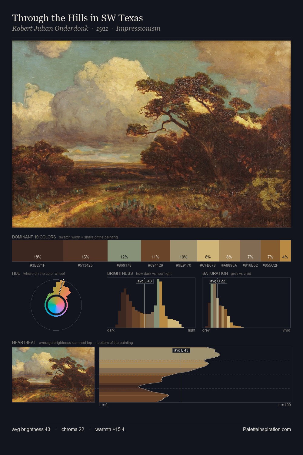
Luke Fildes occupies the comfortable middle of the value scale, avoiding both extremes to hold the eye in a sustained middle grey. Temperature reads distinctly warm: the reds and earth tones from Luke Fildes carry the compositional weight. Chroma hovers near zero; colour declares itself through subtle shifts in hue rather than outright saturation. 26.3% of the palette belongs to #2D2A21, a concentration that makes it the unmistakable visual centre. Only 5.9% is devoted to #7B5C23, yet that small allocation delivers the palette's entire chromatic tension. 41 units of value spread create a palette that is varied but unified - contrast in the service of harmony. Luke Fildes's palette 5 carries its own internal logic while remaining in conversation with the artist's broader colour intelligence.
Example use cases
- theater design
- jewelry brands
- tobacco-adjacent retail
- event branding
- film & entertainment
I Love This!
Copy, export, or download for your project