Ludwig Passini Palette 3

Palette Analysis
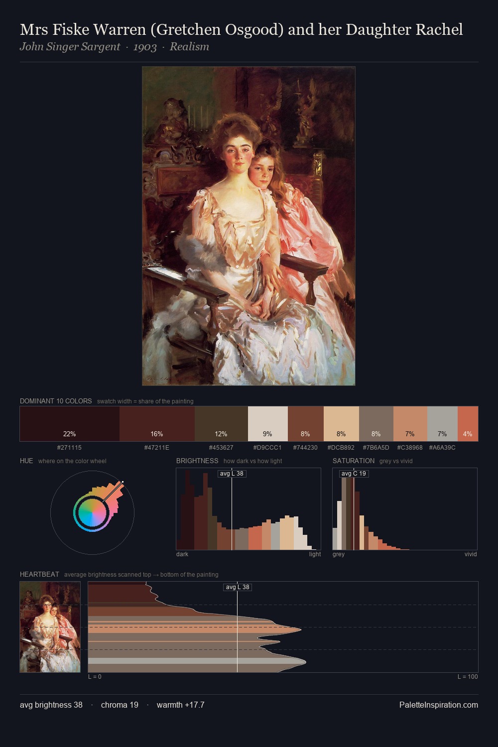
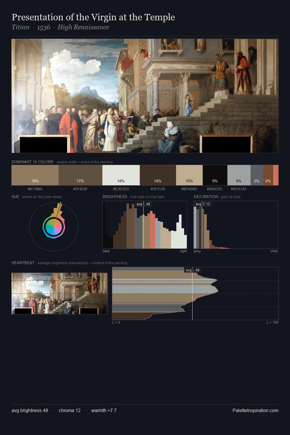
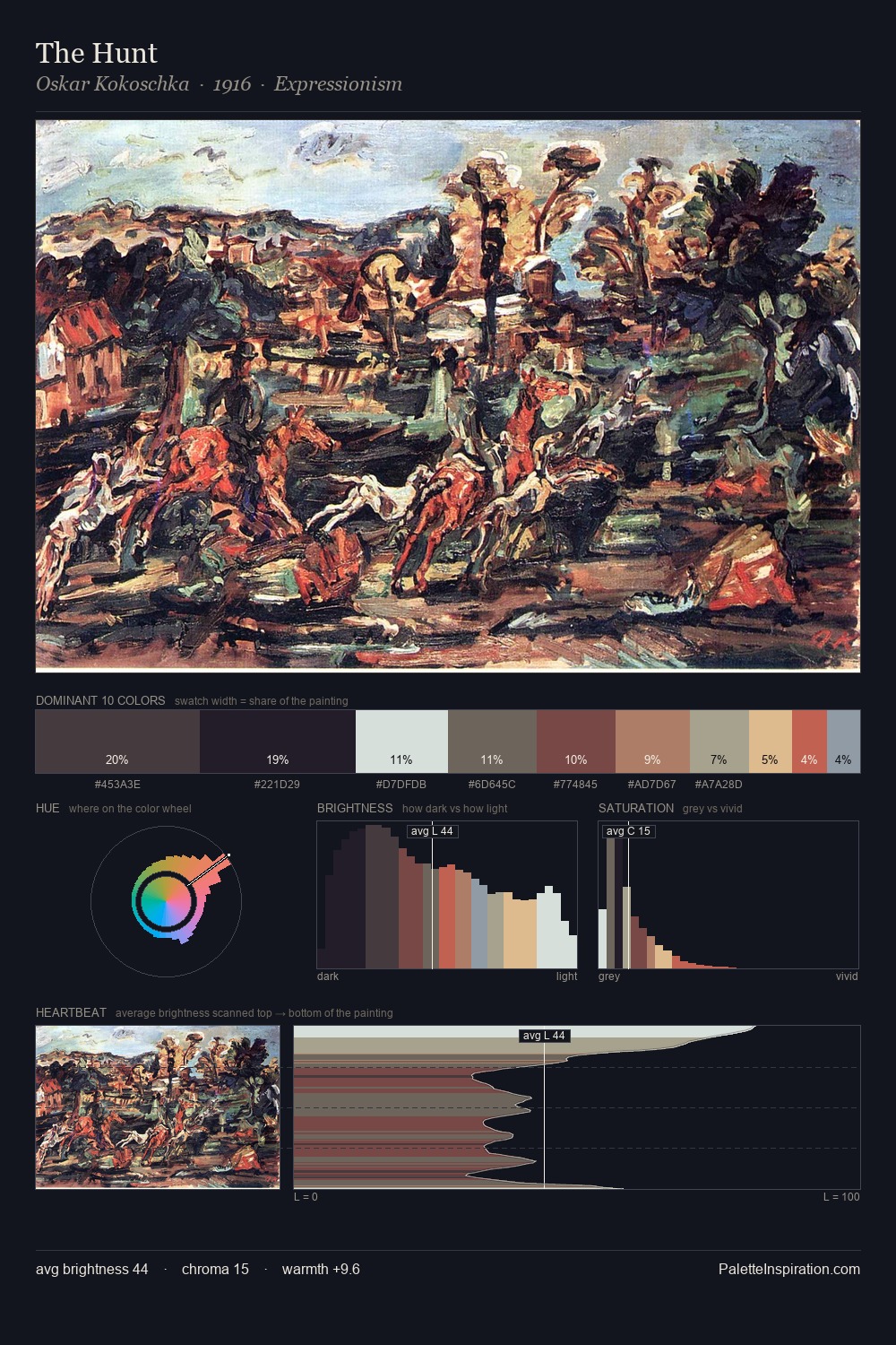
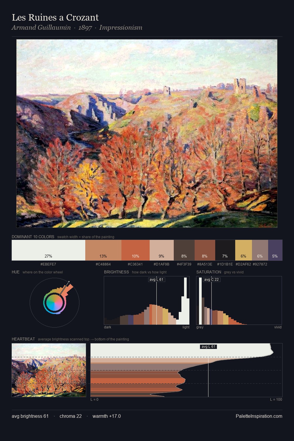
Ludwig Passini is strongly light-biased - shadow is suggested rather than declared. Temperature is cool-dominant, with blue and green families claiming the largest areas. Muted throughout, the palette achieves its effects through value and temperature rather than chromatic force. #E6E1D7 at 40.7% of the palette: an overwhelming presence that pulls all other colours into its gravitational field. The highest-chroma note - #BA7F61 - appears at just 4.2%, deployed as a precision accent against the quieter ground. At 69 units of value range, the palette has the tonal breadth to sustain complex spatial readings. High luminosity and cool temperature suggest the plein-air condition: unfiltered daylight and open sky. Palette 3 sits within the larger chromatic argument that Ludwig Passini's complete body of work advances.
Example use cases
- nonprofit identity
- public libraries
- historical sites
- literary journals
- archival print
I Love This!
Copy, export, or download for your project