Louis Marcoussis Palette 5

Palette Analysis
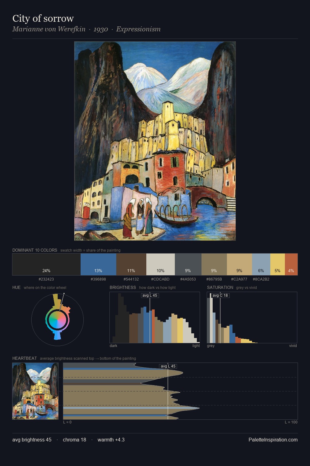
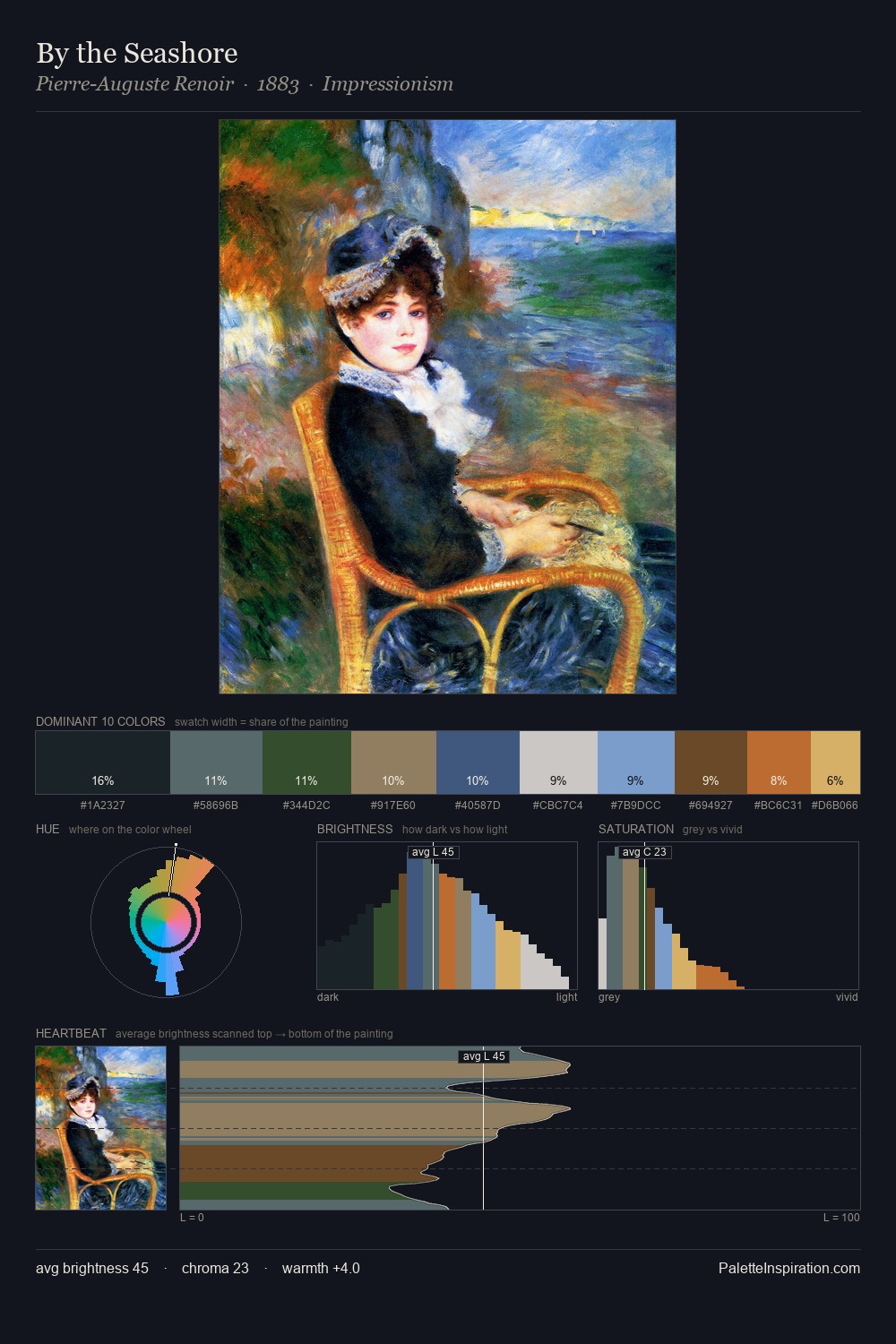
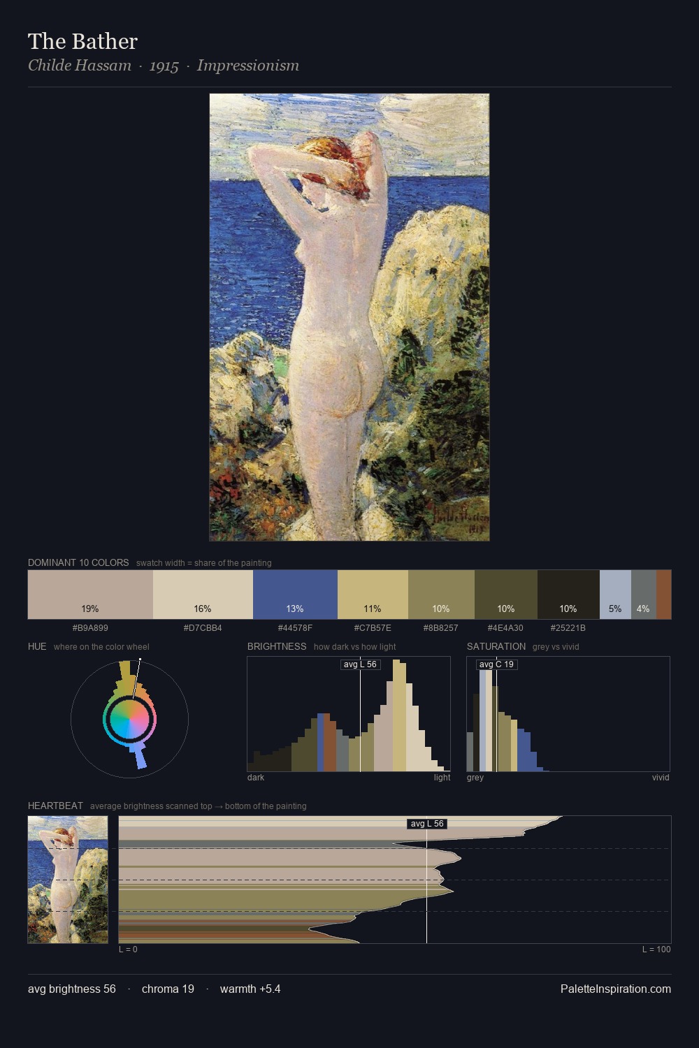
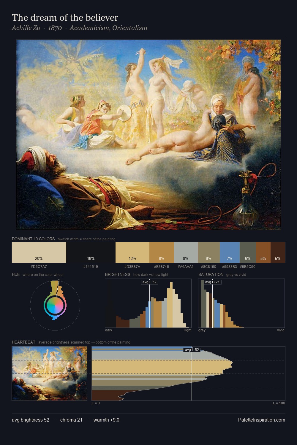
Values in Louis Marcoussis rest in the mid-range - neither dramatically lit nor steeped in shadow. Warm and cool are kept in productive tension, creating the kind of chromatic harmony that sustains the eye. Chroma hovers near zero; colour declares itself through subtle shifts in hue rather than outright saturation. The dominant colour, #1A1918, takes 29.6% of the total area, establishing the overall mood before any other hue is introduced. The most saturated colour, #573A26, is reserved to 9.5% of the surface, where it acts as a focal punctuation. A value spread of 70 units gives the palette both depth and air - shadows are genuinely dark, lights genuinely light. Louis Marcoussis's palette 5 carries its own internal logic while remaining in conversation with the artist's broader colour intelligence.
Example use cases
- exhibition design
- foundation branding
- estate management
- art education
- museums & galleries
I Love This!
Copy, export, or download for your project