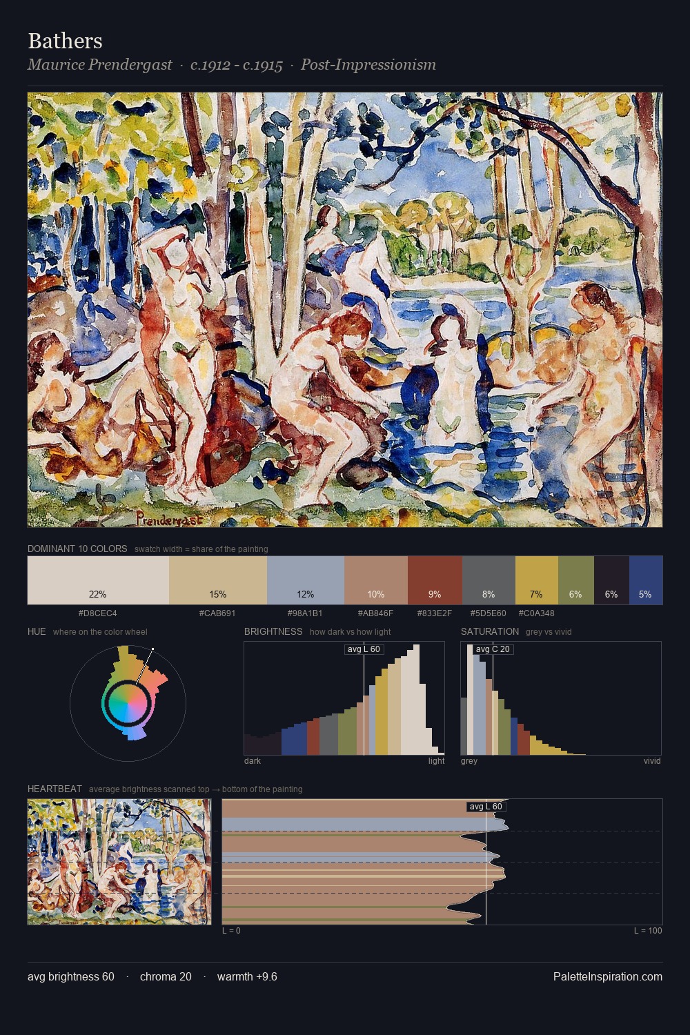
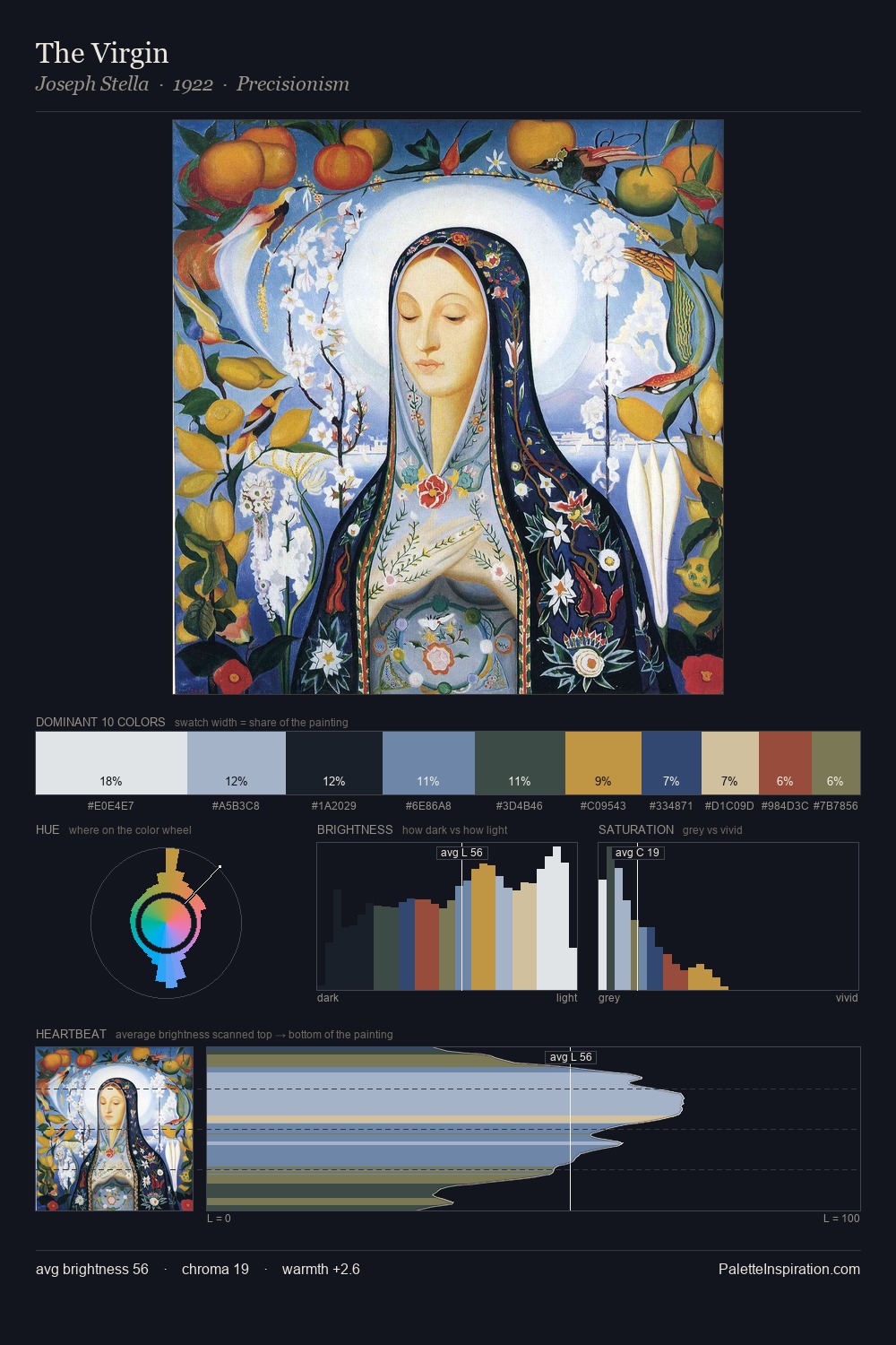
Louis Marcoussis Palette 3

Palette Analysis
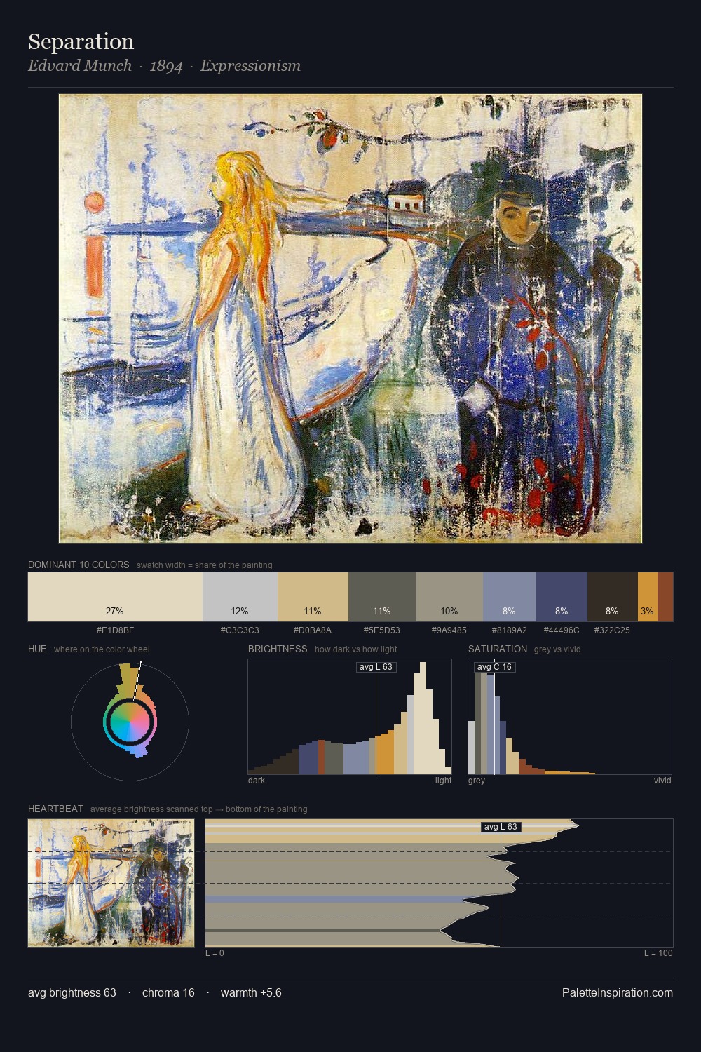
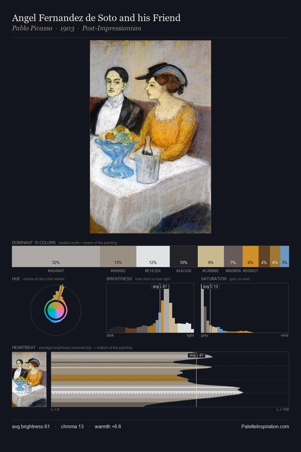
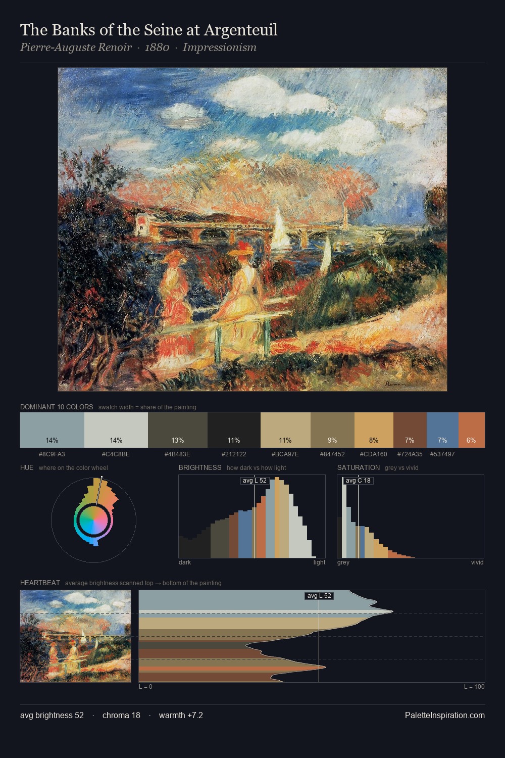
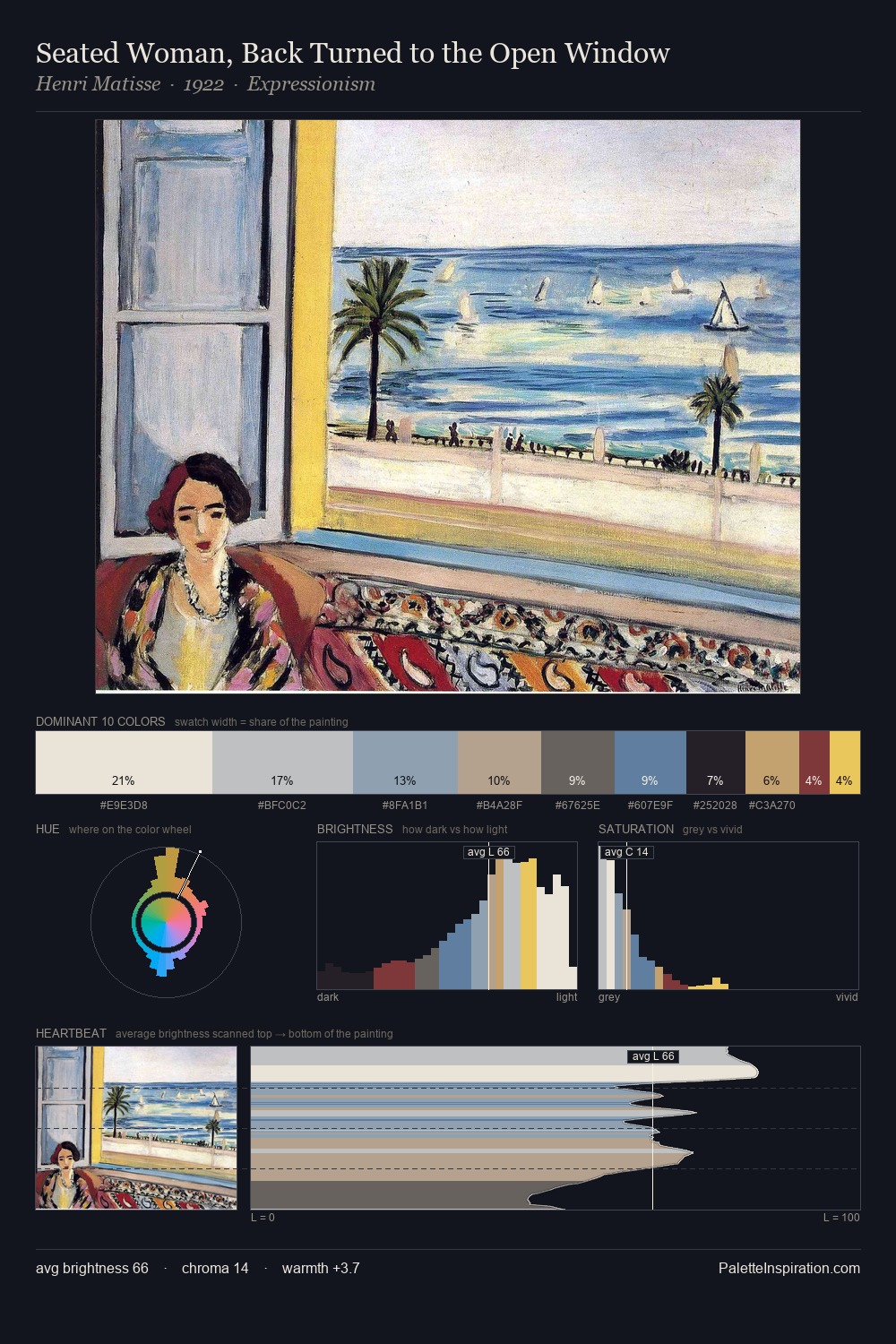
Values in Louis Marcoussis rest in the mid-range - neither dramatically lit nor steeped in shadow. Temperature is cool-dominant, with blue and green families claiming the largest areas. Chroma hovers near zero; colour declares itself through subtle shifts in hue rather than outright saturation. At 29.2%, #EAE9DF functions less as a colour accent and more as a complete atmospheric environment. At 2.9%, #7C422E carries the palette's sharpest chromatic charge: an accent that earns its place precisely because it is withheld. 72 units of value range underpin the palette's structural clarity: the eye always knows where light falls. The mid-to-high key, cool bias, and moderate chroma point to outdoor observation - sky and diffused daylight as the dominant light source. Palette 3 sits within the larger chromatic argument that Louis Marcoussis's complete body of work advances.
Example use cases
- museums & galleries
- academic publishing
- heritage brands
- auction houses
- exhibition design
I Love This!
Copy, export, or download for your project