Louis Comfort Tiffany Palette 5

Palette Analysis
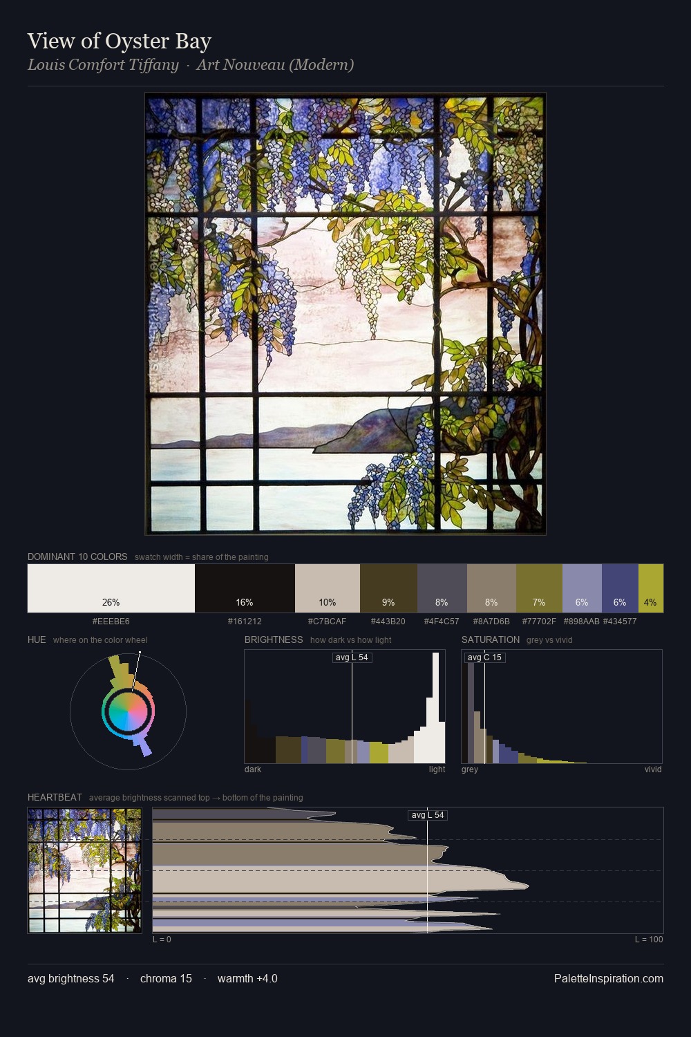
Louis Comfort Tiffany distributes its values across the middle register, creating harmony without high contrast. The palette achieves thermal balance - reds and blues, ochres and greens, each holding the other in check. Saturation is deliberately withheld - the beauty here lies in the near-monochromatic gradations rather than colour difference. A single dominant - #BCB5B1 at 27.6% - sets the character of the whole composition. Only 3.4% is devoted to #787226, yet that small allocation delivers the palette's entire chromatic tension. From deepest dark to palest light, the palette traverses 70 units of the value scale - a span that creates natural depth. Palette 5 sits within the larger chromatic argument that Louis Comfort Tiffany's complete body of work advances.
Example use cases
- ceramics & pottery
- boutique hospitality
- menswear
- heritage food brands
- craft & artisan brands
I Love This!
Copy, export, or download for your project