Lo Scheggia Palette 9
Shadowed Gamboge
Shadowed Low-key - values weighted toward shadow, the palette of dim interiors and overcast skies.
Gamboge Deep golden yellow - a traditional warm pigment, rich amber-gold.

Palette Analysis
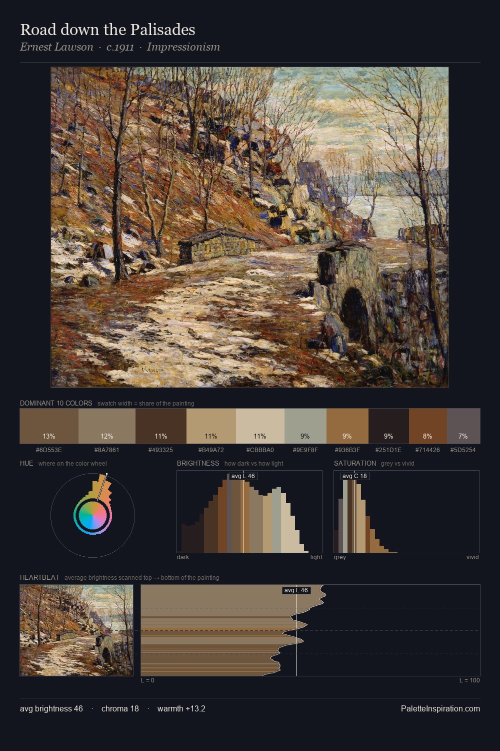
Lo Scheggia occupies the comfortable middle of the value scale, avoiding both extremes to hold the eye in a sustained middle grey. The dominant temperature is warm, with earth tones and fire-hues setting the emotional key. All colours lean toward grey, building depth through value rather than colour punch. The highest-chroma note - #C9A87B - appears at just 8.0%, deployed as a precision accent against the quieter ground. 53 units of value spread create a palette that is varied but unified - contrast in the service of harmony. Palette 9 sits within the larger chromatic argument that Lo Scheggia's complete body of work advances.
Example use cases
- theater design
- jewelry brands
- tobacco-adjacent retail
- event branding
- film & entertainment
I Love This!
Use This Palette
Copy, export, or download for your project
Copy, export, or download for your project
Copy:
Download:
Share: