Leopoldo Metlicovitz Palette 2

Palette Analysis
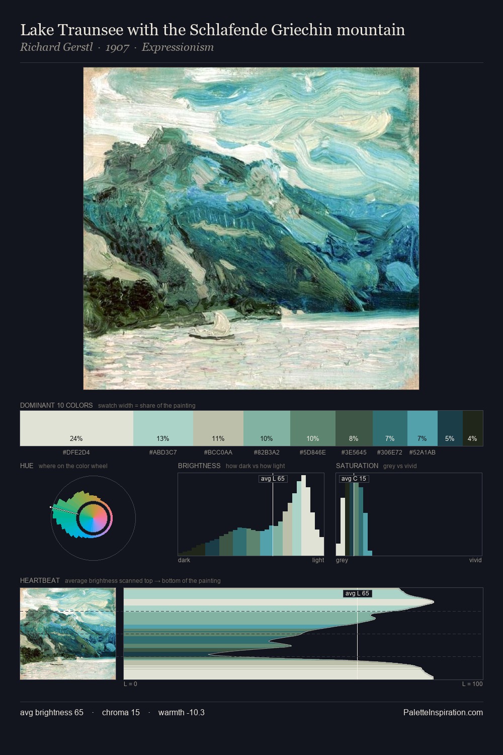
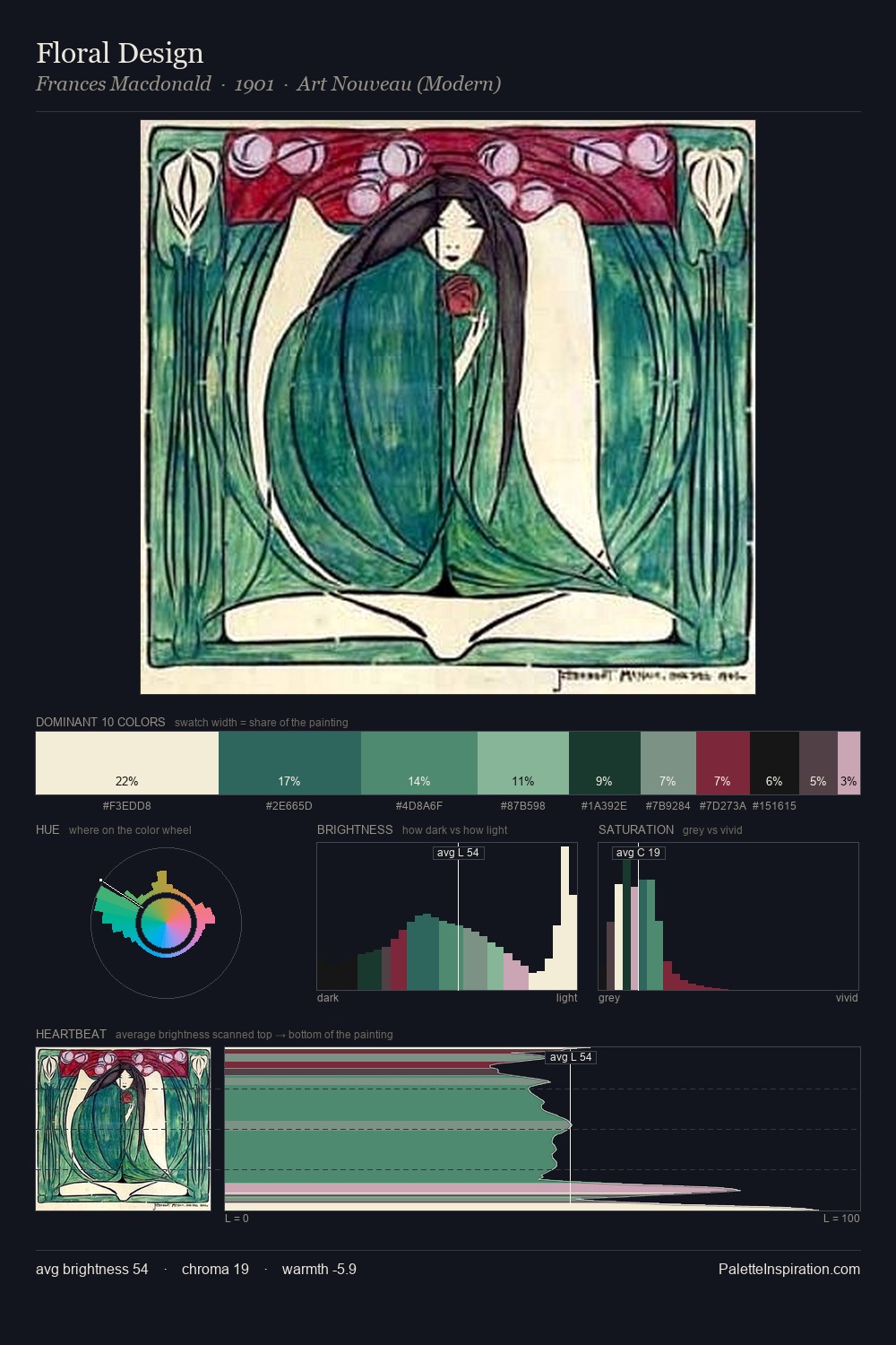
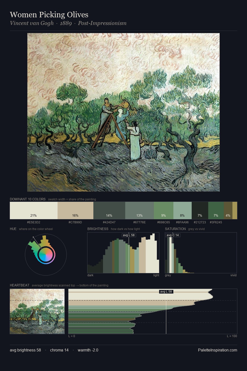
Light floods Leopoldo Metlicovitz; the palette keeps values pale and airy across its range. Cool tones set the register here - the blues and greens easily outweigh any warm accents. Muted throughout, the palette achieves its effects through value and temperature rather than chromatic force. The most saturated colour, #E6E4D5, is reserved to 6.7% of the surface, where it acts as a focal punctuation. The full value range is 63 units: broad enough to build convincing three-dimensional form. The mid-to-high key, cool bias, and moderate chroma point to outdoor observation - sky and diffused daylight as the dominant light source. Leopoldo Metlicovitz's palette 2 carries its own internal logic while remaining in conversation with the artist's broader colour intelligence.
Example use cases
- exhibition design
- foundation branding
- estate management
- art education
- museums & galleries
I Love This!
Copy, export, or download for your project