Leonardo da Vinci Palette 2

Palette Analysis
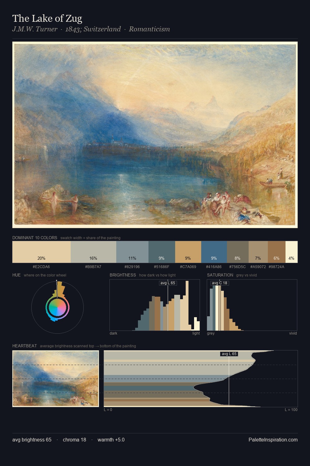
Light floods Leonardo da Vinci; the palette keeps values pale and airy across its range. A distinctly cool atmosphere runs through this palette: sky, water, and mist given colour form. Chroma is kept low across all colours, producing the soft, enveloping quality that characterises tonal painting. The highest-chroma note - #7C673C - appears at just 5.2%, deployed as a precision accent against the quieter ground. The value range of 42 units sits in the comfortable middle: enough depth, enough light, neither extreme. The mid-to-high key, cool bias, and moderate chroma point to outdoor observation - sky and diffused daylight as the dominant light source. Palette 2 sits within the larger chromatic argument that Leonardo da Vinci's complete body of work advances.
Example use cases
- craft & artisan brands
- specialty coffee
- home goods
- lifestyle retail
- ceramics & pottery
I Love This!
Copy, export, or download for your project