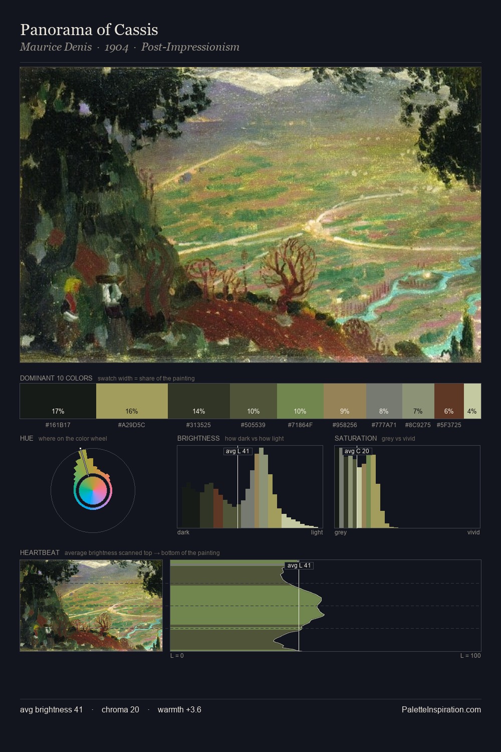
Laura Knight Palette 5

Palette Analysis
Laura Knight works almost entirely in the lower half of the value scale, privileging depth over brilliance. Cool tones set the register here - the blues and greens easily outweigh any warm accents. Chroma hovers near zero; colour declares itself through subtle shifts in hue rather than outright saturation. The highest-chroma note - #A4916B - appears at just 1.6%, deployed as a precision accent against the quieter ground. At 47 units across the value scale, the palette keeps contrast readable without letting it dominate. Together these qualities place Laura Knight firmly in the tonal tradition - concerned with mood and atmosphere rather than chromatic display. This is palette 5 of Laura Knight's sequence - a single chapter in a chromatic story told across many works.
Example use cases
- legal services
- corporate identity
- industrial design
- professional services
- fintech
I Love This!
Copy, export, or download for your project