Konstantinos Volanakis Palette 9
Tenebrous Pewter
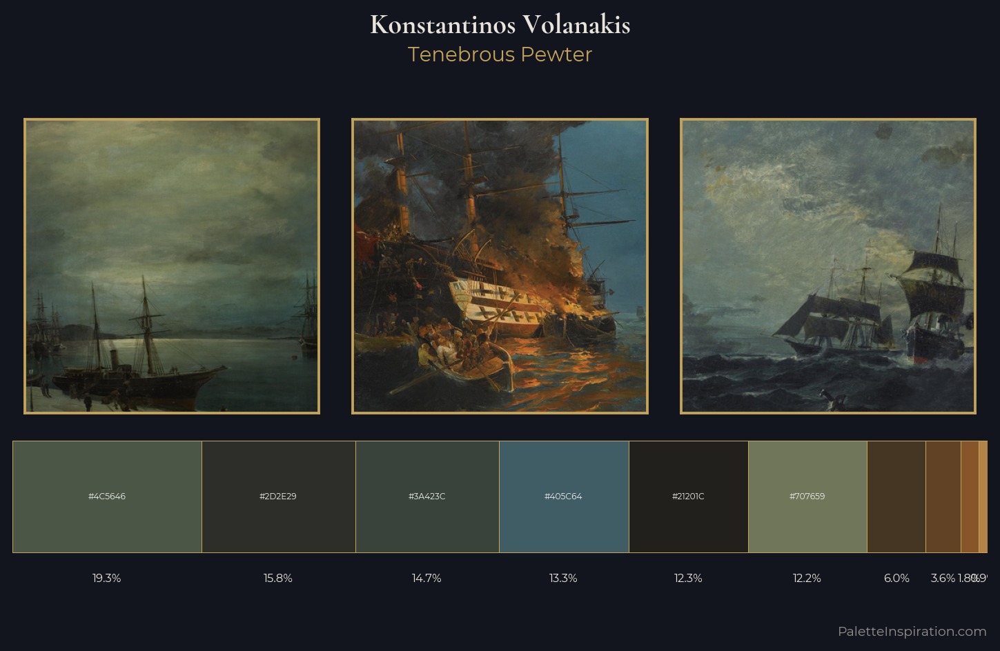
Tenebrous Dark and murky - low-key values with obscured form, Baroque in temperament.
Pewter Mid-tone warm gray - the color of pewter alloy, between silver and lead.
Palette Analysis
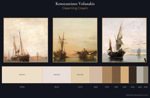
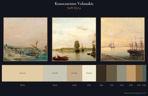
Mid-key values give Konstantinos Volanakis its characteristic quietness - nothing blazes, nothing disappears. A distinctly cool atmosphere runs through this palette: sky, water, and mist given colour form. Chroma is kept low across all colours, producing the soft, enveloping quality that characterises tonal painting. #B48347 functions as the palette's exclamation mark: highest chroma, lowest percentage (0.9%). 41 units of value spread create a palette that is varied but unified - contrast in the service of harmony. High luminosity and cool temperature suggest the plein-air condition: unfiltered daylight and open sky. This is palette 9 of Konstantinos Volanakis's sequence - a single chapter in a chromatic story told across many works.
Example use cases
- publishing
- corporate identity
- consumer apps
- hospitality
- design agencies
I Love This!
Use This Palette
Copy, export, or download for your project
Copy, export, or download for your project
Copy:
Download:
Share: