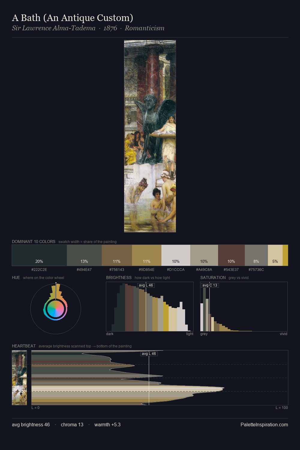
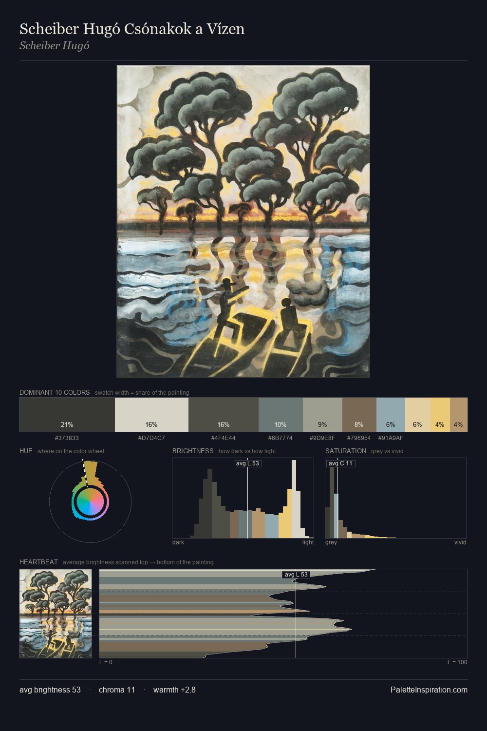
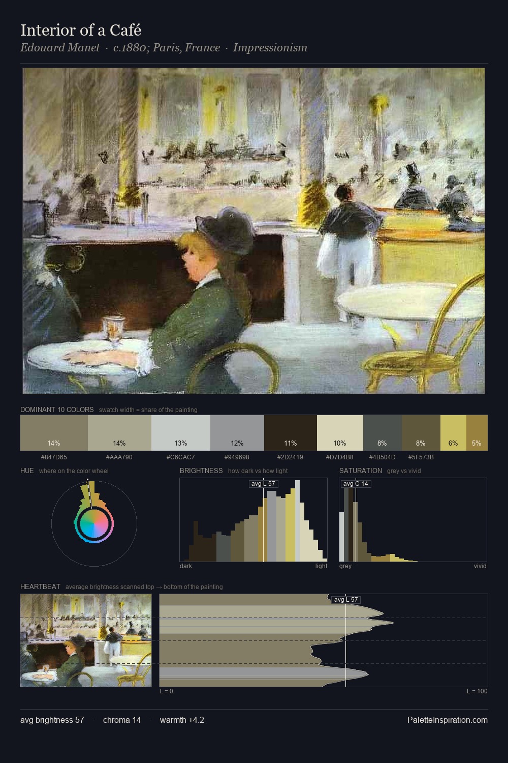
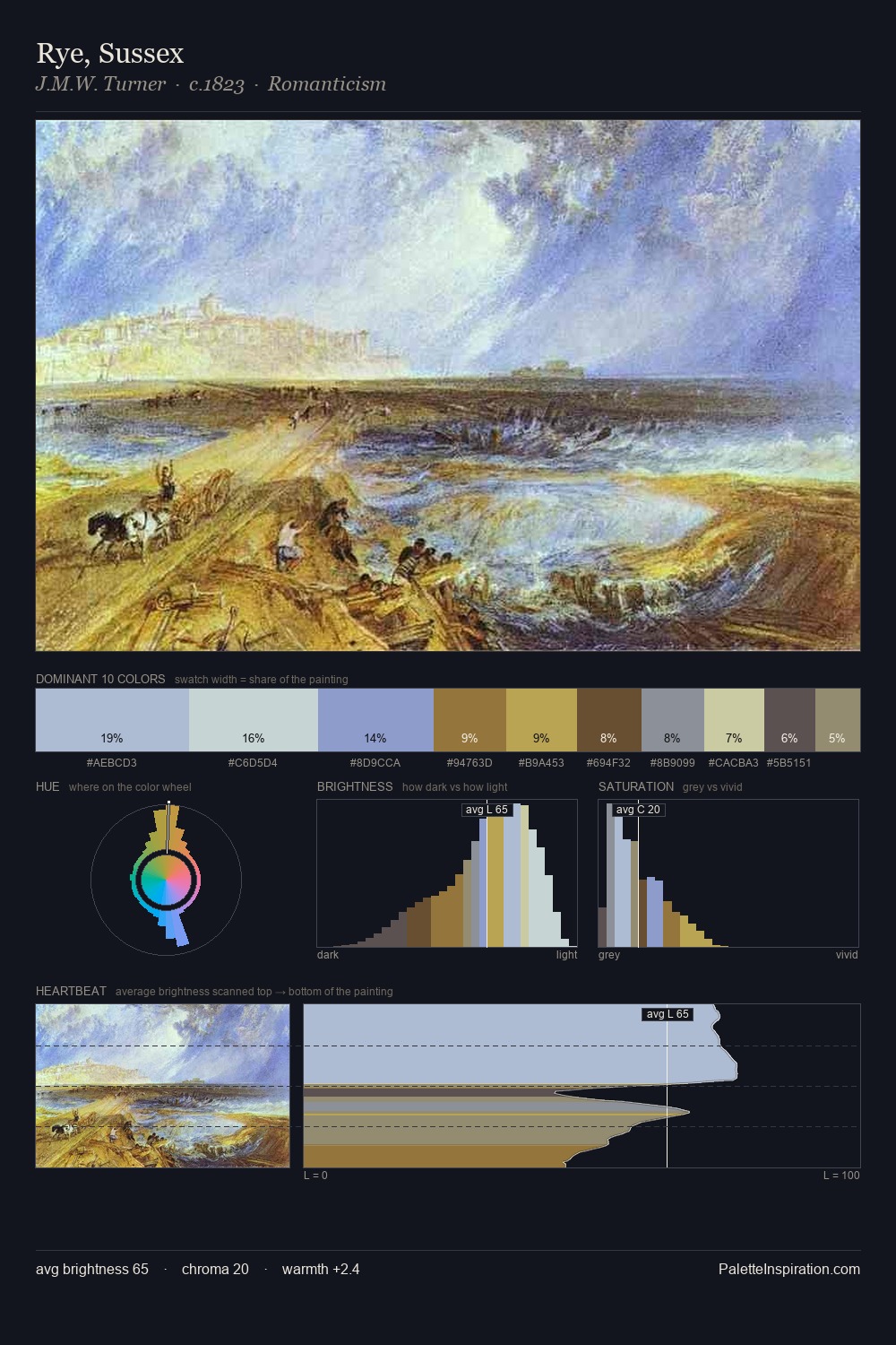
Konstantin Somov Palette 2
Soft Ecru
Soft Low-contrast, gentle chroma - mid-key values and low saturation, approachable and calm.
Ecru Unbleached linen - warm mid-neutral, slightly grayed, raw and natural.

Palette Analysis
Konstantin Somov is high-key - luminous, open, and weighted toward light. Warm and cool are kept in productive tension, creating the kind of chromatic harmony that sustains the eye. Saturation is deliberately withheld - the beauty here lies in the near-monochromatic gradations rather than colour difference. The highest-chroma note - #D9CCA6 - appears at just 6.0%, deployed as a precision accent against the quieter ground. Spanning 51 units on the value axis, the palette achieves the balance between tonal flatness and fragmentation. This is palette 2 of Konstantin Somov's sequence - a single chapter in a chromatic story told across many works.
Example use cases
- exhibition design
- foundation branding
- estate management
- art education
- museums & galleries
I Love This!
Use This Palette
Copy, export, or download for your project
Copy, export, or download for your project
Copy:
Download:
Share: