Konstantin Kryzhitsky Master Palette

Palette Analysis
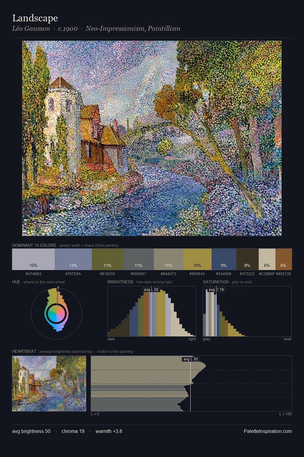
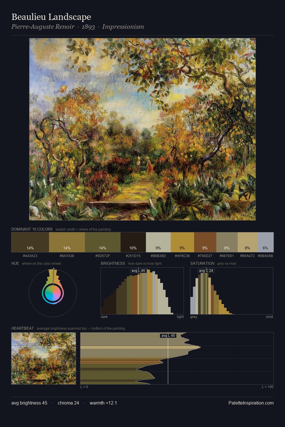
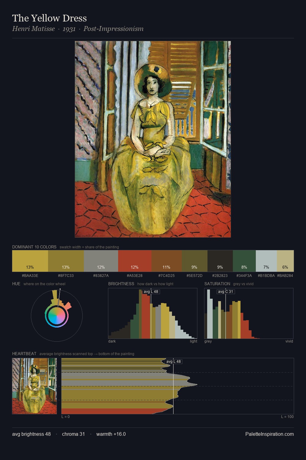
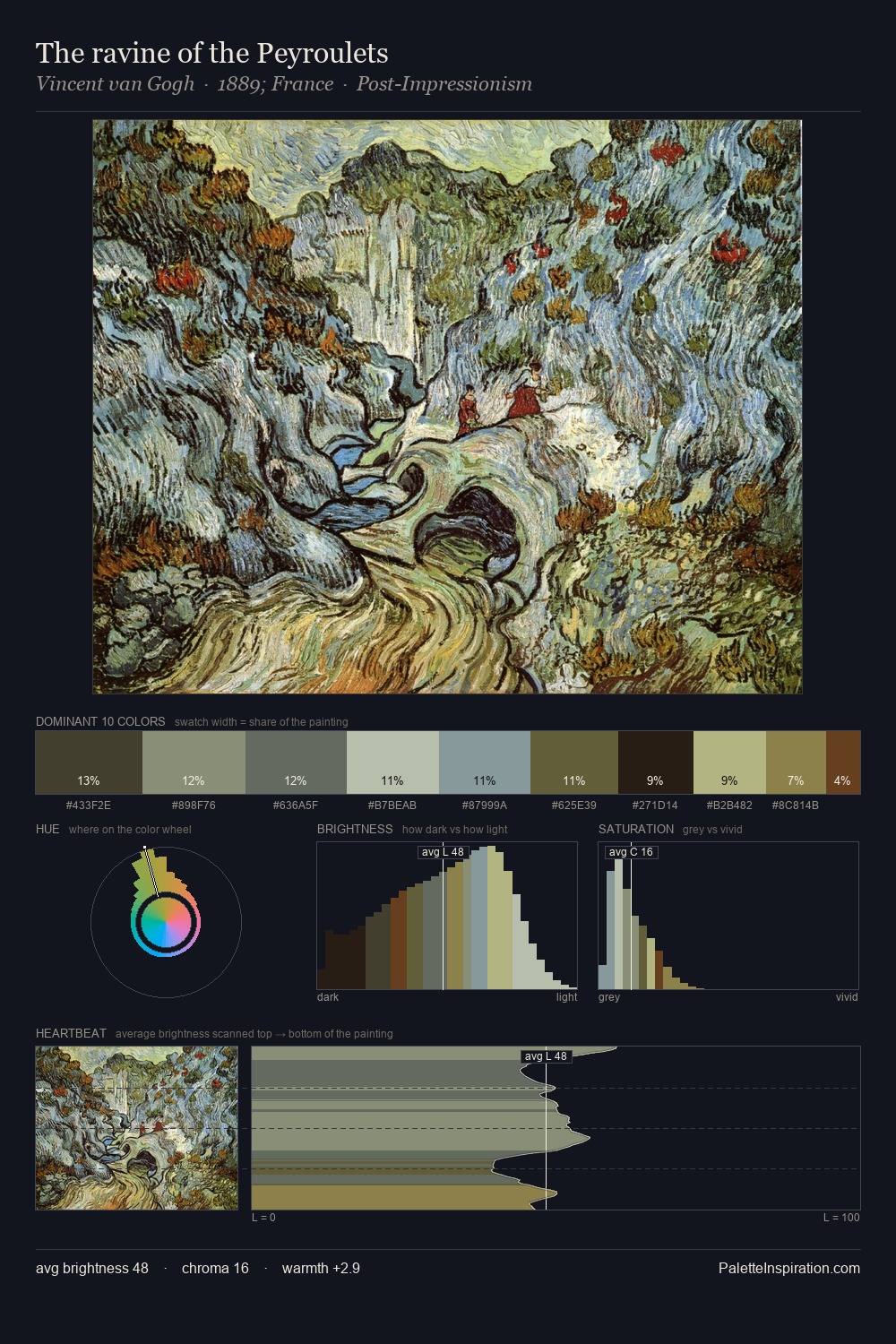
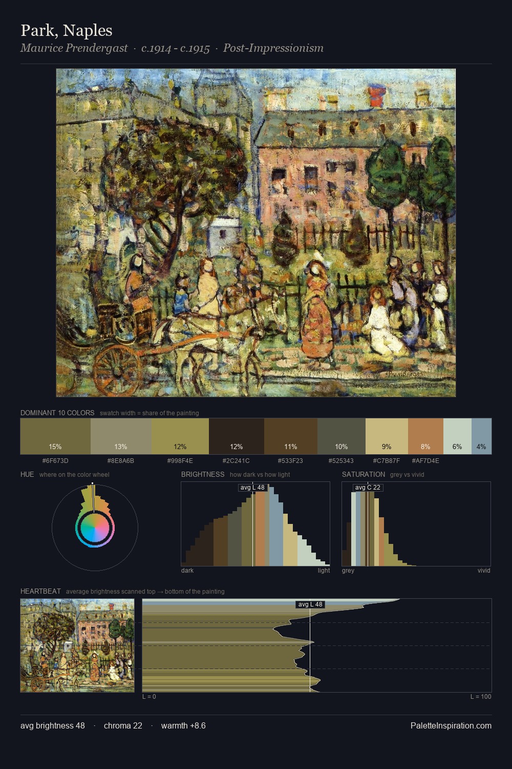
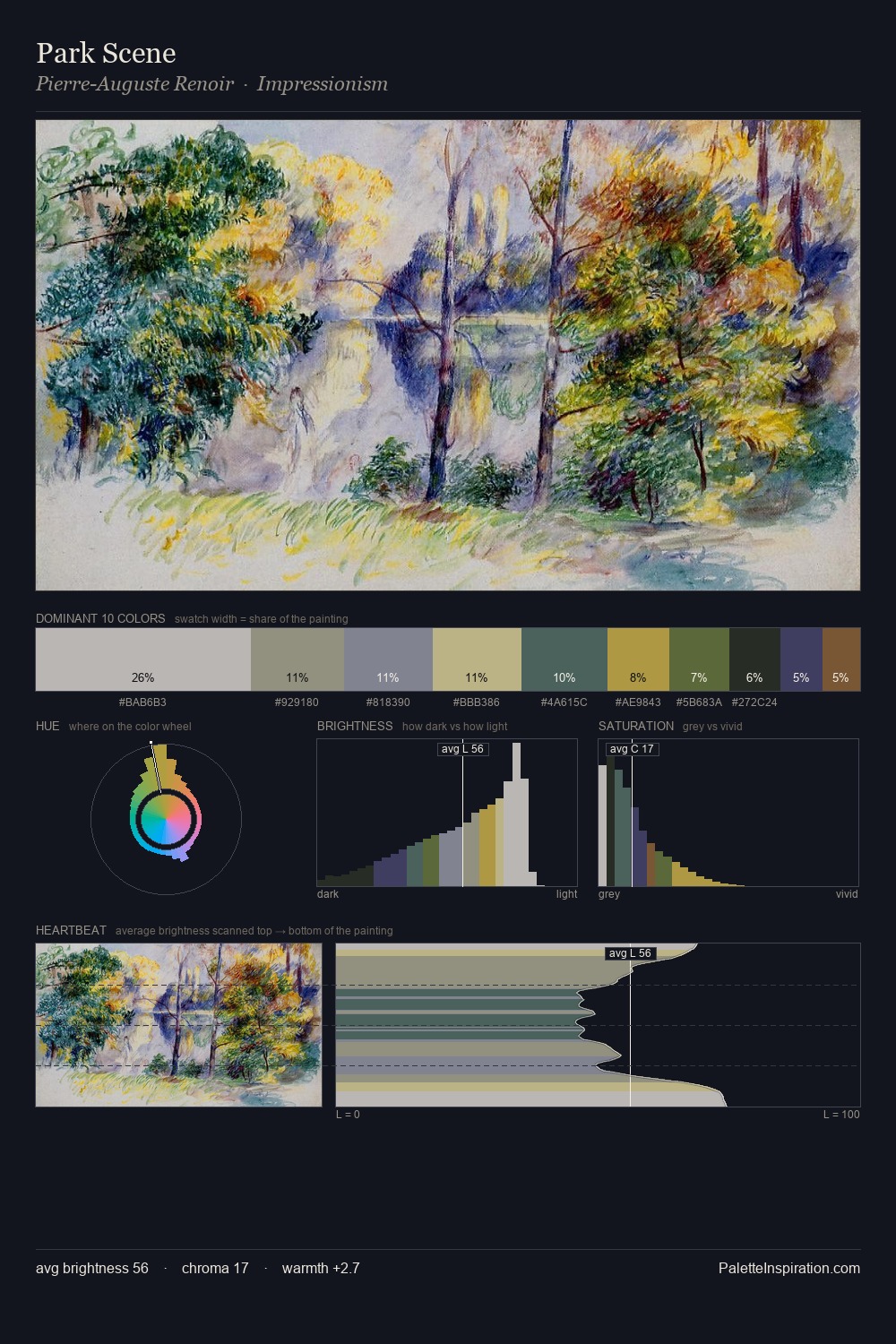
Konstantin Kryzhitsky occupies the comfortable middle of the value scale, avoiding both extremes to hold the eye in a sustained middle grey. Temperature is cool-dominant, with blue and green families claiming the largest areas. The absence of saturated colour is itself an expressive choice: this is a palette of restraint and atmosphere. Only 5.0% is devoted to #575421, yet that small allocation delivers the palette's entire chromatic tension. The palette spans 48 value units: a measured range that delivers coherence over drama. The palette has the character of outdoor light: cool, mid-bright, with colour rendered faithfully rather than expressively. The palette is recognisably Konstantin Kryzhitsky's own: particular in its temperature, chroma, and the economy of its brightest note.
Example use cases
- boutique hospitality
- film production
- menswear
- art prints & posters
- heritage brands
I Love This!
Copy, export, or download for your project