Konstantin Kryzhitsky Palette 3

Palette Analysis
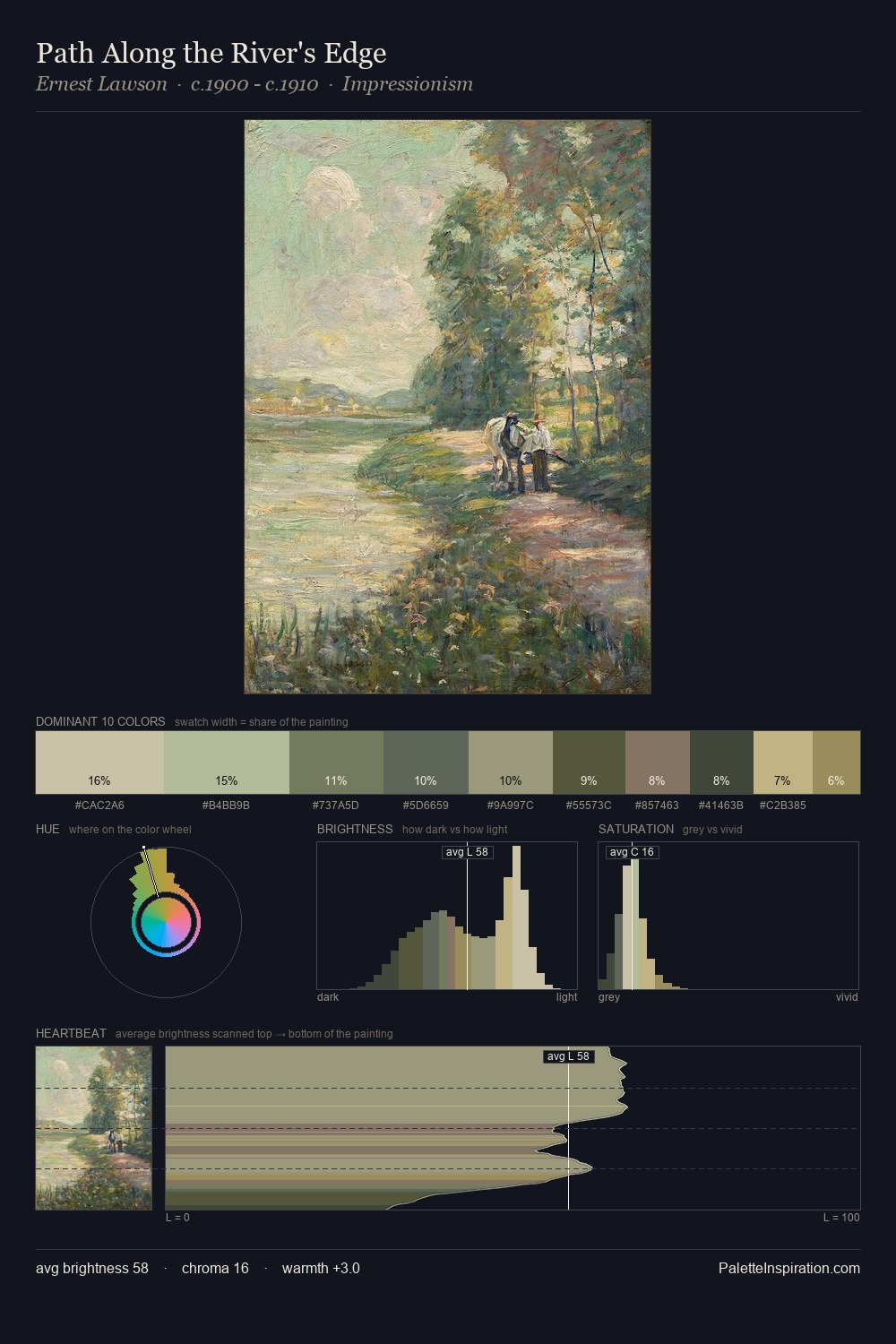
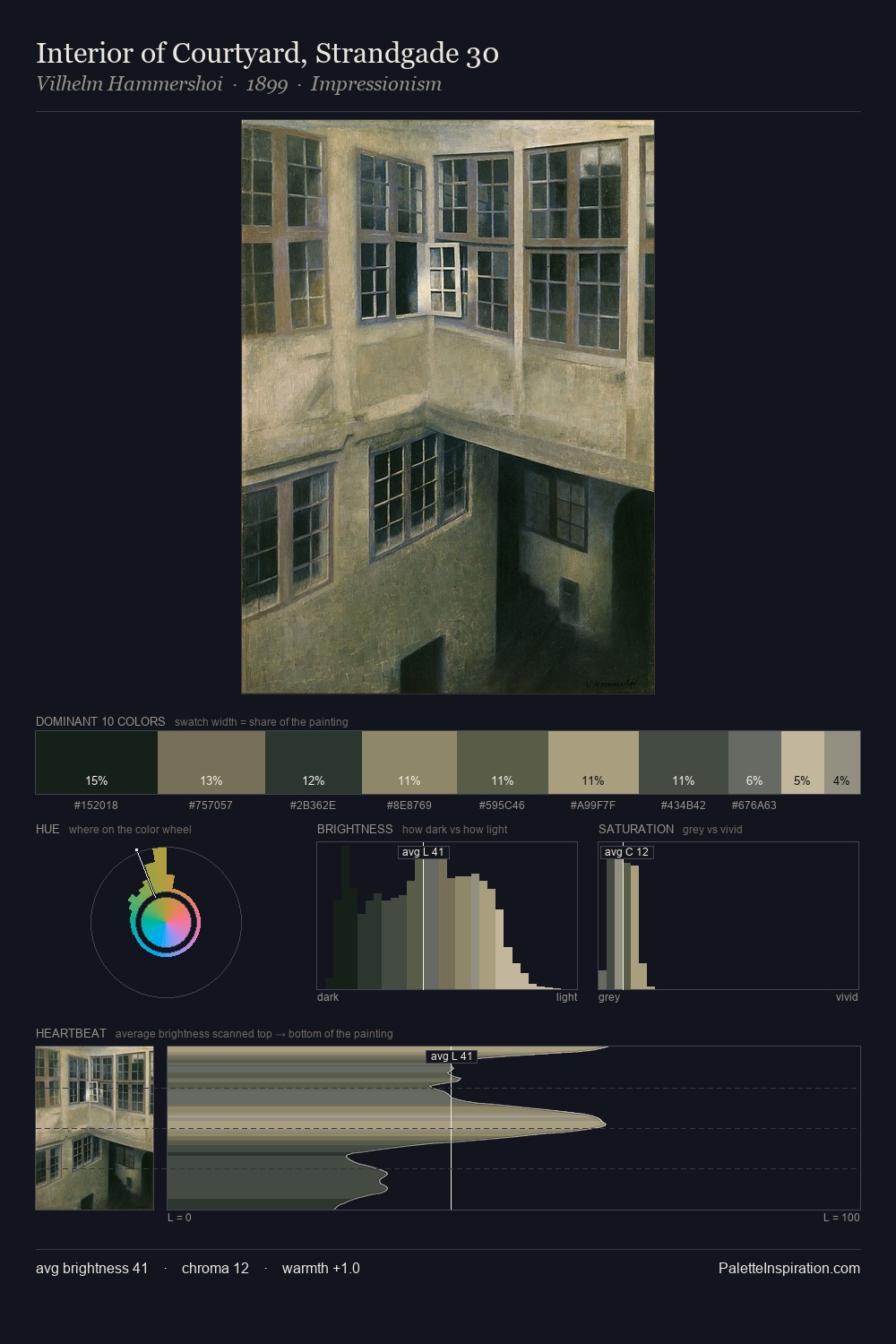
The value structure of Konstantin Kryzhitsky is mid-key: quiet, controlled, and cohesive. Blues and teal-greys govern the palette, lending it an aquatic or atmospheric quality. All colours lean toward grey, building depth through value rather than colour punch. The dominant colour, #ABA281, takes 26.2% of the total area, establishing the overall mood before any other hue is introduced. At 9.6%, #B7AB7F carries the palette's sharpest chromatic charge: an accent that earns its place precisely because it is withheld. Value range is moderate at 38 units - enough contrast for legibility, not so much as to fragment the tonal unity. The mid-to-high key, cool bias, and moderate chroma point to outdoor observation - sky and diffused daylight as the dominant light source. This is palette 3 of Konstantin Kryzhitsky's sequence - a single chapter in a chromatic story told across many works.
Example use cases
- exhibition design
- foundation branding
- estate management
- art education
- museums & galleries
I Love This!
Copy, export, or download for your project