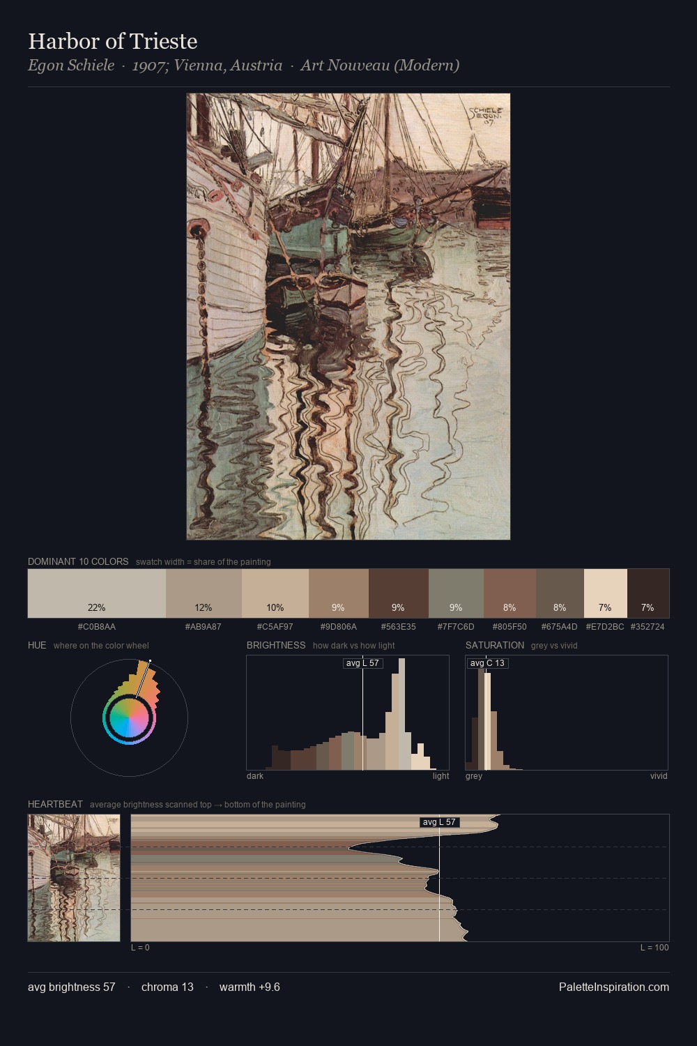
Konstantin Bogaevsky Palette 6

Palette Analysis
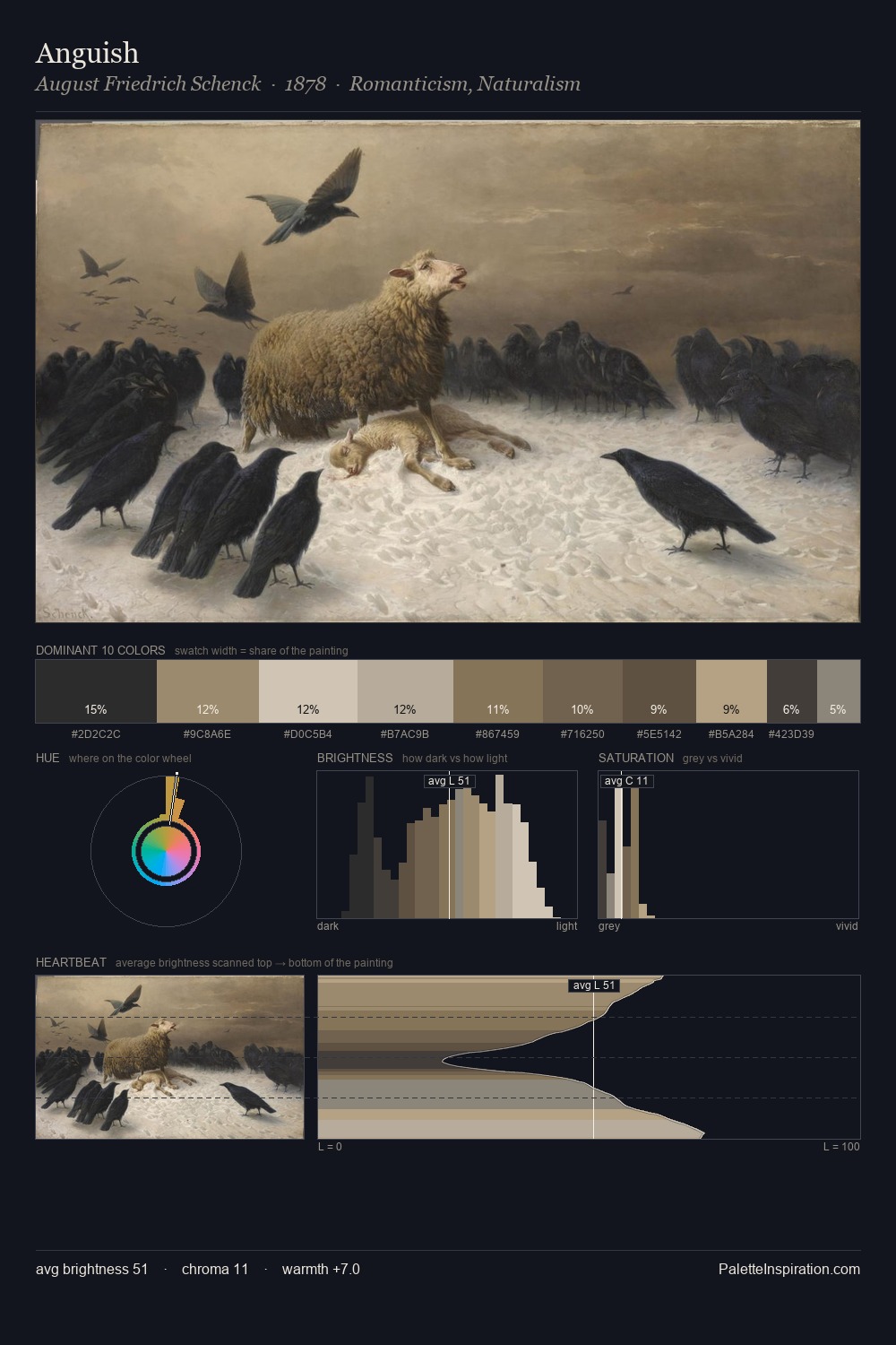
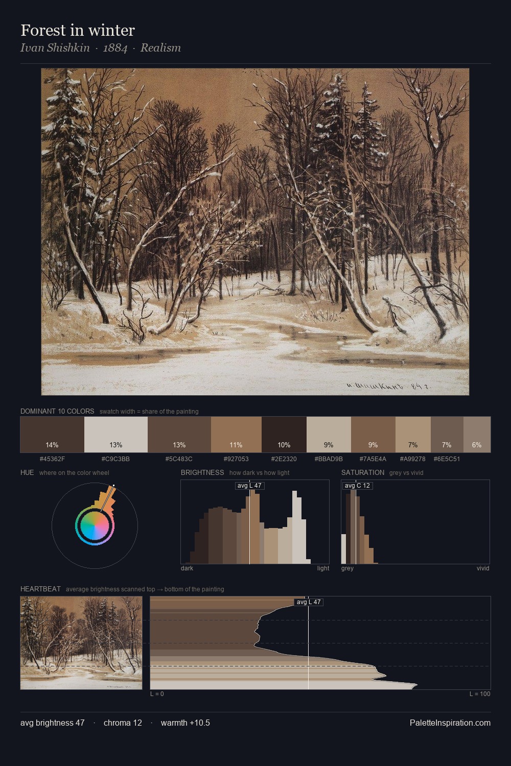
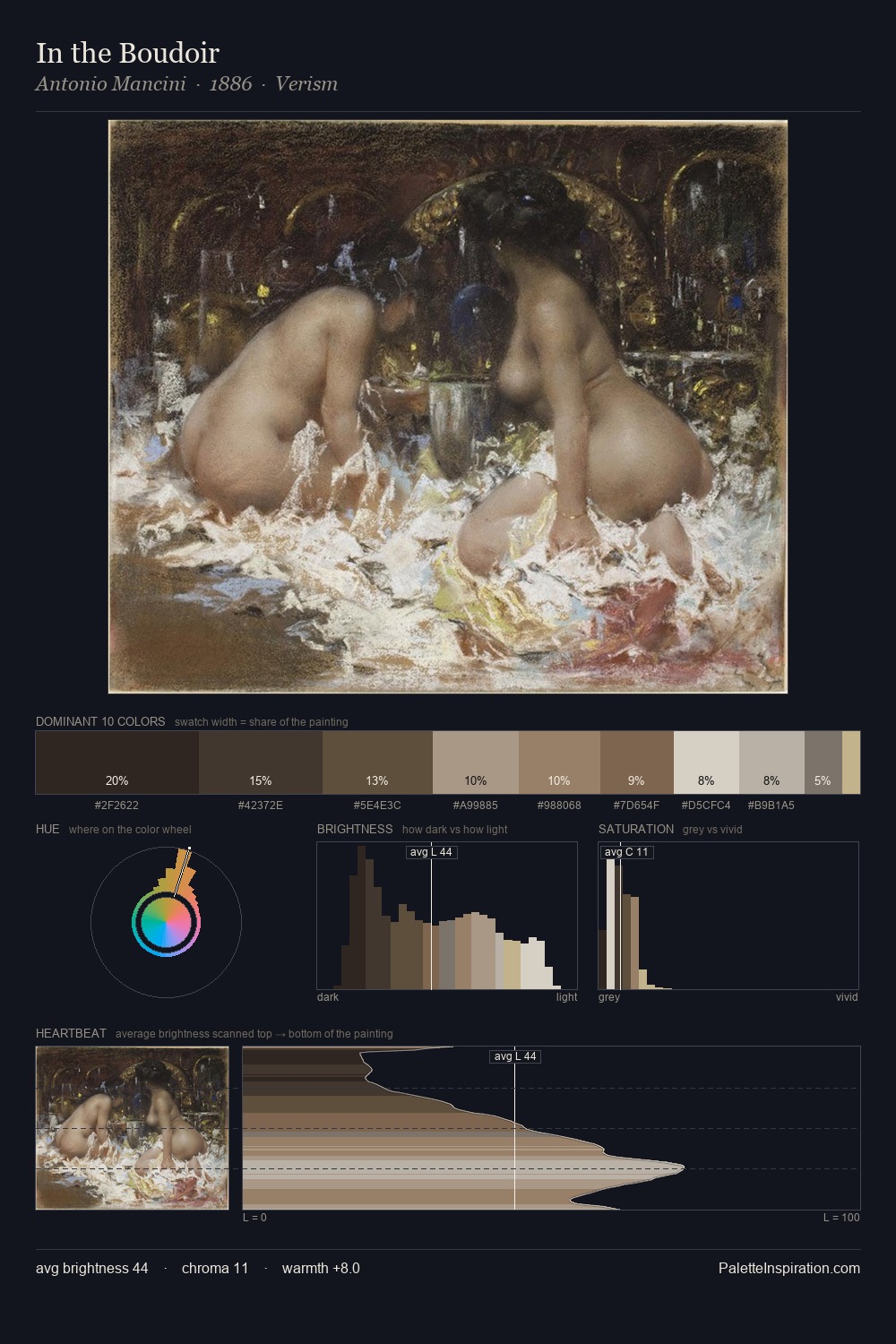
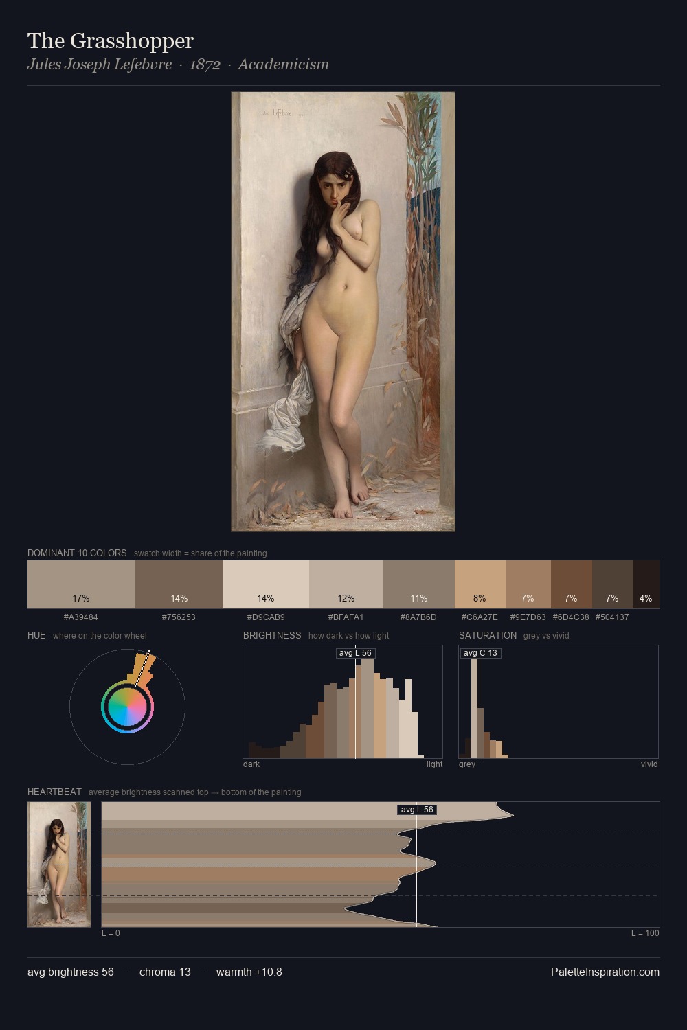
Konstantin Bogaevsky keeps values measured and balanced, a hallmark of tonal restraint. Temperature reads distinctly warm: the reds and earth tones from Konstantin Bogaevsky carry the compositional weight. All colours lean toward grey, building depth through value rather than colour punch. #D9D0BA at 26.5% of the palette: an overwhelming presence that pulls all other colours into its gravitational field. The most saturated colour, #7E634C, is reserved to 6.2% of the surface, where it acts as a focal punctuation. From deepest dark to palest light, the palette traverses 58 units of the value scale - a span that creates natural depth. Palette 6 sits within the larger chromatic argument that Konstantin Bogaevsky's complete body of work advances.
Example use cases
- archival print
- university identity
- rare books
- cultural institutions
- nonprofit identity
I Love This!
Copy, export, or download for your project