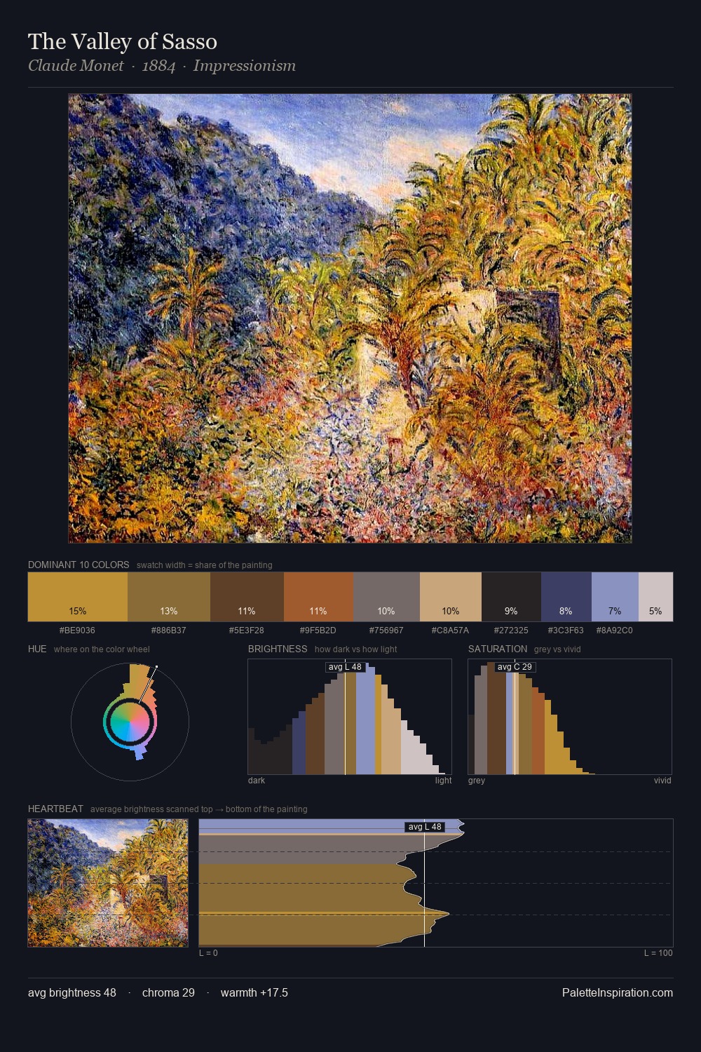
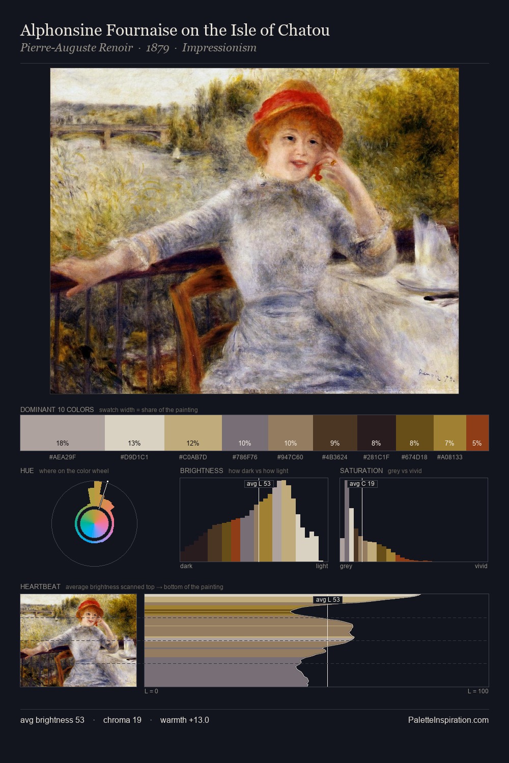
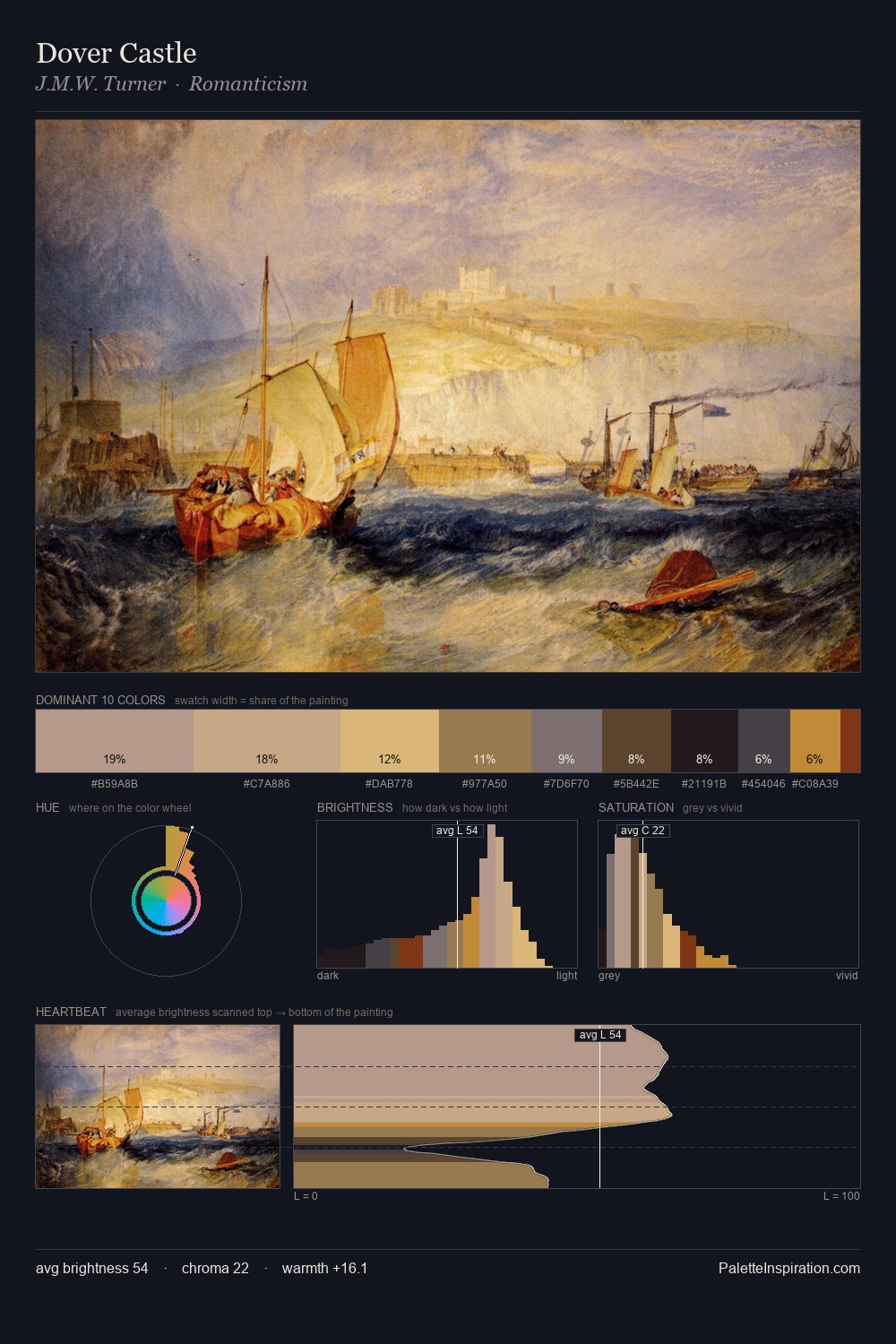
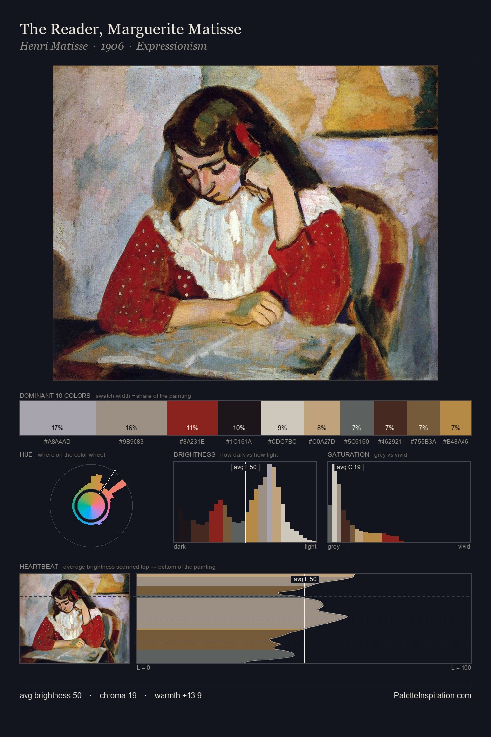
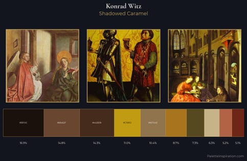
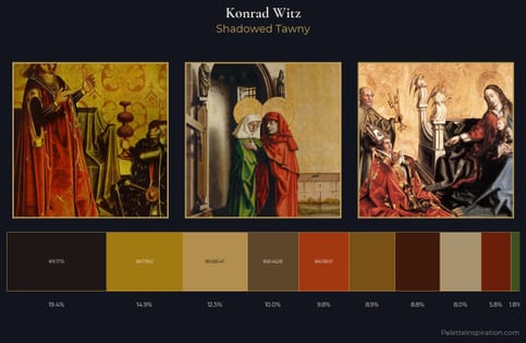
Konrad Witz Master Palette
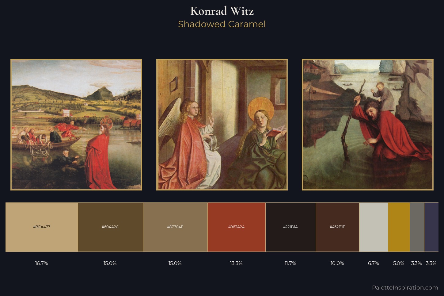
Shadowed Caramel
Shadowed Low-key - values weighted toward shadow, the palette of dim interiors and overcast skies.
Caramel Warm mid-brown - the color of cooked sugar, smooth and amber-toned.
Palette Analysis
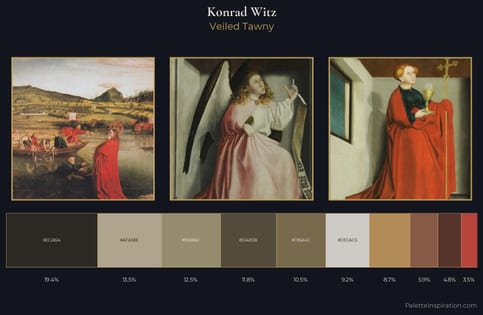
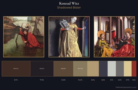
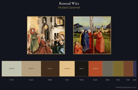
Mid-key values give Konrad Witz its characteristic quietness - nothing blazes, nothing disappears. Temperature is balanced: the palette pits warm earth against cool sky without declaring a winner. All colours lean toward grey, building depth through value rather than colour punch. Only 5.0% is devoted to #B08517, yet that small allocation delivers the palette's entire chromatic tension. From deepest dark to palest light, the palette traverses 58 units of the value scale - a span that creates natural depth. This is the light Konrad Witz preferred, made measurable.
Example use cases
- music labels
- luxury hospitality
- editorial photography
- leather goods
- premium streaming
I Love This!
Use This Palette
Copy, export, or download for your project
Copy, export, or download for your project
Copy:
Download:
Share: