Knud Baade Palette 7

Palette Analysis
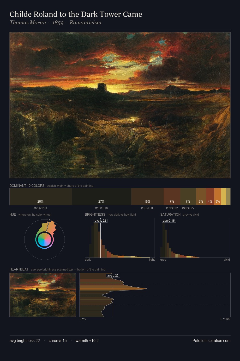
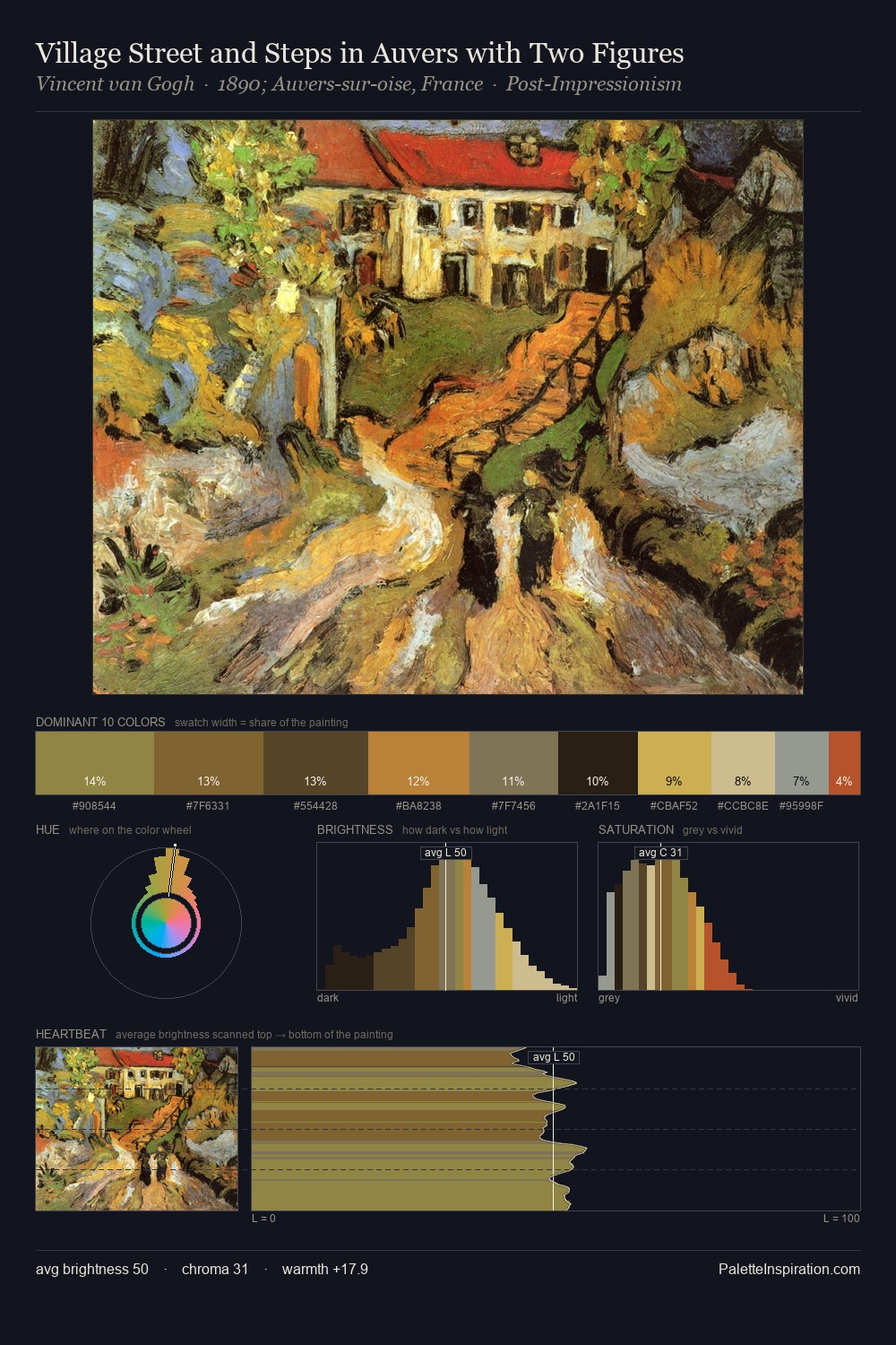
Darkness anchors Knud Baade; light is rationed, creating dramatic contrast rather than open air. Warm and cool are kept in productive tension, creating the kind of chromatic harmony that sustains the eye. Muted throughout, the palette achieves its effects through value and temperature rather than chromatic force. At 4.5%, #54331E carries the palette's sharpest chromatic charge: an accent that earns its place precisely because it is withheld. 59 units of value range underpin the palette's structural clarity: the eye always knows where light falls. This tonal restraint is characteristic of the Knud Baade approach: colour serves light, not the reverse. Palette 7 sits within the larger chromatic argument that Knud Baade's complete body of work advances.
Example use cases
- theater design
- jewelry brands
- tobacco-adjacent retail
- event branding
- film & entertainment
I Love This!
Copy, export, or download for your project