Knud Baade Palette 2

Palette Analysis
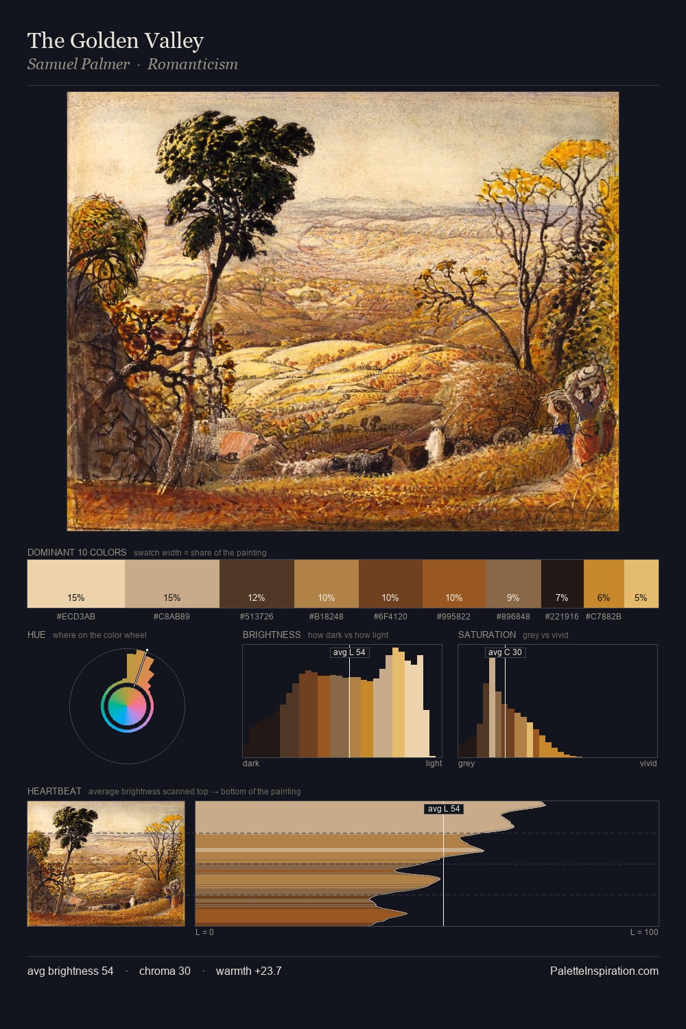
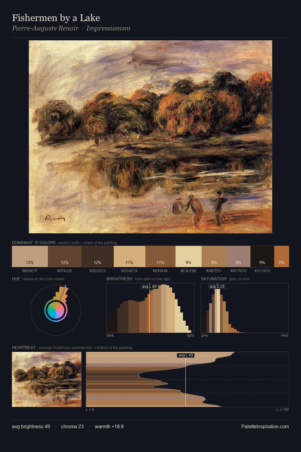
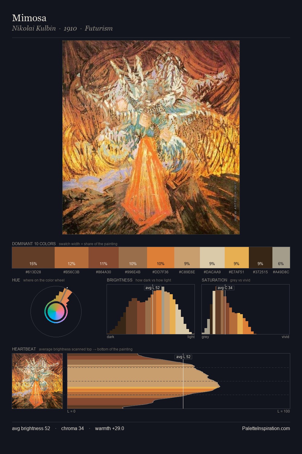
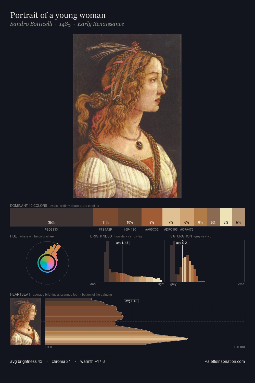
Knud Baade occupies the comfortable middle of the value scale, avoiding both extremes to hold the eye in a sustained middle grey. The dominant temperature is warm, with earth tones and fire-hues setting the emotional key. Chroma is held at a comfortable level - distinct colours, but no single hue is allowed to overwhelm. #553A23 at 25.2% of the palette: an overwhelming presence that pulls all other colours into its gravitational field. Only 3.3% is devoted to #FBE7B6, yet that small allocation delivers the palette's entire chromatic tension. From deepest dark to palest light, the palette traverses 63 units of the value scale - a span that creates natural depth. Knud Baade's palette 2 carries its own internal logic while remaining in conversation with the artist's broader colour intelligence.
Example use cases
- music labels
- luxury hospitality
- editorial photography
- leather goods
- premium streaming
I Love This!
Copy, export, or download for your project