Kiyokata Kaburagi Palette 2

Palette Analysis
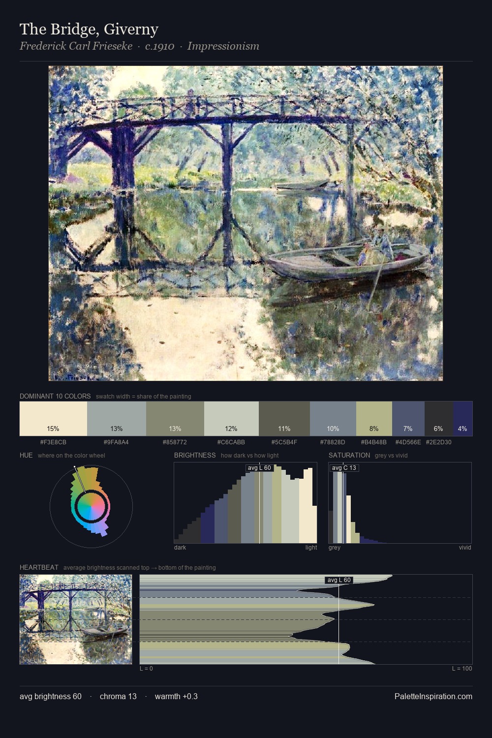
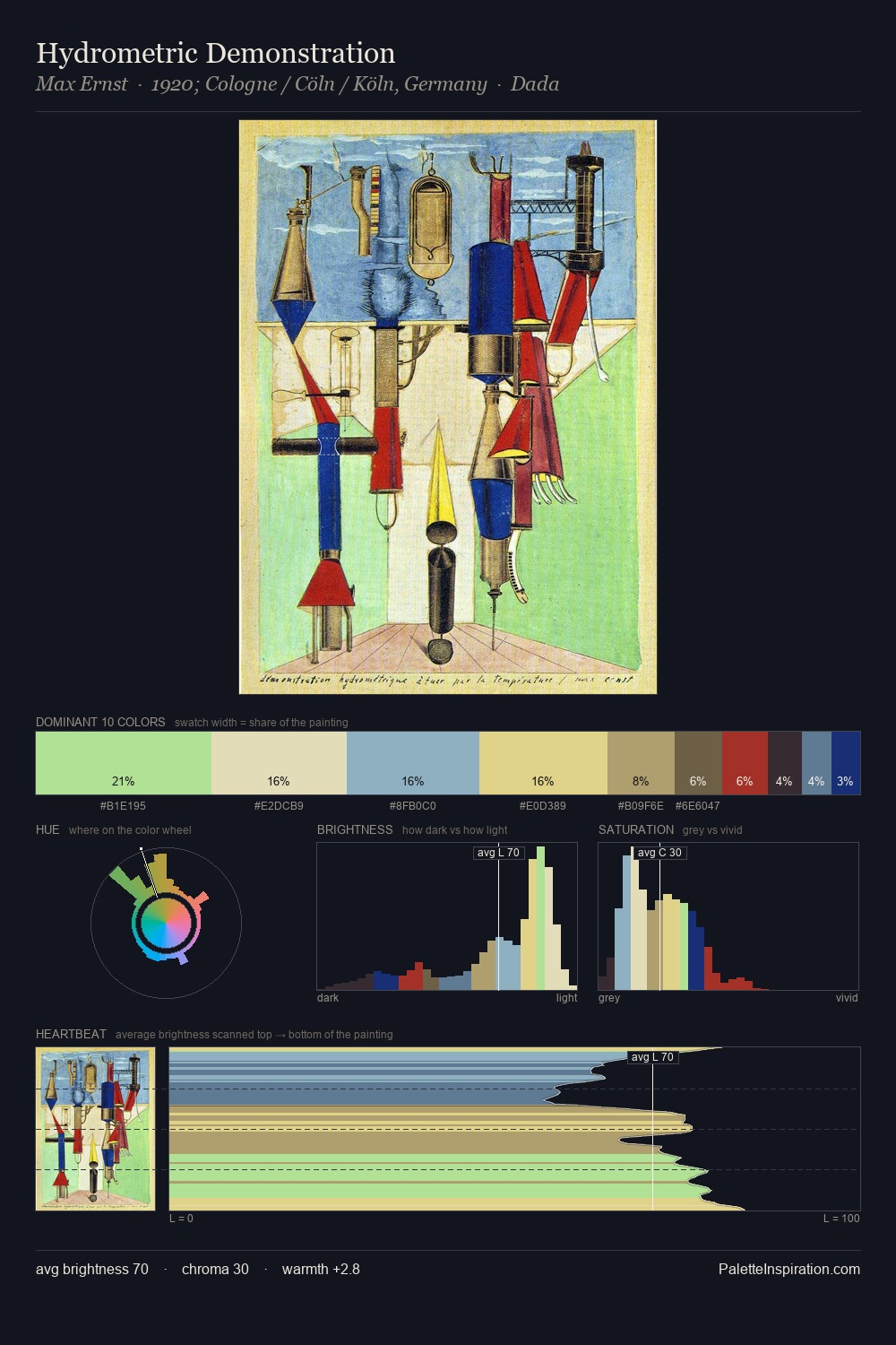
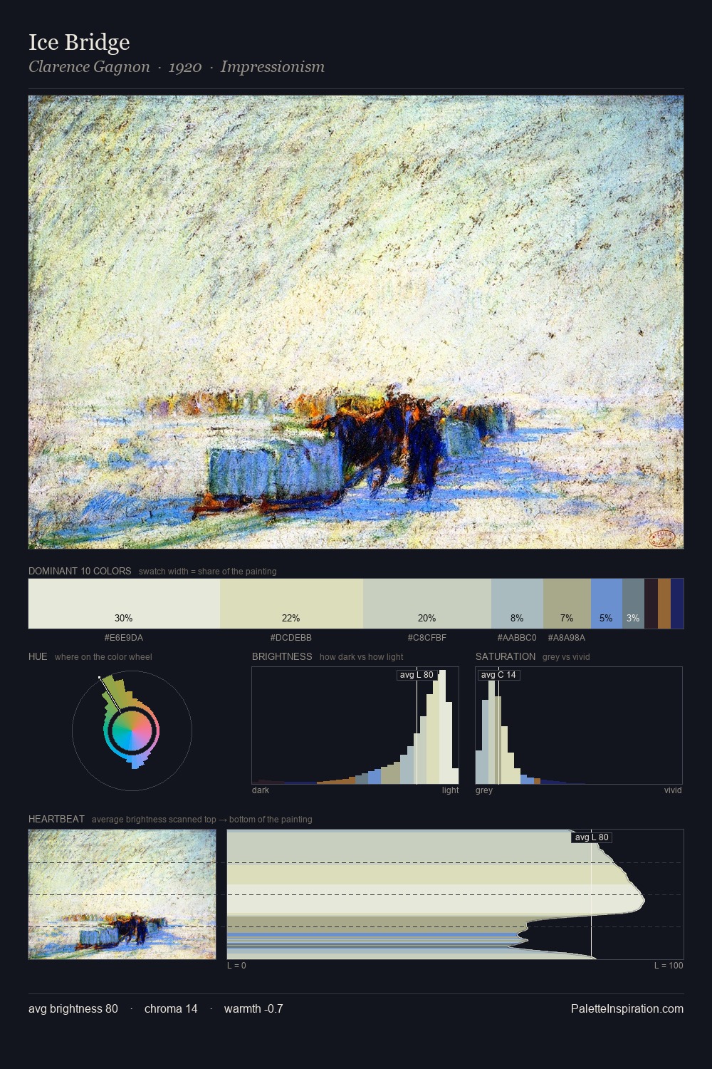
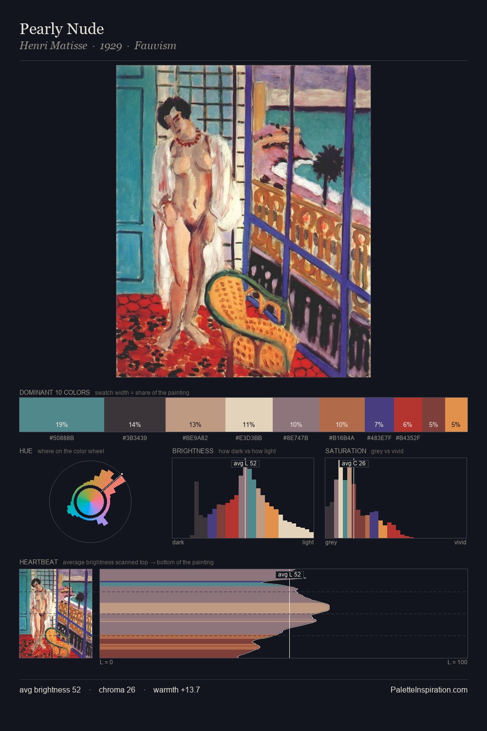
Kiyokata Kaburagi is strongly light-biased - shadow is suggested rather than declared. Cool hues prevail: blues, greens, and greys anchor the palette's emotional temperature. The absence of saturated colour is itself an expressive choice: this is a palette of restraint and atmosphere. Kiyokata Kaburagi gives 33.6% of the composition to a single #F2E9CC - a decisive chromatic anchor. The saturated accent, #81C9C0, registers at 10.8% - sparse enough to feel like a deliberate surprise. A value spread of 63 units gives the palette both depth and air - shadows are genuinely dark, lights genuinely light. The palette has the character of outdoor light: cool, mid-bright, with colour rendered faithfully rather than expressively. In the context of Kiyokata Kaburagi's full range of palettes, group 2 represents one movement in an ongoing chromatic dialogue.
Example use cases
- publishing
- corporate identity
- consumer apps
- hospitality
- design agencies
I Love This!
Copy, export, or download for your project