Kitagawa Utamaro Palette 6
Gleaming Champagne
Gleaming Bright and polished - high-key, often warm, suggesting reflective or luminous surfaces.
Champagne Pale gold - the color of sparkling wine, high-key and lightly warm.

Palette Analysis
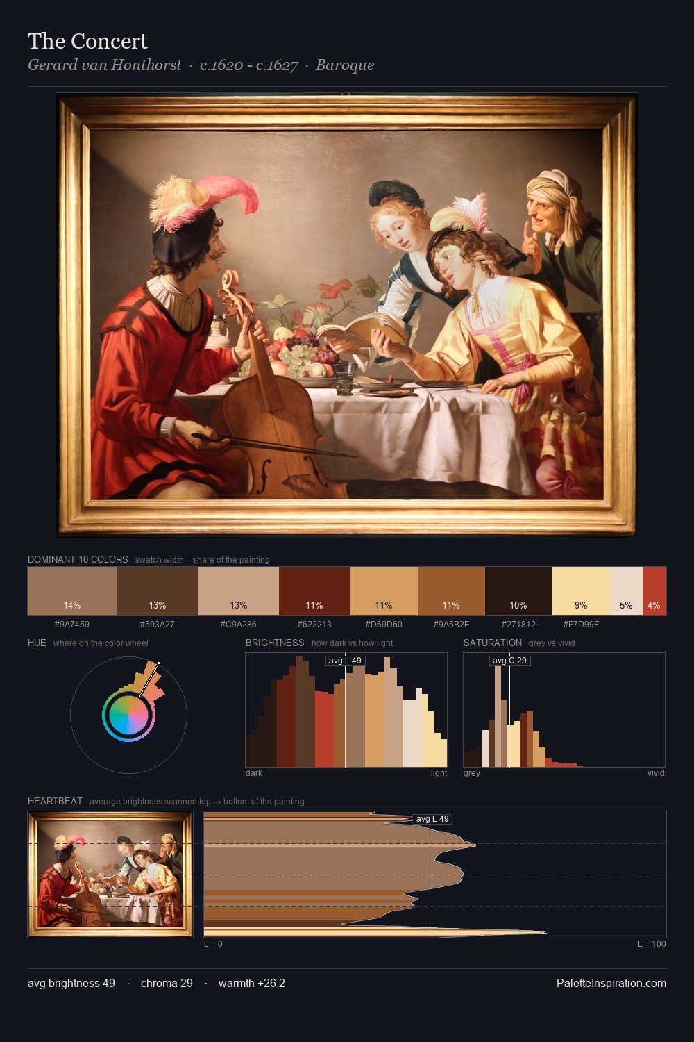
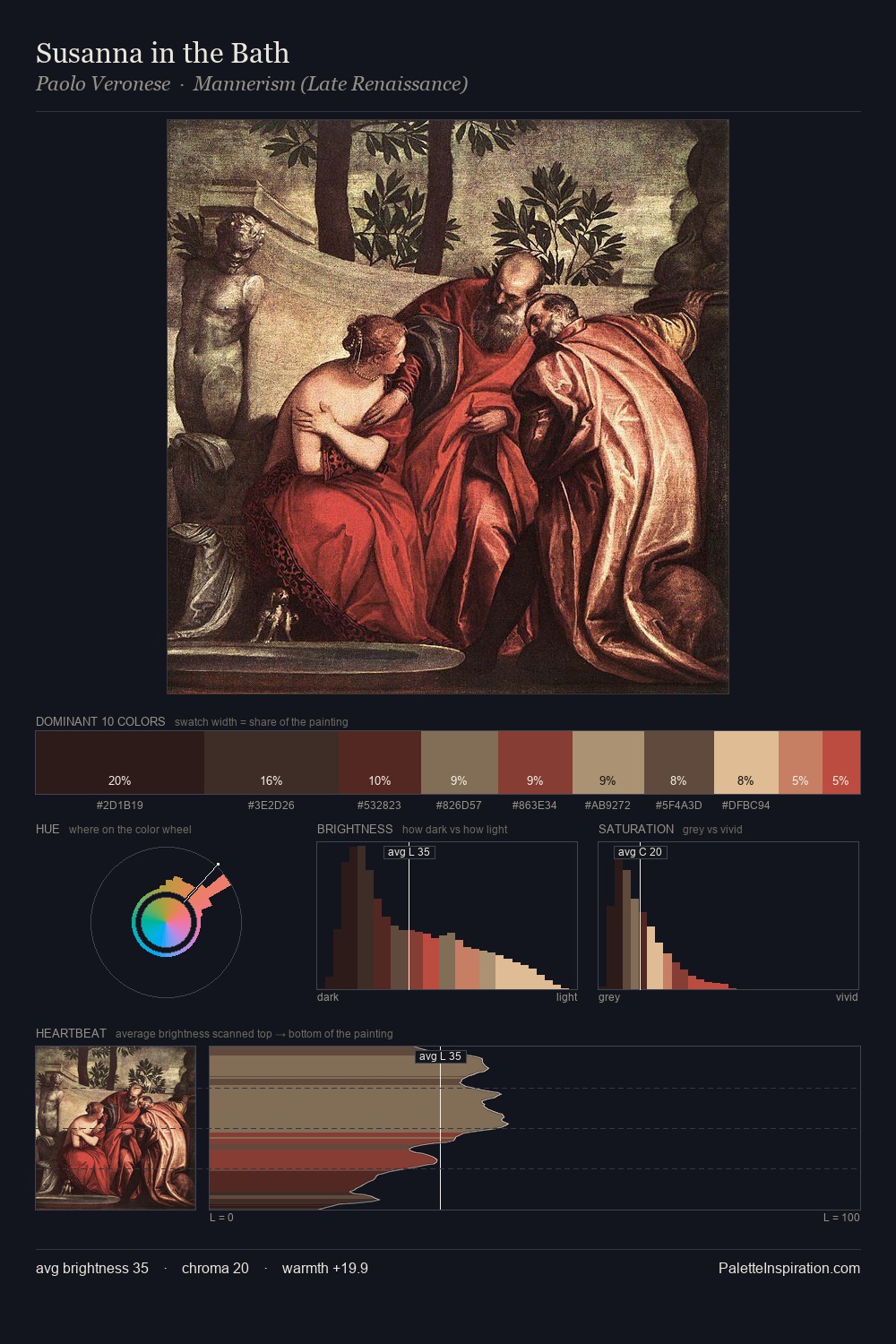
Kitagawa Utamaro is strongly light-biased - shadow is suggested rather than declared. Kitagawa Utamaro orchestrates warmth above all else - reds, ambers, and siennas take the lead. Mid-saturation across the board: the palette has colour character without chromatic excess. The saturated accent, #D7604C, registers at 2.7% - sparse enough to feel like a deliberate surprise. A value spread of 64 units gives the palette both depth and air - shadows are genuinely dark, lights genuinely light. Kitagawa Utamaro's palette 6 carries its own internal logic while remaining in conversation with the artist's broader colour intelligence.
Example use cases
- publishing
- corporate identity
- consumer apps
- hospitality
- design agencies
I Love This!
Use This Palette
Copy, export, or download for your project
Copy, export, or download for your project
Copy:
Download:
Share: