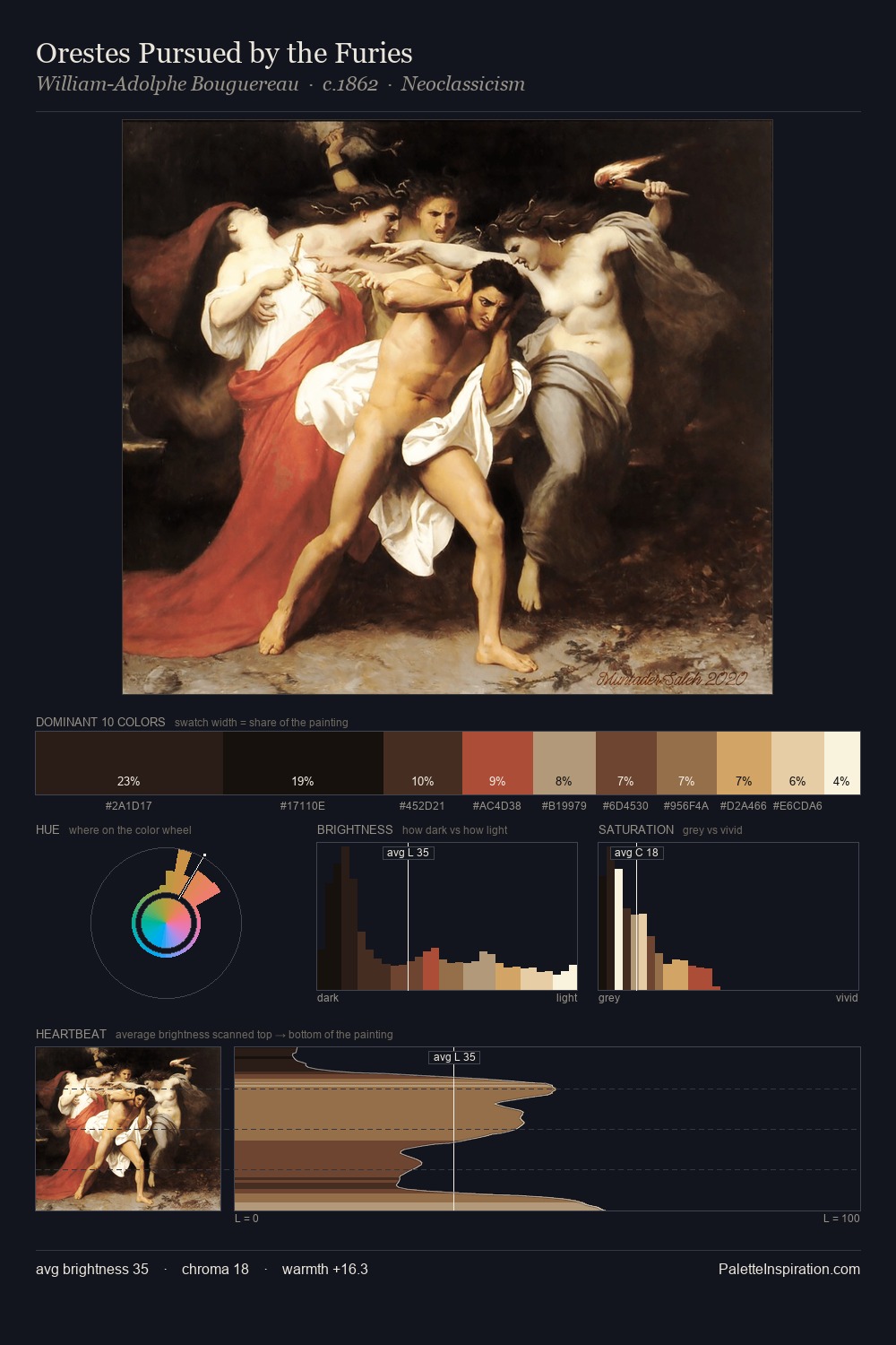
Kitagawa Utamaro Palette 1

Palette Analysis
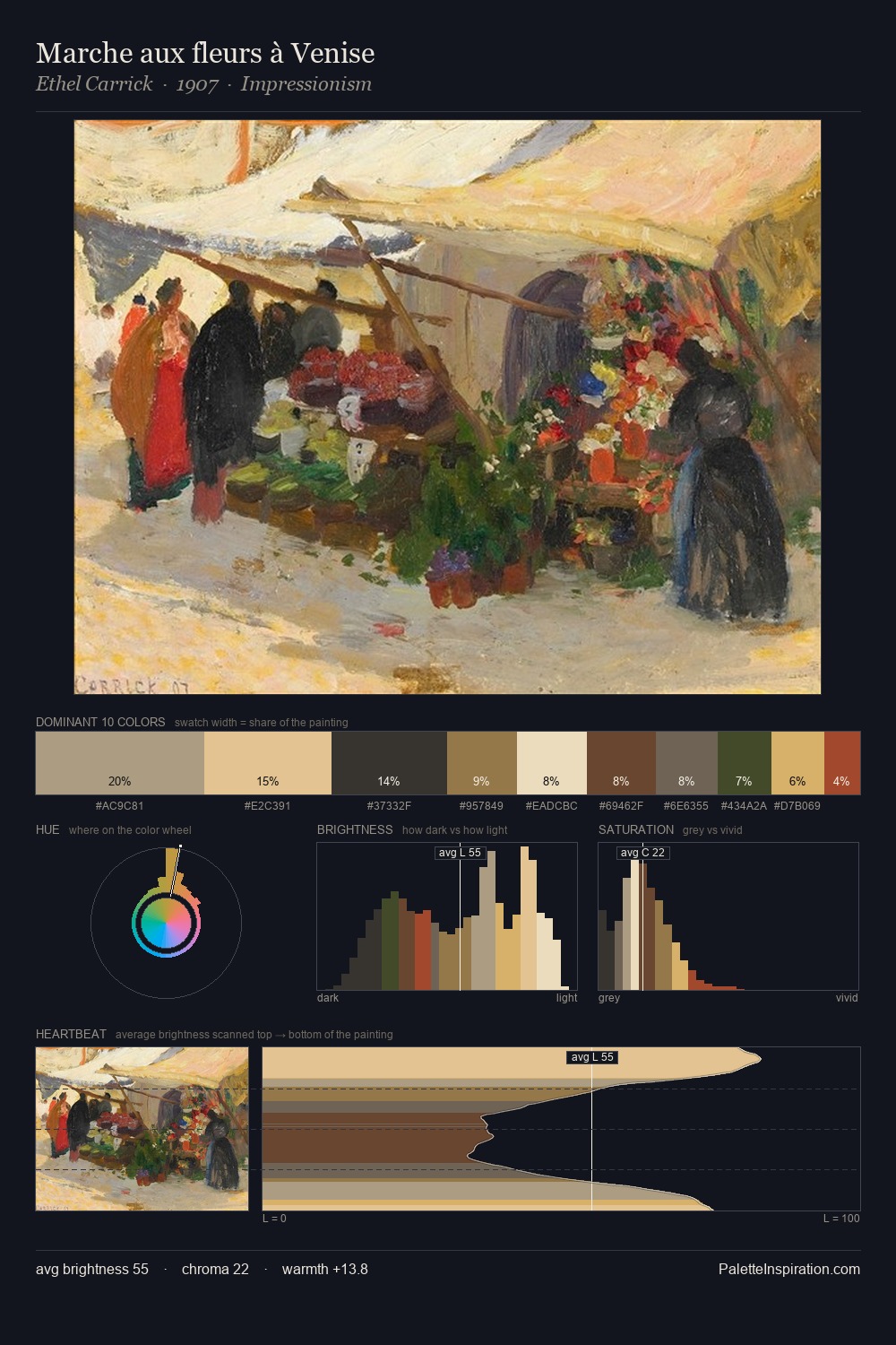
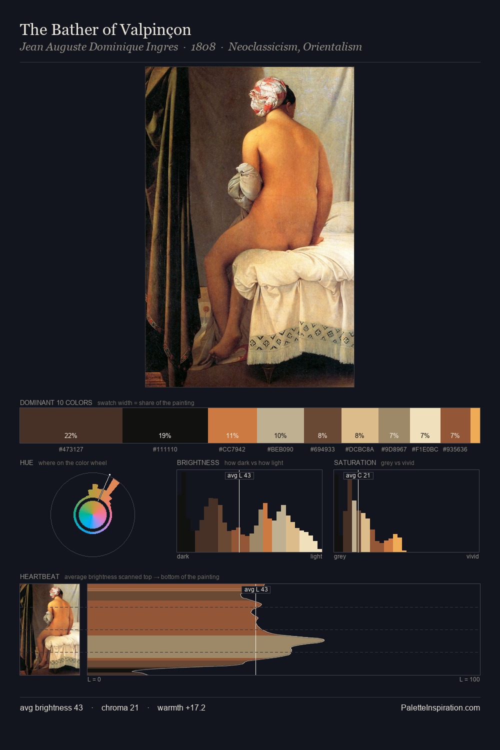
The high-key values of Kitagawa Utamaro give it an effulgent, almost bleached quality. Temperature is balanced: the palette pits warm earth against cool sky without declaring a winner. Chroma is held at a comfortable level - distinct colours, but no single hue is allowed to overwhelm. The highest-chroma note - #E8C380 - appears at just 9.0%, deployed as a precision accent against the quieter ground. From deepest dark to palest light, the palette traverses 72 units of the value scale - a span that creates natural depth. Together these qualities point to the open-air Impressionist method: recording light rather than local colour. In the context of Kitagawa Utamaro's full range of palettes, group 1 represents one movement in an ongoing chromatic dialogue.
Example use cases
- design agencies
- product brands
- e-commerce
- editorial sites
- publishing
I Love This!
Copy, export, or download for your project