Kathe Kollwitz Palette 5

Palette Analysis
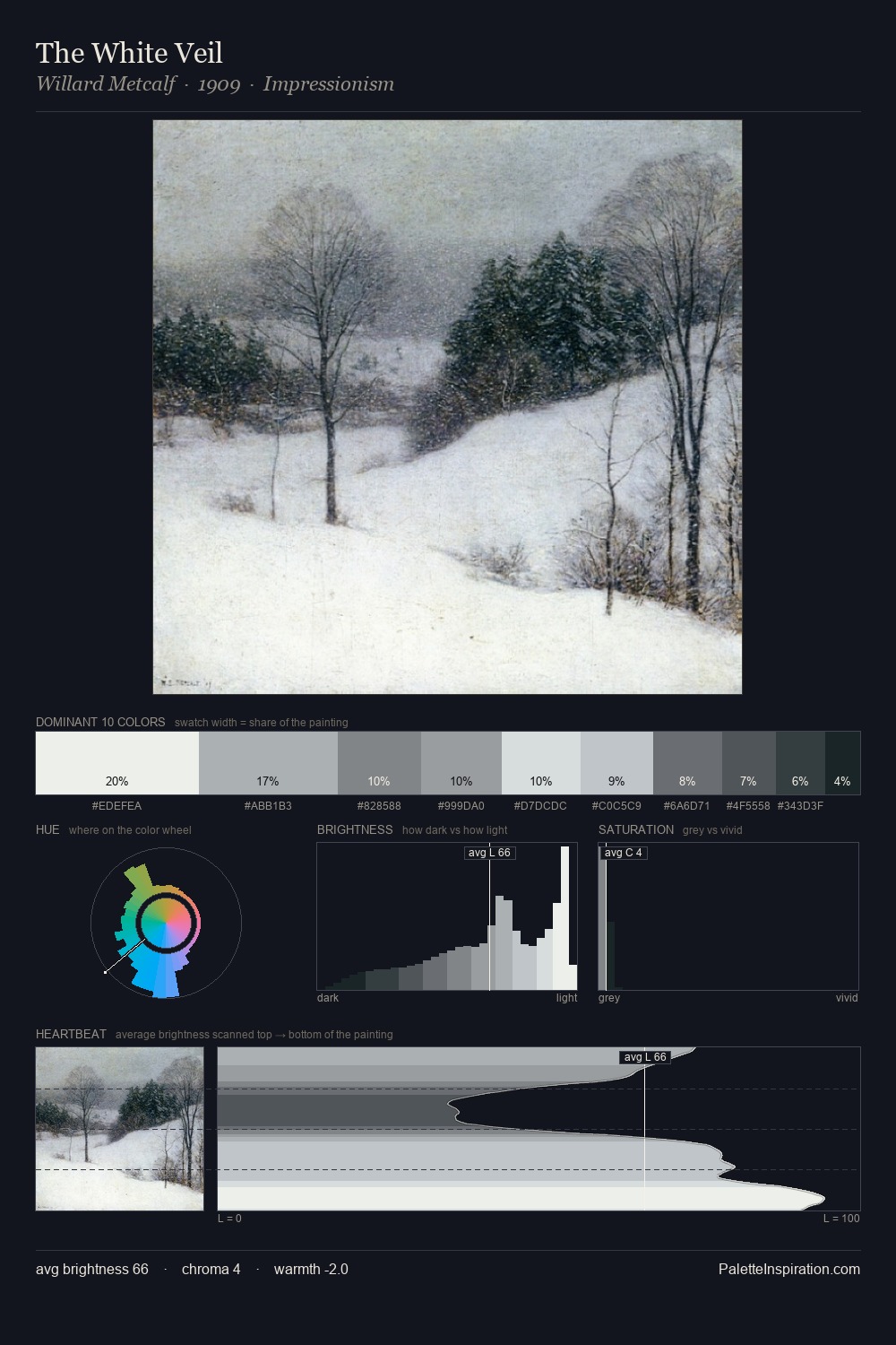
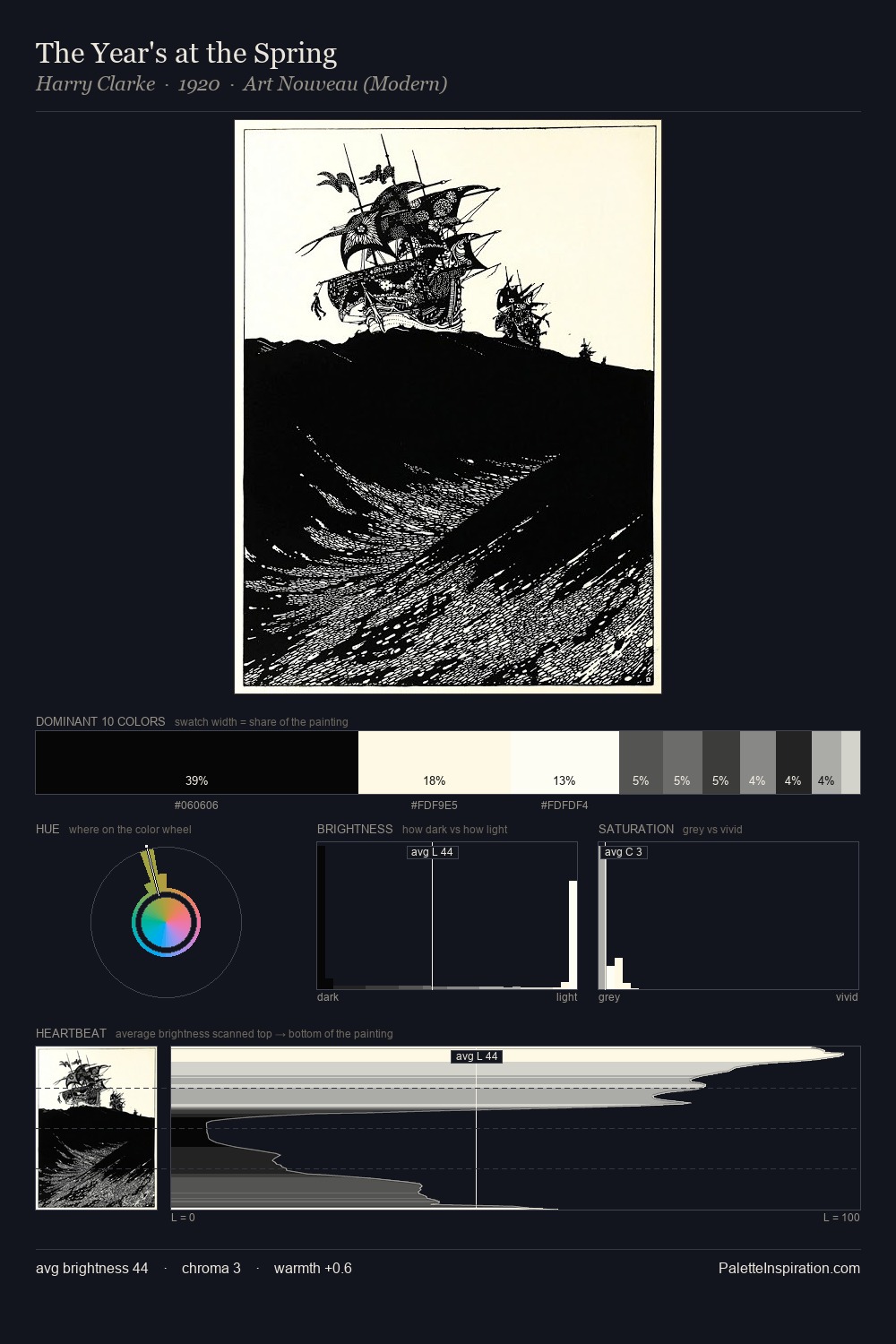
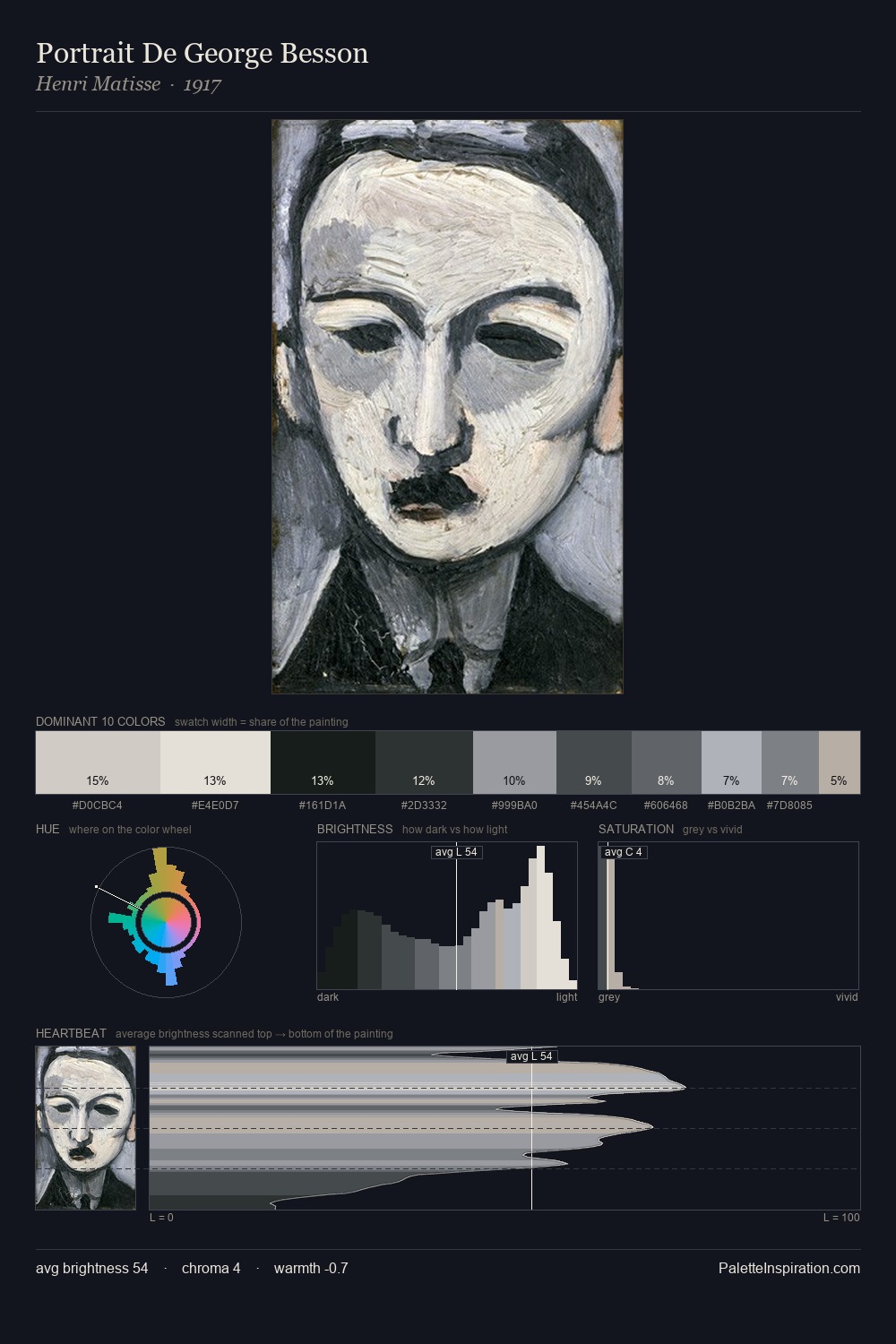
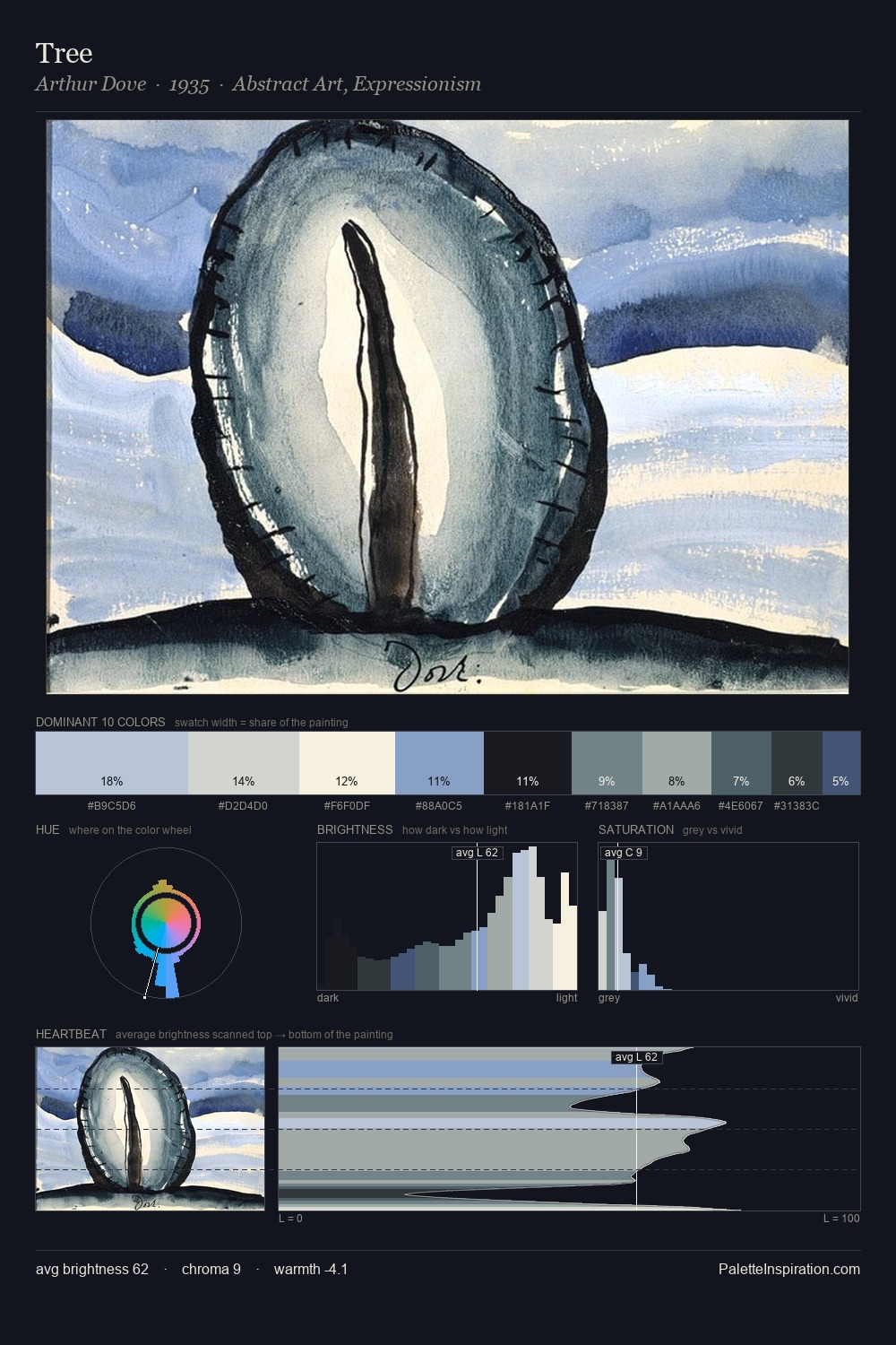
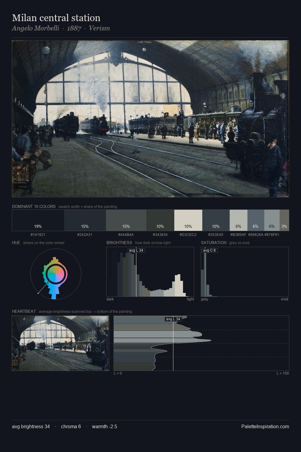
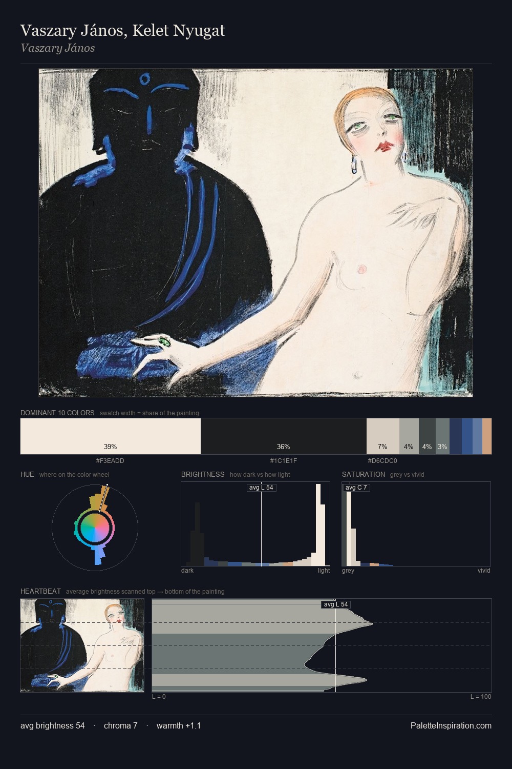
Mid-key values give Kathe Kollwitz its characteristic quietness - nothing blazes, nothing disappears. Kathe Kollwitz tilts toward cool - blues and silver-greys carry the structural weight. Muted throughout, the palette achieves its effects through value and temperature rather than chromatic force. #122023 at 27.0% of the palette: an overwhelming presence that pulls all other colours into its gravitational field. Only 12.9% is devoted to #121E27, yet that small allocation delivers the palette's entire chromatic tension. 73 units of value range underpin the palette's structural clarity: the eye always knows where light falls. The palette has the character of outdoor light: cool, mid-bright, with colour rendered faithfully rather than expressively. Palette 5 sits within the larger chromatic argument that Kathe Kollwitz's complete body of work advances.
Example use cases
- legal services
- corporate identity
- industrial design
- professional services
- fintech
I Love This!
Copy, export, or download for your project