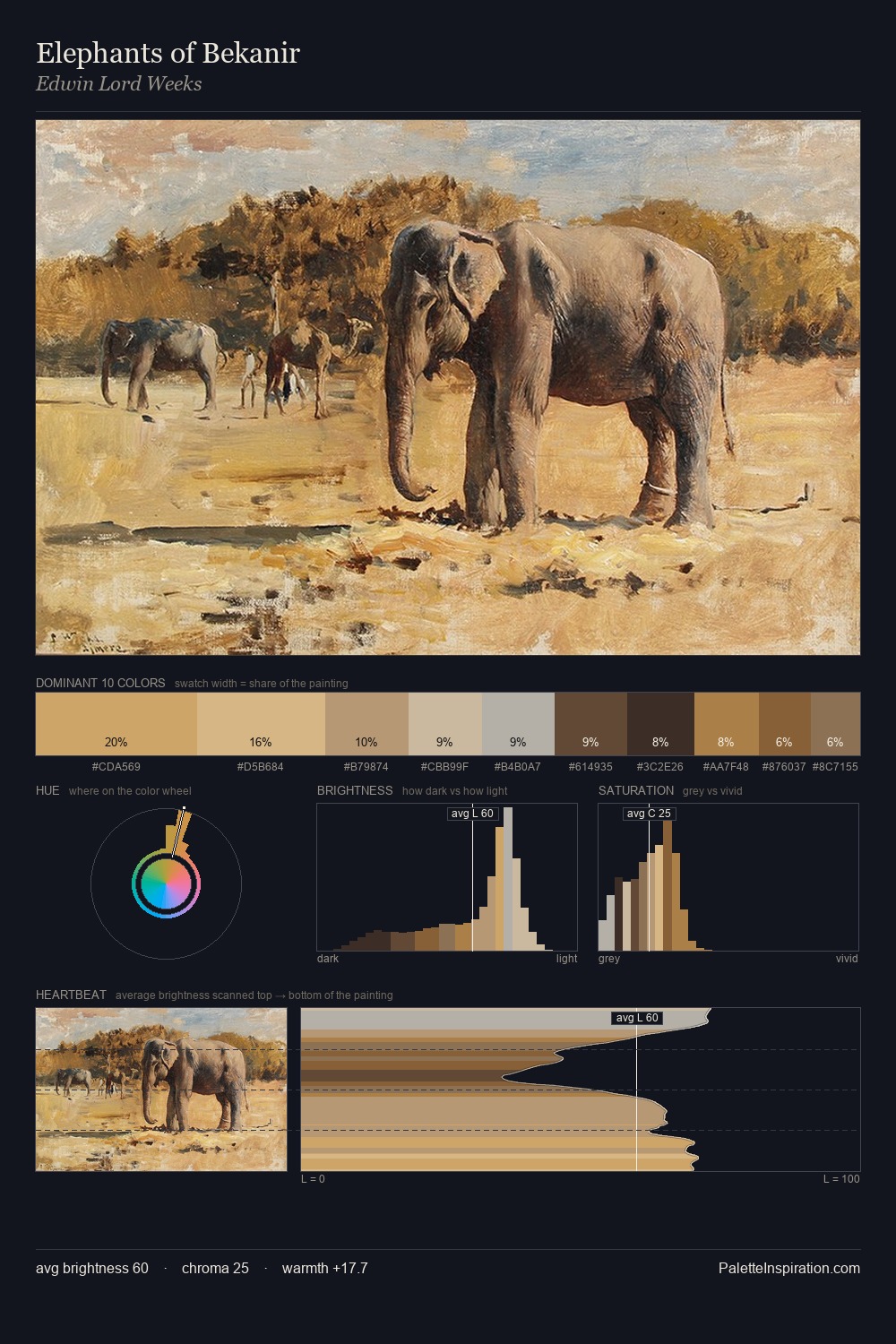
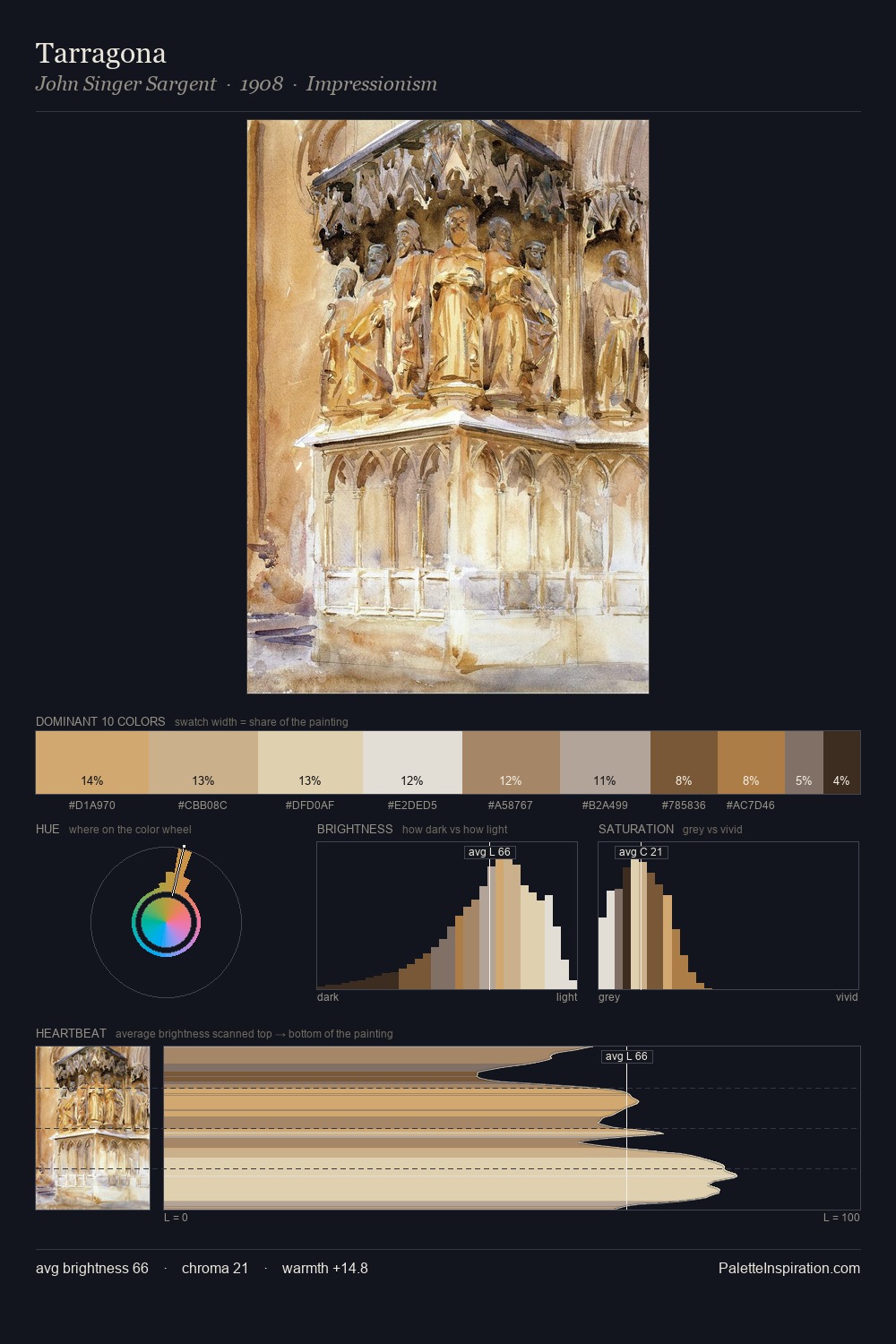
Karl Heinrich Jaeckel Master Palette
Veiled Topaz
Veiled Partially obscured light - mid-dark with a hazy, scrim-filtered quality.
Topaz Golden yellow - the color of topaz gemstone, warm and slightly saturated.

Palette Analysis
Karl Heinrich Jaeckel distributes its values across the middle register, creating harmony without high contrast. Yellow, ochre, sienna: warm hues that Karl Heinrich Jaeckel deploys as the palette's primary energy. The absence of saturated colour is itself an expressive choice: this is a palette of restraint and atmosphere. The highest-chroma note - #D09D56 - appears at just 5.0%, deployed as a precision accent against the quieter ground. From deepest dark to palest light, the palette traverses 58 units of the value scale - a span that creates natural depth. This is the light Karl Heinrich Jaeckel preferred, made measurable.
Example use cases
- ceramics & pottery
- boutique hospitality
- menswear
- heritage food brands
- craft & artisan brands
I Love This!
Use This Palette
Copy, export, or download for your project
Copy, export, or download for your project
Copy:
Download:
Share: