Karl Friedrich Schinkel Palette 1

Palette Analysis
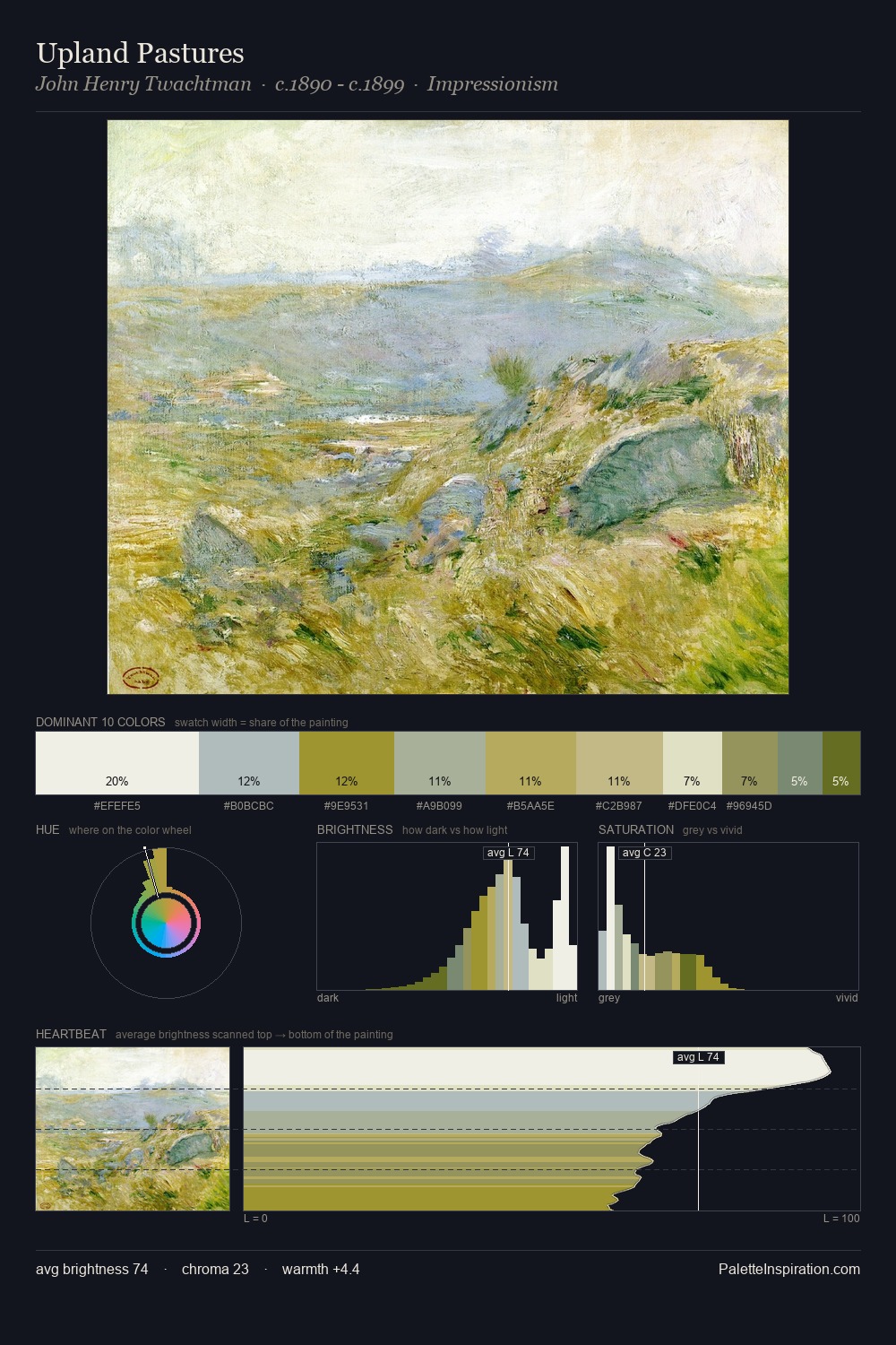
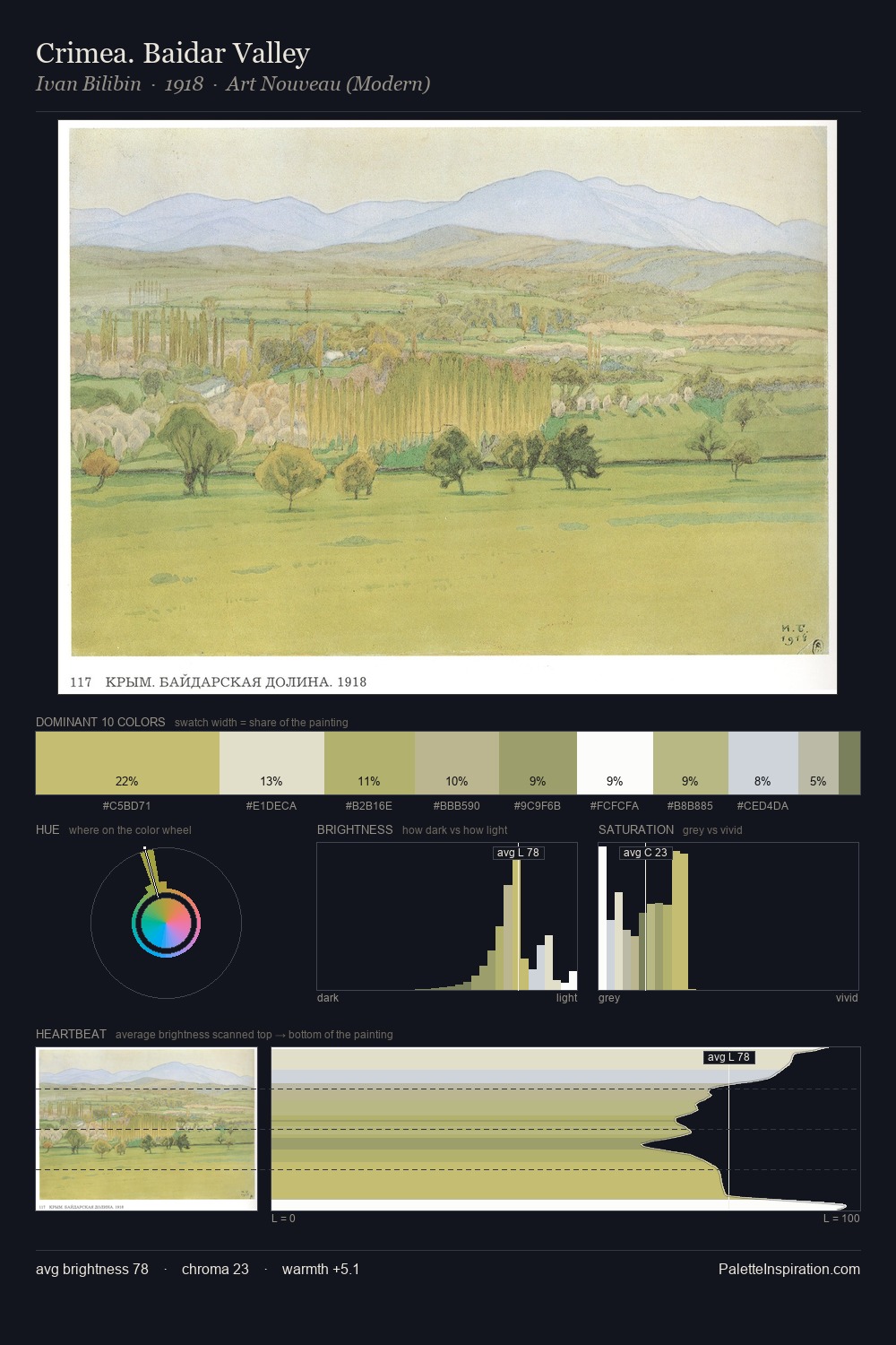
Karl Friedrich Schinkel is high in key: pale, luminous, and filled with optical air. A distinctly cool atmosphere runs through this palette: sky, water, and mist given colour form. Chroma hovers near zero; colour declares itself through subtle shifts in hue rather than outright saturation. The highest-chroma note - #E1D9AE - appears at just 11.3%, deployed as a precision accent against the quieter ground. At 35 units across the value scale, the palette keeps contrast readable without letting it dominate. The mid-to-high key, cool bias, and moderate chroma point to outdoor observation - sky and diffused daylight as the dominant light source. This is palette 1 of Karl Friedrich Schinkel's sequence - a single chapter in a chromatic story told across many works.
Example use cases
- publishing
- corporate identity
- consumer apps
- hospitality
- design agencies
I Love This!
Copy, export, or download for your project