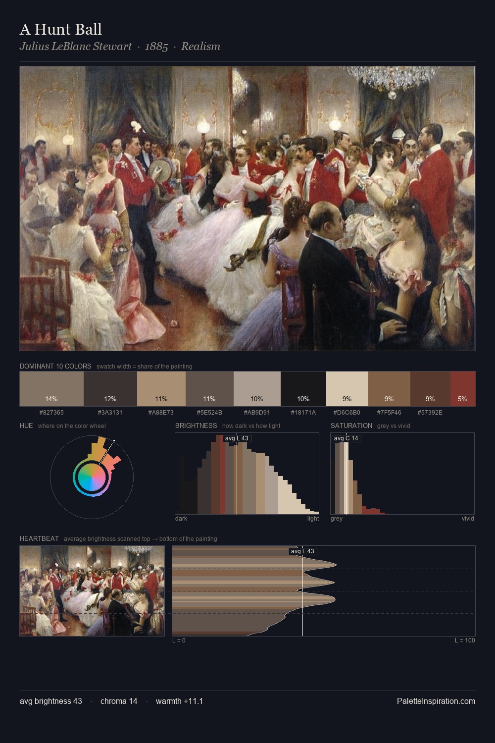
Karl Bryullov Palette 9
Shadowed Tawny
Shadowed Low-key - values weighted toward shadow, the palette of dim interiors and overcast skies.
Tawny Warm orange-brown - a traditional term for the color of tanned leather or lion fur.

Palette Analysis
Karl Bryullov distributes its values across the middle register, creating harmony without high contrast. Heat pervades this palette; warm chromatic identities outweigh cool ones at almost every weight. Saturation is deliberately withheld - the beauty here lies in the near-monochromatic gradations rather than colour difference. #A33E4D delivers the chromatic peak at only 4.2% - a small shot of colour with outsized visual impact. At 71 units of value range, the palette has the tonal breadth to sustain complex spatial readings. Palette 9 sits within the larger chromatic argument that Karl Bryullov's complete body of work advances.
Example use cases
- ceramics & pottery
- boutique hospitality
- menswear
- heritage food brands
- craft & artisan brands
I Love This!
Use This Palette
Copy, export, or download for your project
Copy, export, or download for your project
Copy:
Download:
Share: