Karl Bryullov Palette 4

Palette Analysis
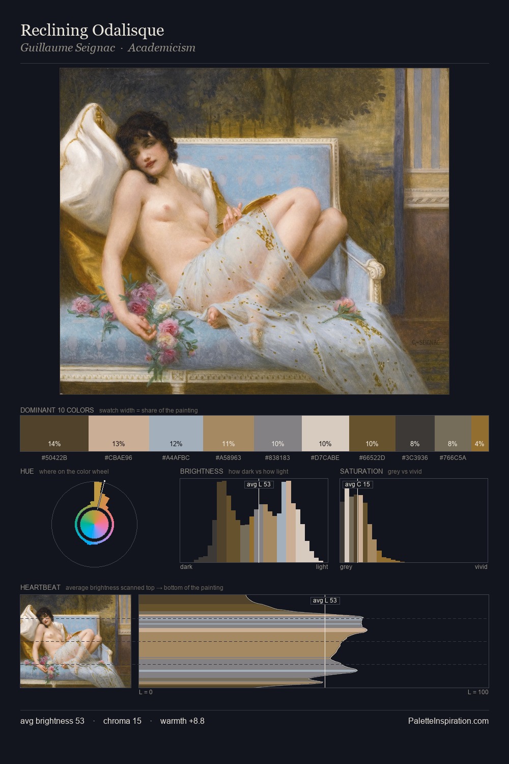
Karl Bryullov is strongly light-biased - shadow is suggested rather than declared. Cool tones set the register here - the blues and greens easily outweigh any warm accents. Saturation is deliberately withheld - the beauty here lies in the near-monochromatic gradations rather than colour difference. A single dominant - #BAB8B3 at 37.9% - sets the character of the whole composition. At 8.0%, #C0AE9A carries the palette's sharpest chromatic charge: an accent that earns its place precisely because it is withheld. At 60 units of value range, the palette has the tonal breadth to sustain complex spatial readings. The mid-to-high key, cool bias, and moderate chroma point to outdoor observation - sky and diffused daylight as the dominant light source. Palette 4 sits within the larger chromatic argument that Karl Bryullov's complete body of work advances.
Example use cases
- hospitality branding
- boutique hotels
- restaurant identity
- home goods
- florist branding
I Love This!
Copy, export, or download for your project