Karl Bodmer Palette 3

Palette Analysis
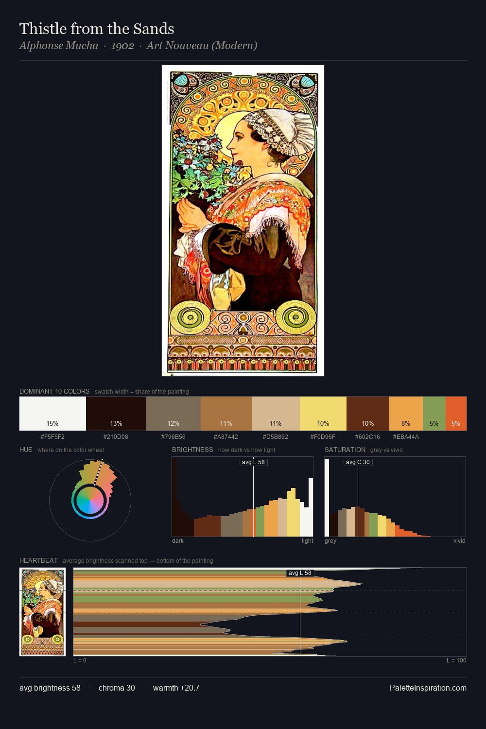
Light floods Karl Bodmer; the palette keeps values pale and airy across its range. Warm and cool tones are held in careful balance - neither family dominates, creating tension and resolution simultaneously. Colours are neither washed out nor blazing; they occupy the productive middle ground of the chroma scale. A single dominant - #FEFDFB at 36.0% - sets the character of the whole composition. The most saturated colour, #C55037, is reserved to 5.6% of the surface, where it acts as a focal punctuation. From deepest dark to palest light, the palette traverses 77 units of the value scale - a span that creates natural depth. The palette reads as an Impressionist one - light-biased, chromatically direct, and built on temperature contrast rather than value opposition. Palette 3 sits within the larger chromatic argument that Karl Bodmer's complete body of work advances.
Example use cases
- publishing
- corporate identity
- consumer apps
- hospitality
- design agencies
I Love This!
Copy, export, or download for your project