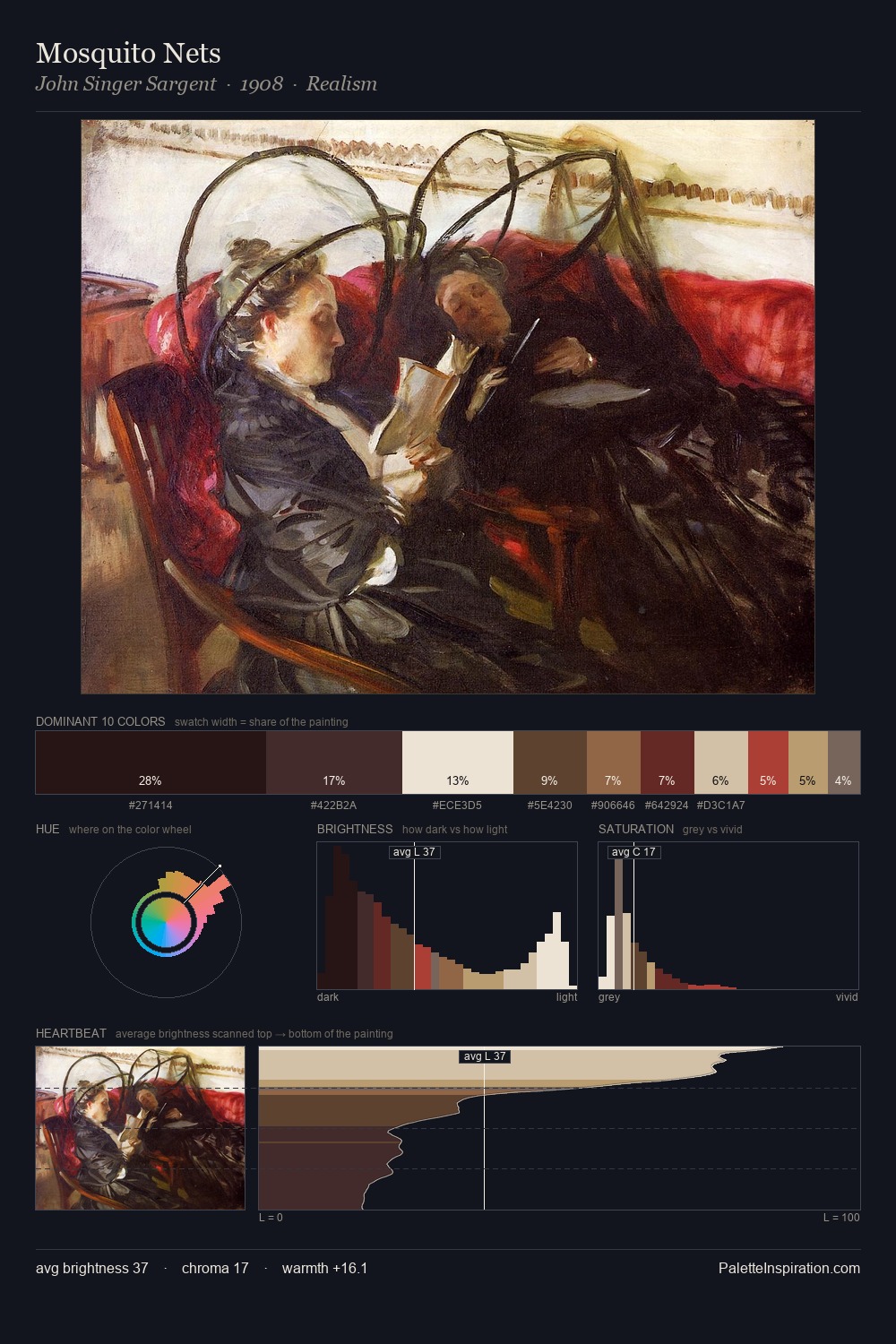
Karl Becker Master Palette
Shadowed Gamboge
Shadowed Low-key - values weighted toward shadow, the palette of dim interiors and overcast skies.
Gamboge Deep golden yellow - a traditional warm pigment, rich amber-gold.

Palette Analysis
Karl Becker sits in the centre of the value range, lending the palette a sense of even, sustained light. Yellow, ochre, sienna: warm hues that Karl Becker deploys as the palette's primary energy. The absence of saturated colour is itself an expressive choice: this is a palette of restraint and atmosphere. The most saturated colour, #511E13, is reserved to 4.0% of the surface, where it acts as a focal punctuation. 70 units of value range underpin the palette's structural clarity: the eye always knows where light falls. The palette is a signature: Karl Becker's particular sense of value, warmth, and colour weight made legible.
Example use cases
- premium streaming
- cocktail bars
- fashion campaigns
- book covers
- music labels
I Love This!
Use This Palette
Copy, export, or download for your project
Copy, export, or download for your project
Copy:
Download:
Share: