Justus van Gent Palette 4
Muted Tawny
Muted Deliberately desaturated - chroma pulled toward gray, the restraint of tonal painting.
Tawny Warm orange-brown - a traditional term for the color of tanned leather or lion fur.

Palette Analysis
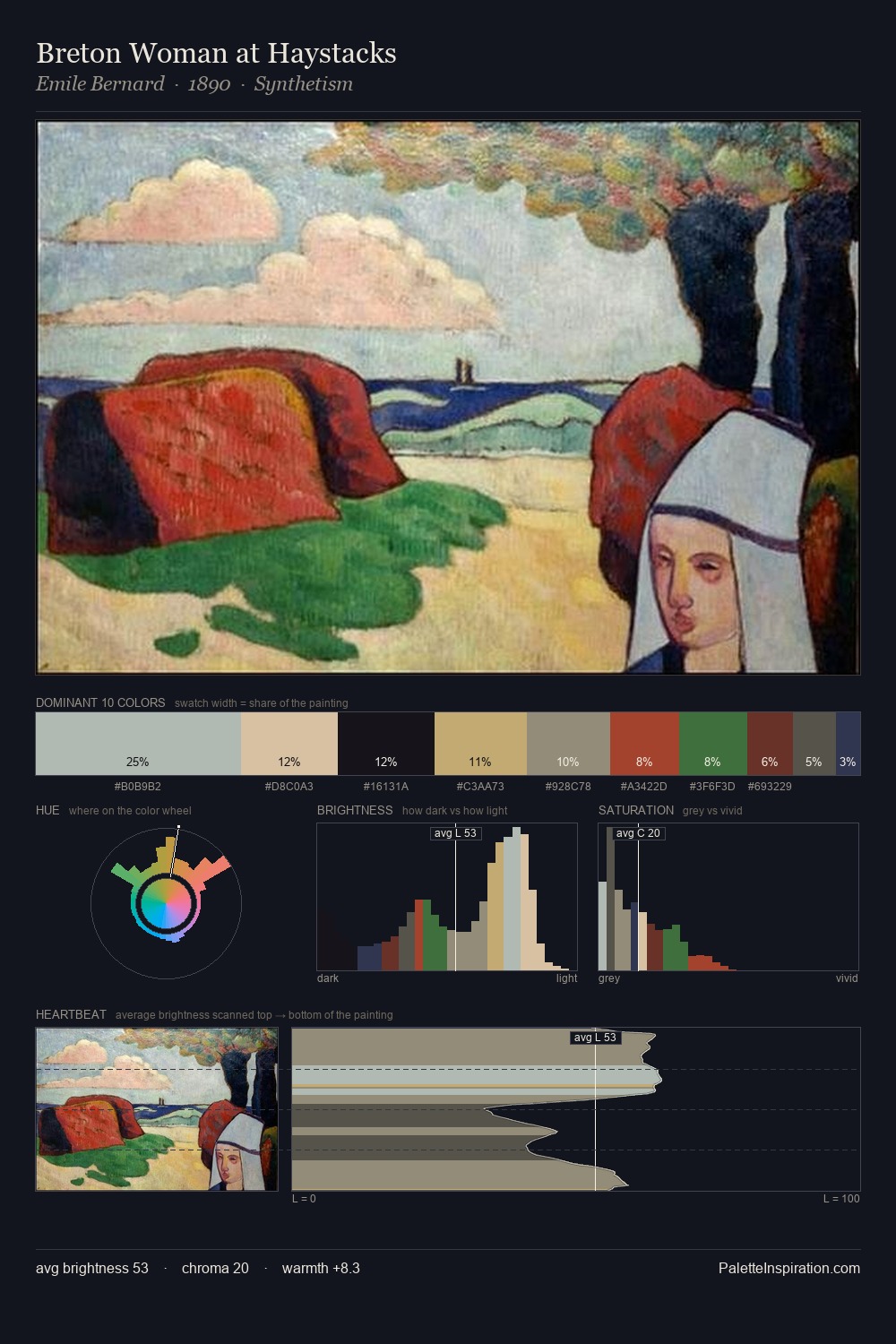
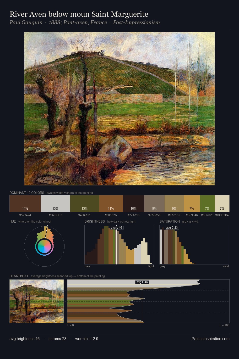
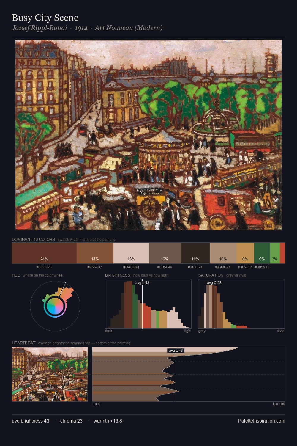
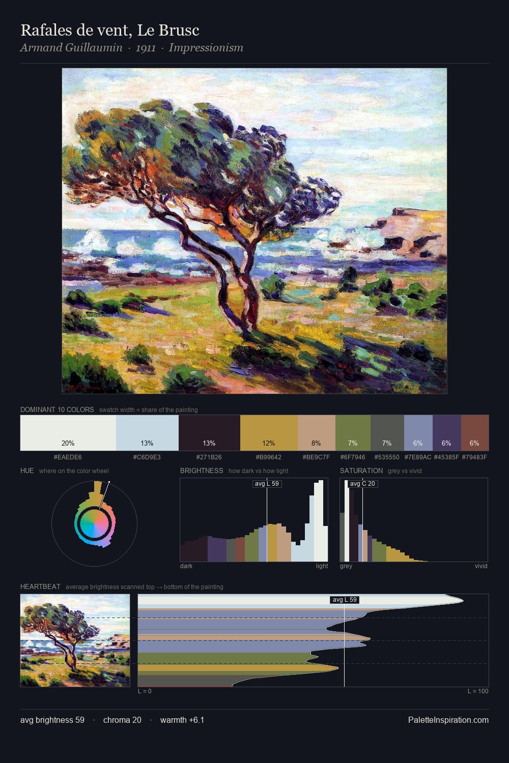
Mid-key values give Justus van Gent its characteristic quietness - nothing blazes, nothing disappears. Warm hues command this palette; Justus van Gent favours the reds, oranges, and yellows of firelight and earth. Saturation is deliberately withheld - the beauty here lies in the near-monochromatic gradations rather than colour difference. The highest-chroma note - #386321 - appears at just 4.8%, deployed as a precision accent against the quieter ground. From deepest dark to palest light, the palette traverses 69 units of the value scale - a span that creates natural depth. This is palette 4 of Justus van Gent's sequence - a single chapter in a chromatic story told across many works.
Example use cases
- ceramics & pottery
- boutique hospitality
- menswear
- heritage food brands
- craft & artisan brands
I Love This!
Use This Palette
Copy, export, or download for your project
Copy, export, or download for your project
Copy:
Download:
Share: