Justus van Gent Palette 2
Muted Apricot
Muted Deliberately desaturated - chroma pulled toward gray, the restraint of tonal painting.
Apricot Soft warm orange - peach-adjacent, the color of ripe stone fruit.

Palette Analysis
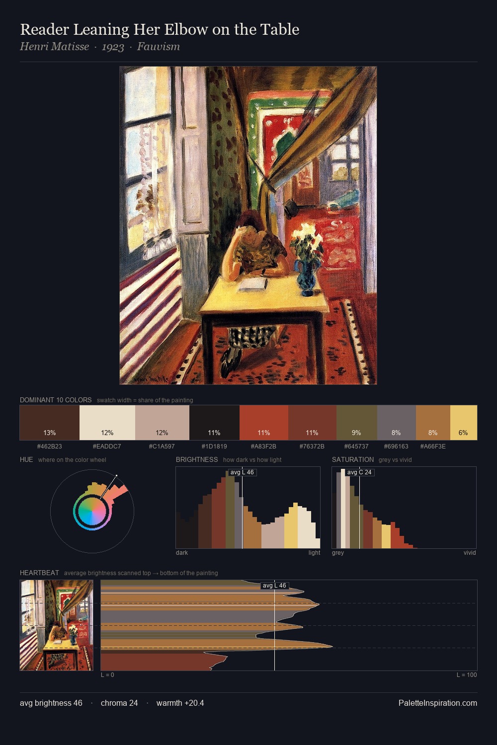
The value structure of Justus van Gent is mid-key: quiet, controlled, and cohesive. Warmth dominates - the palette of Justus van Gent leans heavily on the yellow-orange-red arc of the colour wheel. Mid-saturation across the board: the palette has colour character without chromatic excess. The most saturated colour, #B1422B, is reserved to 6.4% of the surface, where it acts as a focal punctuation. The value range spans 63 units across the palette, providing the full gamut from deep shadow to near-white and ensuring clear tonal hierarchy. In the context of Justus van Gent's full range of palettes, group 2 represents one movement in an ongoing chromatic dialogue.
Example use cases
- craft & artisan brands
- specialty coffee
- home goods
- lifestyle retail
- ceramics & pottery
I Love This!
Use This Palette
Copy, export, or download for your project
Copy, export, or download for your project
Copy:
Download:
Share: