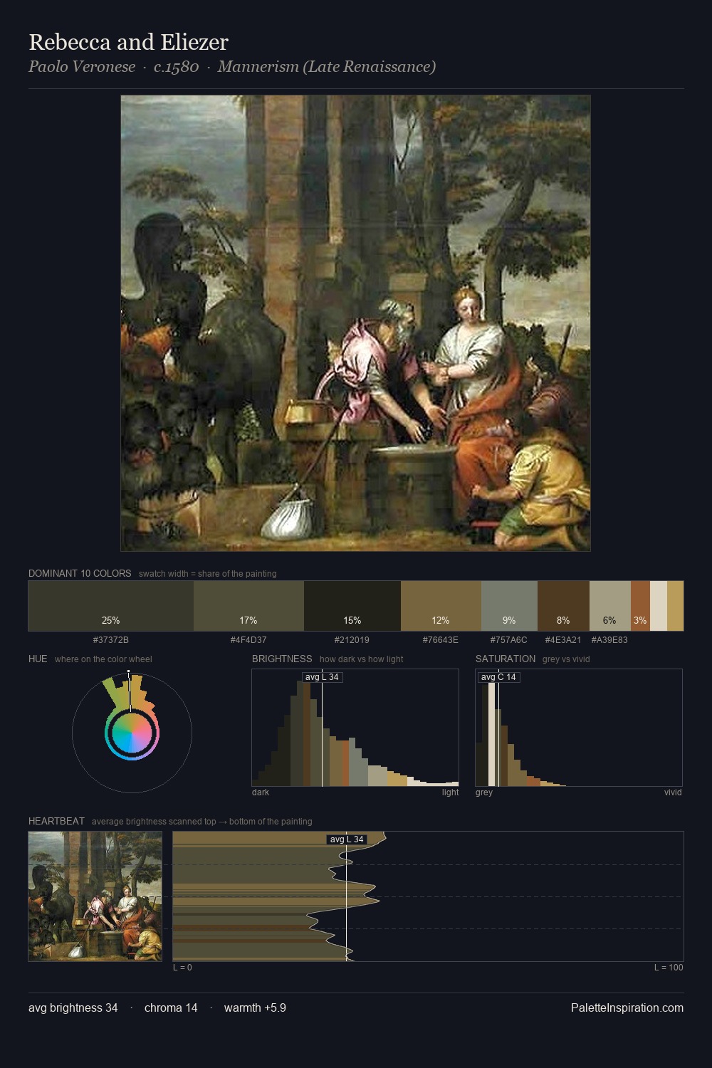
Julius van de Sande Bakhuyzen Palette 4

Palette Analysis
Julius van de Sande Bakhuyzen keeps values measured and balanced, a hallmark of tonal restraint. Blues and teal-greys govern the palette, lending it an aquatic or atmospheric quality. Chroma hovers near zero; colour declares itself through subtle shifts in hue rather than outright saturation. 25.6% of the palette belongs to #BABCBB, a concentration that makes it the unmistakable visual centre. The highest-chroma note - #825021 - appears at just 1.8%, deployed as a precision accent against the quieter ground. At 67 units of value range, the palette has the tonal breadth to sustain complex spatial readings. The palette has the character of outdoor light: cool, mid-bright, with colour rendered faithfully rather than expressively. This is palette 4 of Julius van de Sande Bakhuyzen's sequence - a single chapter in a chromatic story told across many works.
Example use cases
- nonprofit identity
- public libraries
- historical sites
- literary journals
- archival print
I Love This!
Copy, export, or download for your project