Julius Bissier Master Palette

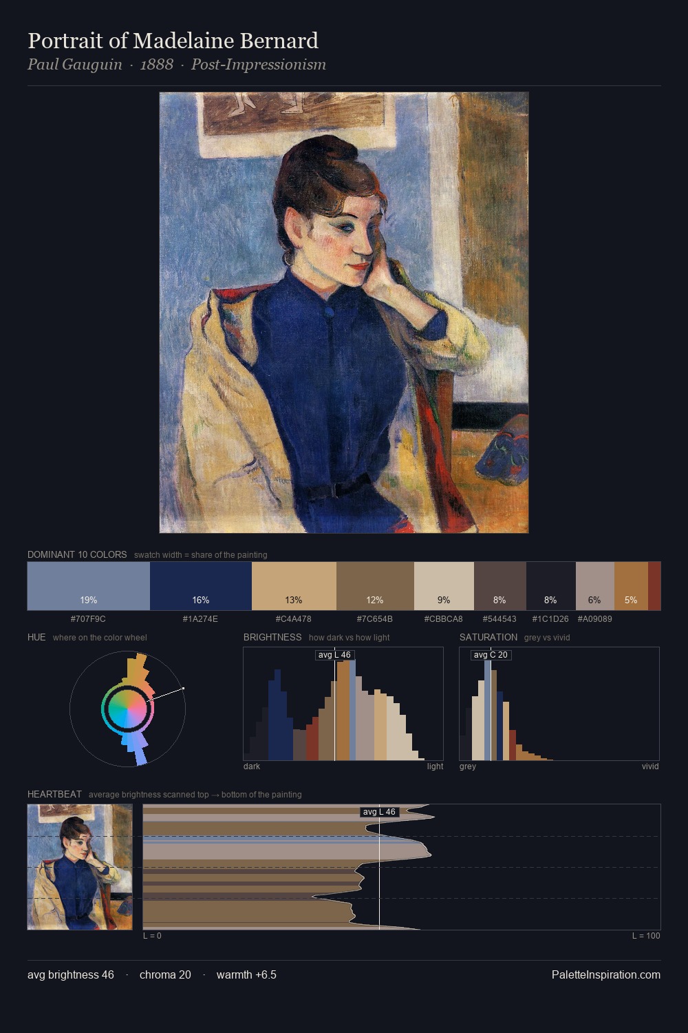
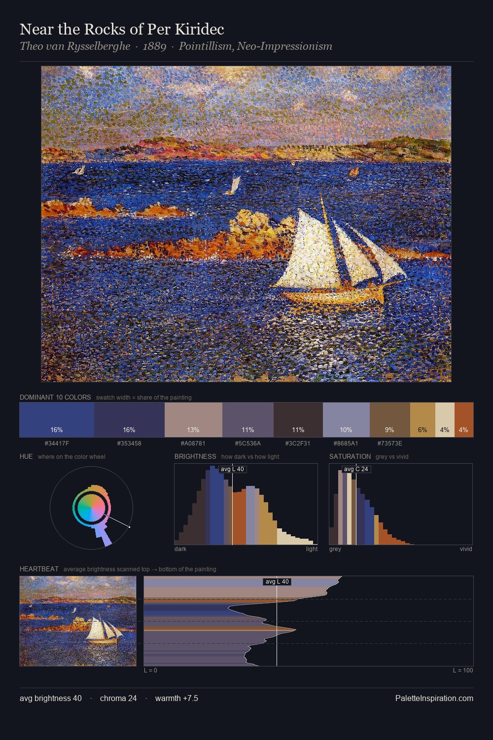
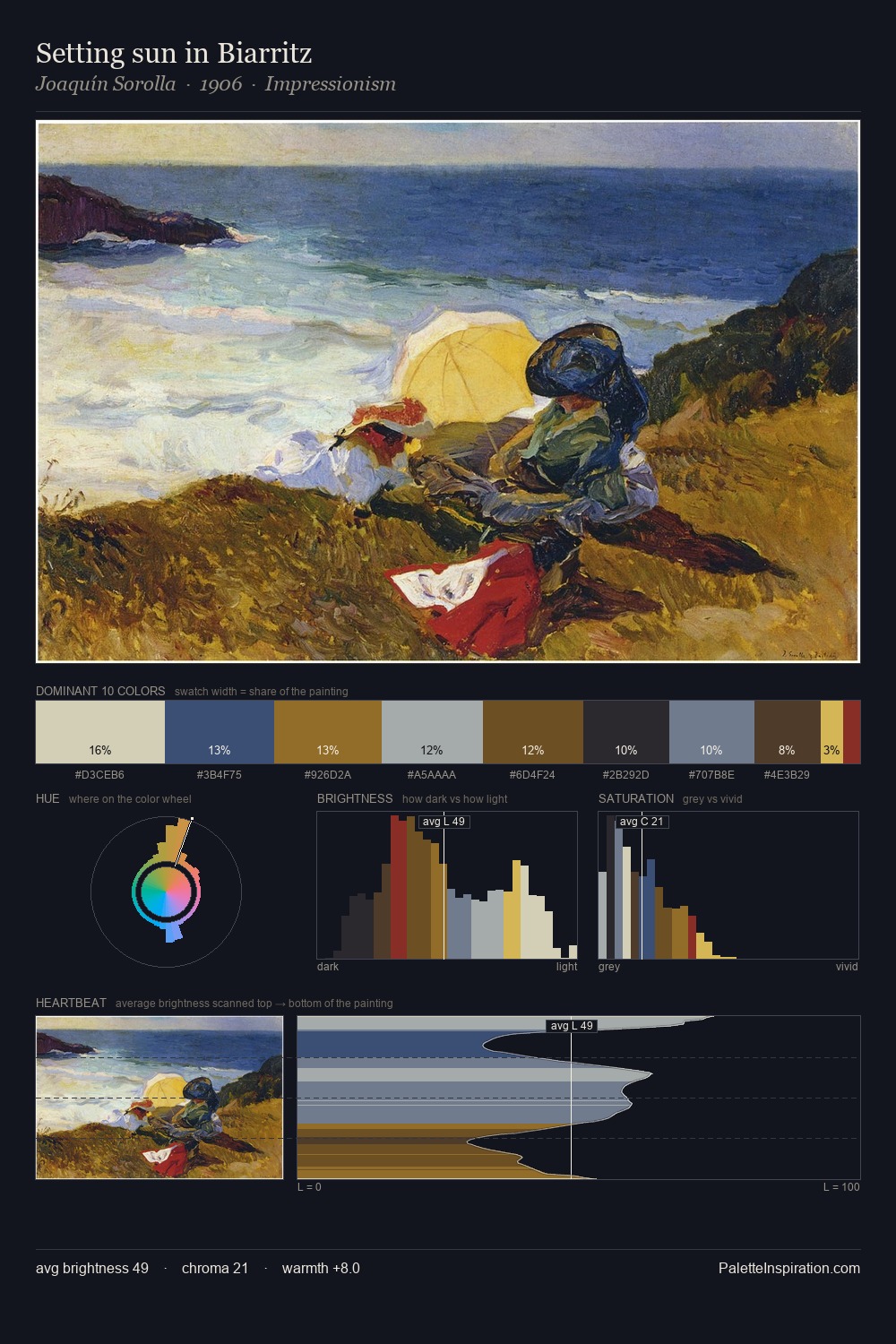
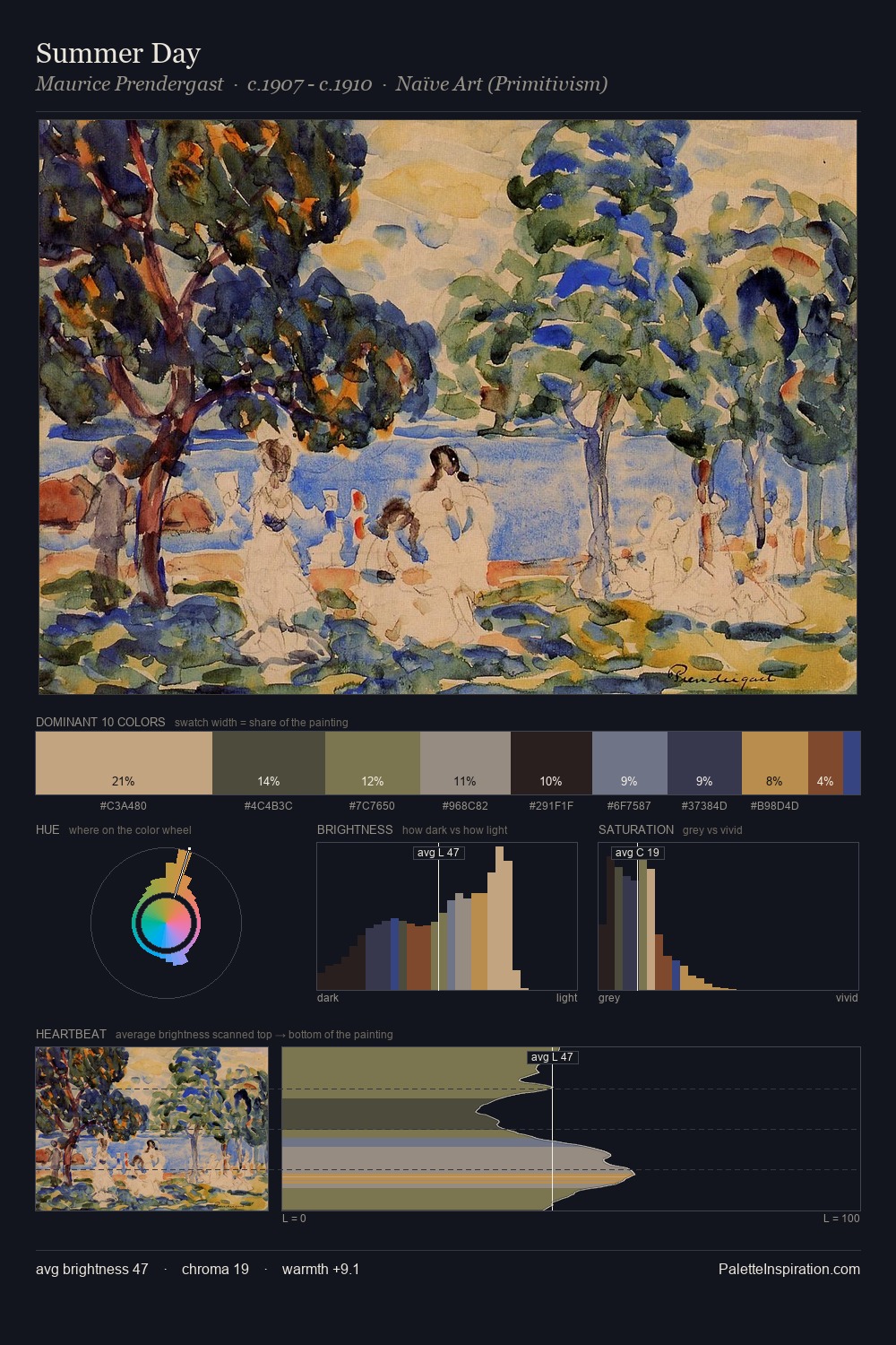
Palette Analysis
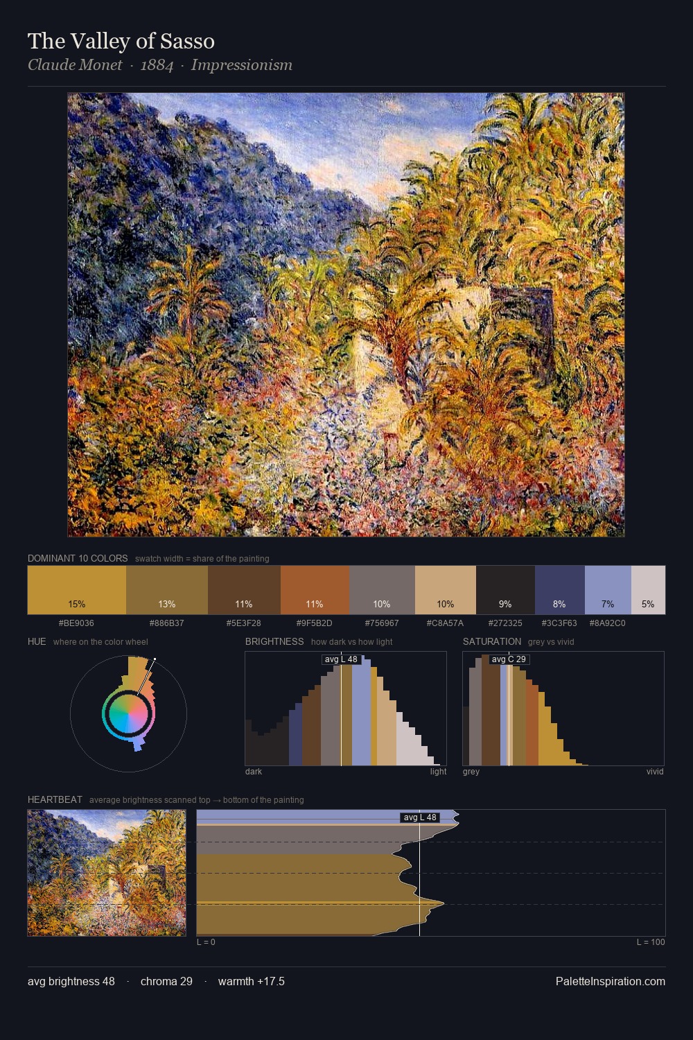
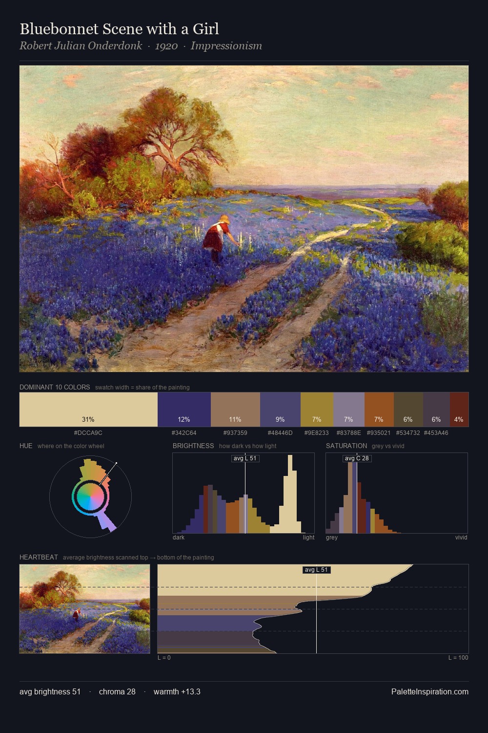
Julius Bissier keeps values measured and balanced, a hallmark of tonal restraint. Temperature is balanced: the palette pits warm earth against cool sky without declaring a winner. Chroma is held at a comfortable level - distinct colours, but no single hue is allowed to overwhelm. #A07535 functions as the palette's exclamation mark: highest chroma, lowest percentage (5.0%). The value range of 52 units sits in the comfortable middle: enough depth, enough light, neither extreme. The palette reads as an Impressionist one - light-biased, chromatically direct, and built on temperature contrast rather than value opposition. The palette is recognisably Julius Bissier's own: particular in its temperature, chroma, and the economy of its brightest note.
Example use cases
- film & entertainment
- fine dining
- spirits branding
- menswear
- theater design
I Love This!
Copy, export, or download for your project