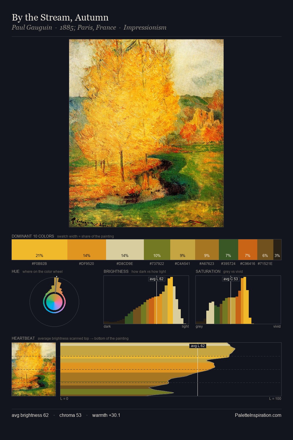
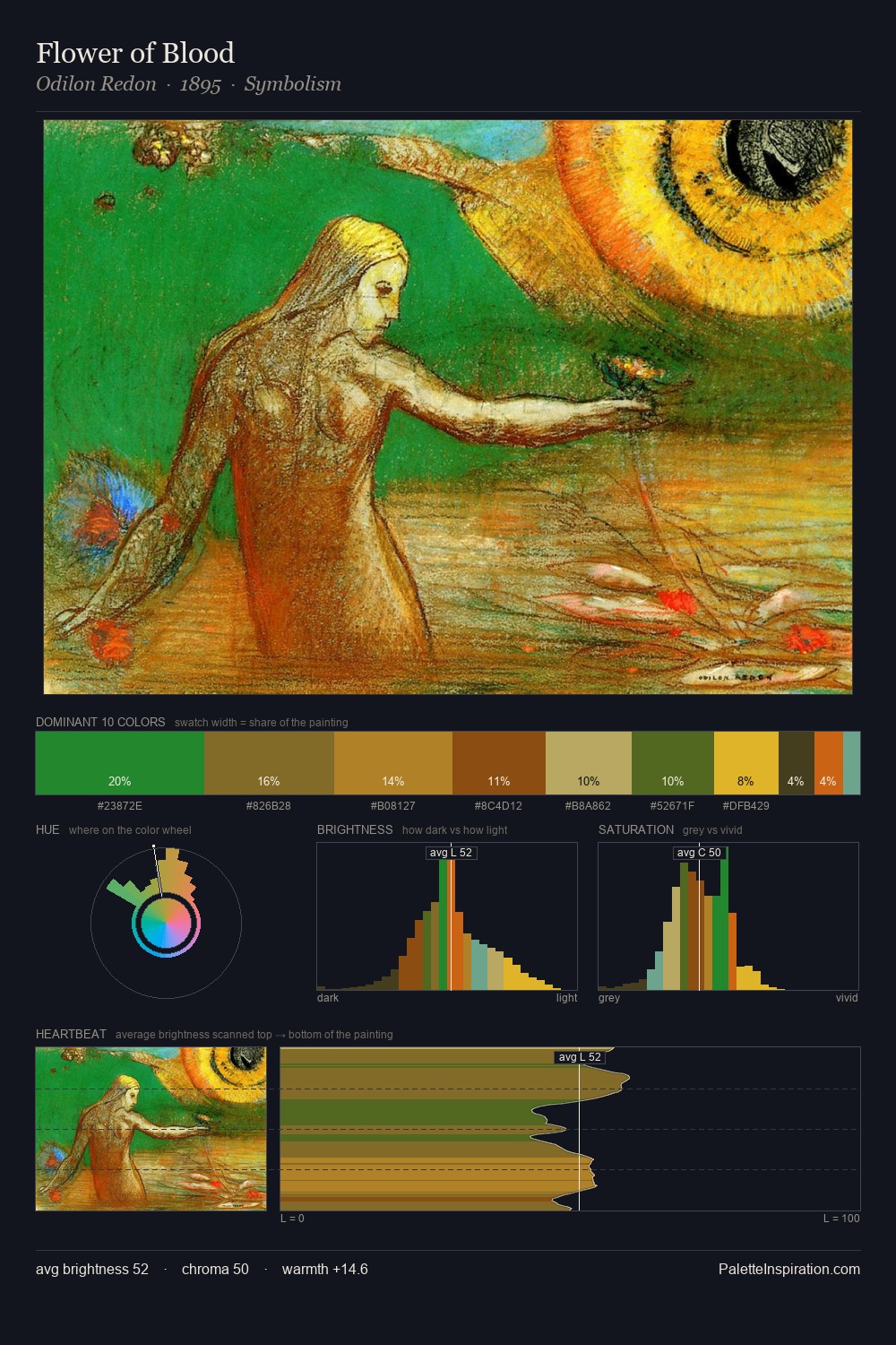
Julio Romero de Torres Palette 2

Palette Analysis
Julio Romero de Torres is strongly light-biased - shadow is suggested rather than declared. Cool hues prevail: blues, greens, and greys anchor the palette's emotional temperature. Chroma is held at a comfortable level - distinct colours, but no single hue is allowed to overwhelm. #CD7614 functions as the palette's exclamation mark: highest chroma, lowest percentage (2.9%). The value range spans 55 units across the palette, providing the full gamut from deep shadow to near-white and ensuring clear tonal hierarchy. The palette has the character of outdoor light: cool, mid-bright, with colour rendered faithfully rather than expressively. This is palette 2 of Julio Romero de Torres's sequence - a single chapter in a chromatic story told across many works.
Example use cases
- publishing
- corporate identity
- consumer apps
- hospitality
- design agencies
I Love This!
Copy, export, or download for your project