Julian Ashton Palette 3

Palette Analysis
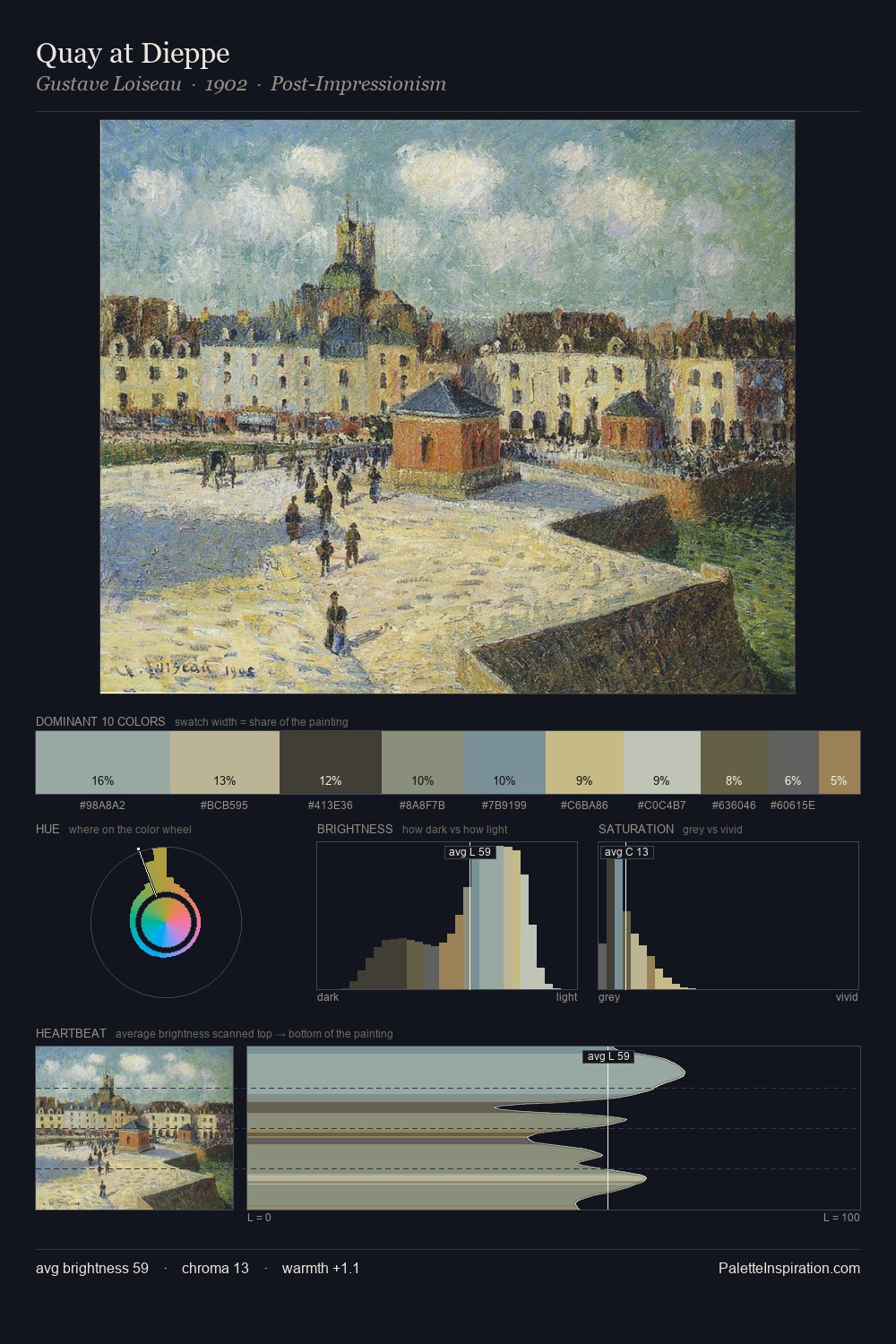
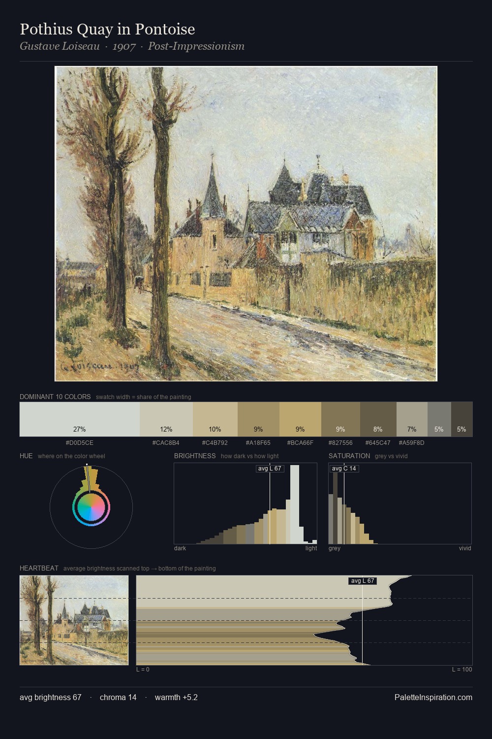
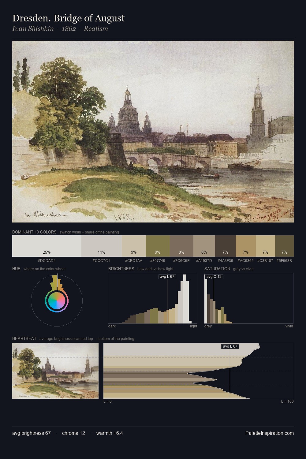
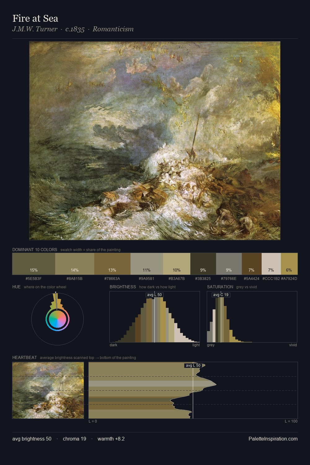
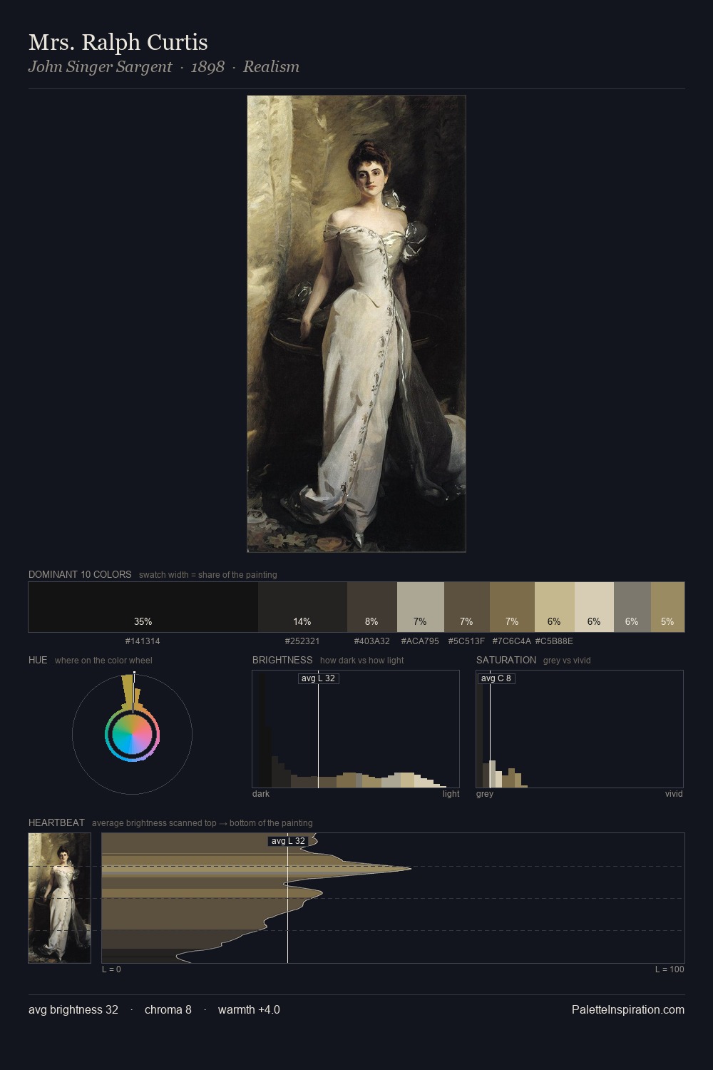
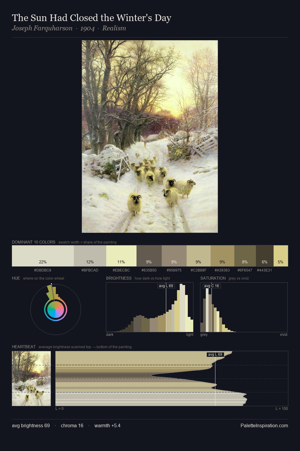
Mid-key values give Julian Ashton its characteristic quietness - nothing blazes, nothing disappears. Blues and teal-greys govern the palette, lending it an aquatic or atmospheric quality. The absence of saturated colour is itself an expressive choice: this is a palette of restraint and atmosphere. The highest-chroma note - #A5915F - appears at just 11.4%, deployed as a precision accent against the quieter ground. Value range is moderate at 45 units - enough contrast for legibility, not so much as to fragment the tonal unity. The palette has the character of outdoor light: cool, mid-bright, with colour rendered faithfully rather than expressively. Julian Ashton's palette 3 carries its own internal logic while remaining in conversation with the artist's broader colour intelligence.
Example use cases
- exhibition design
- foundation branding
- estate management
- art education
- museums & galleries
I Love This!
Copy, export, or download for your project