Juan Jiménez Martín Palette 5
Palette Analysis
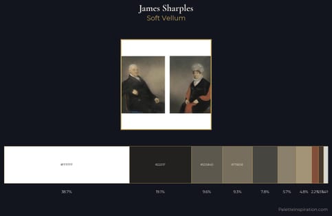
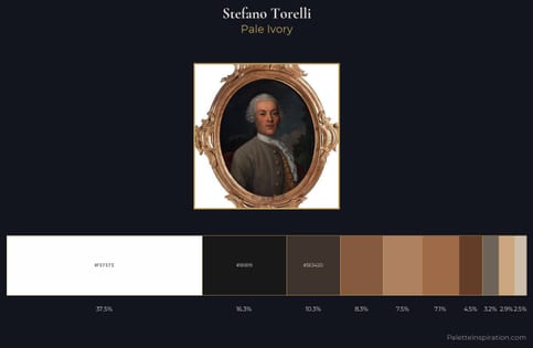
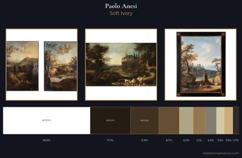
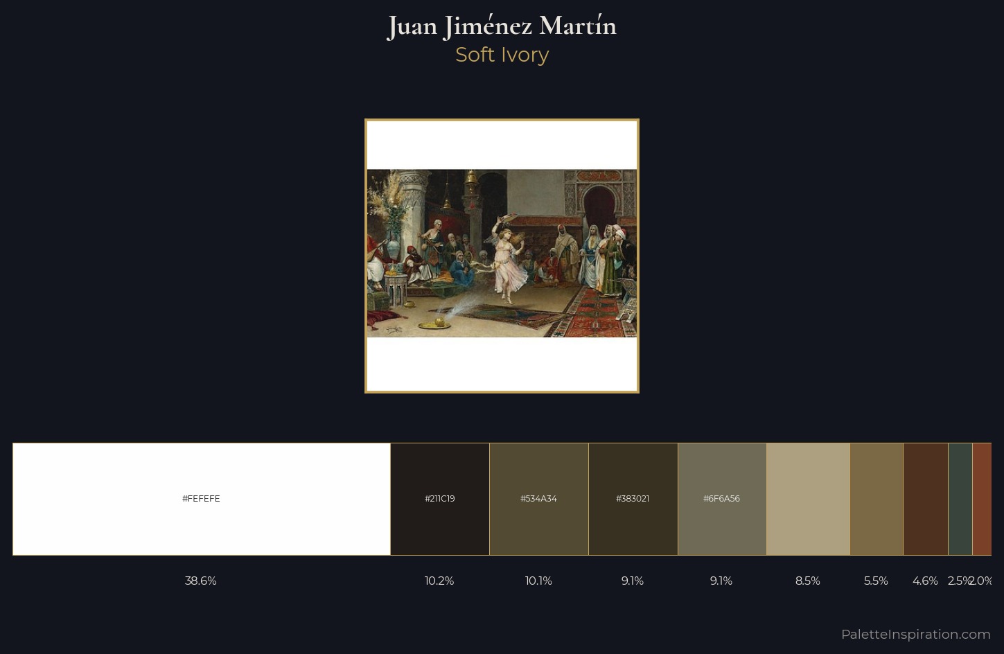
Juan Jiménez Martín distributes its values across the middle register, creating harmony without high contrast. Juan Jiménez Martín builds on cool foundations: the palette favours the blue-cyan-green arc. Chroma hovers near zero; colour declares itself through subtle shifts in hue rather than outright saturation. #FEFEFE at 38.6% of the palette: an overwhelming presence that pulls all other colours into its gravitational field. The most saturated colour, #4F311F, is reserved to 4.6% of the surface, where it acts as a focal punctuation. At 77 units of value range, the palette has the tonal breadth to sustain complex spatial readings. The mid-to-high key, cool bias, and moderate chroma point to outdoor observation - sky and diffused daylight as the dominant light source. Palette 5 sits within the larger chromatic argument that Juan Jiménez Martín's complete body of work advances.
Example use cases
- archival print
- university identity
- rare books
- cultural institutions
- nonprofit identity
I Love This!
Copy, export, or download for your project