Joseph Stella Palette 3

Palette Analysis
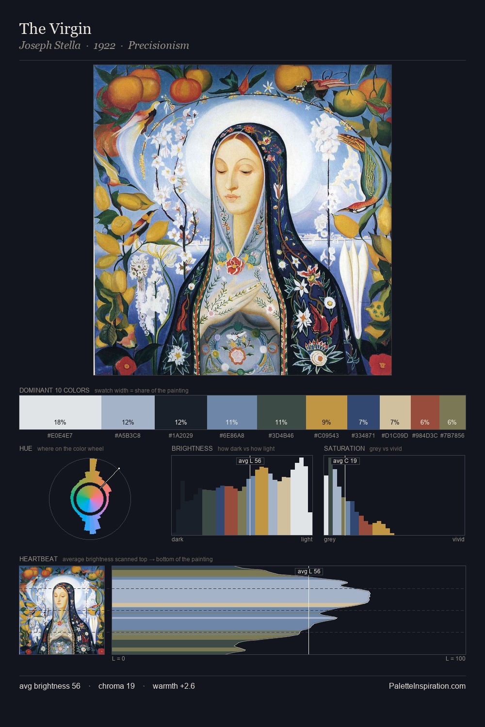
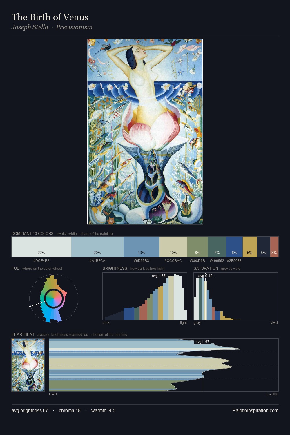
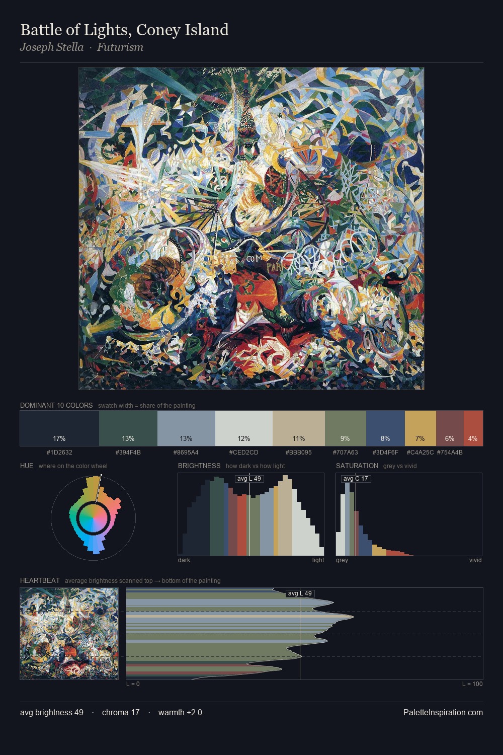
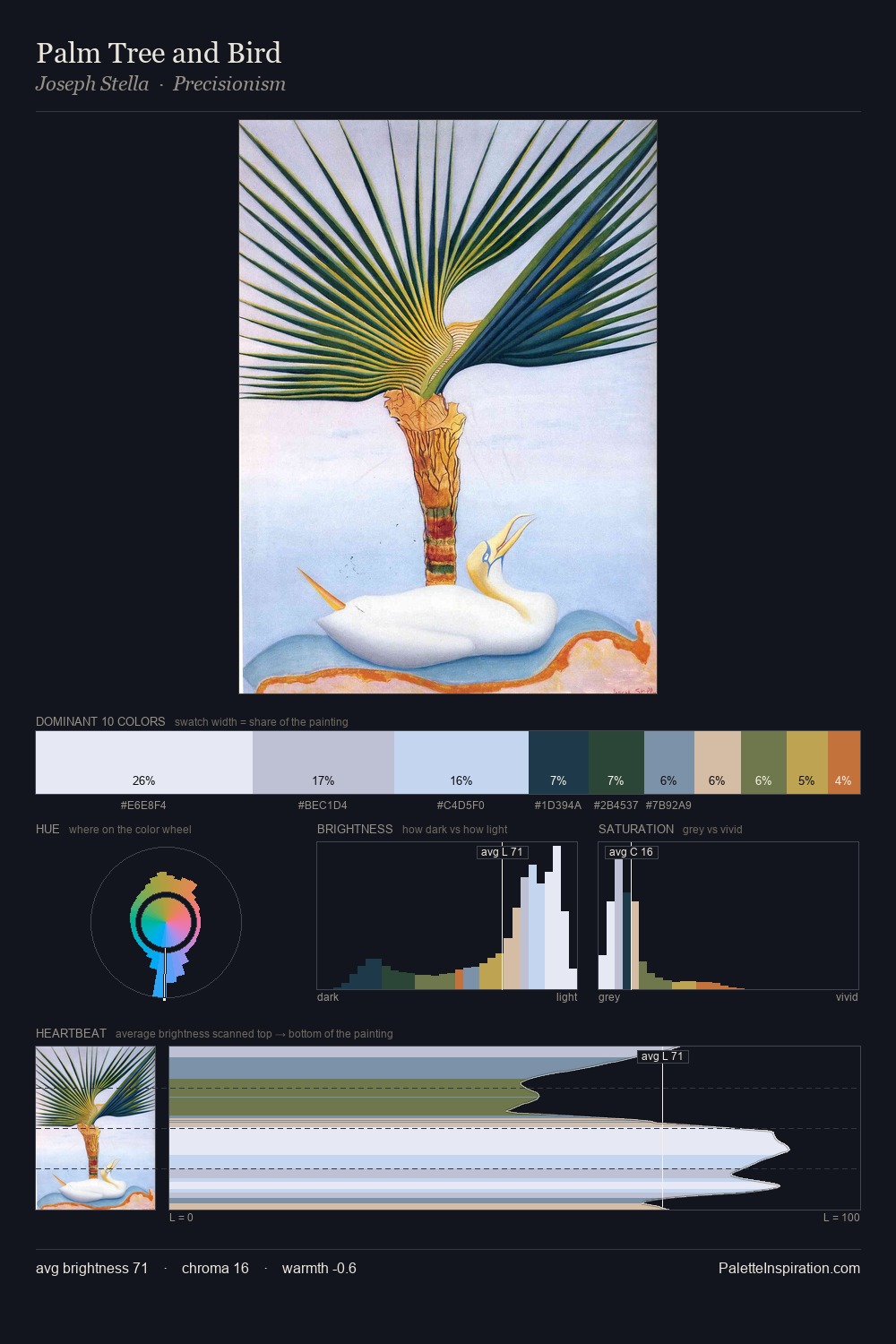
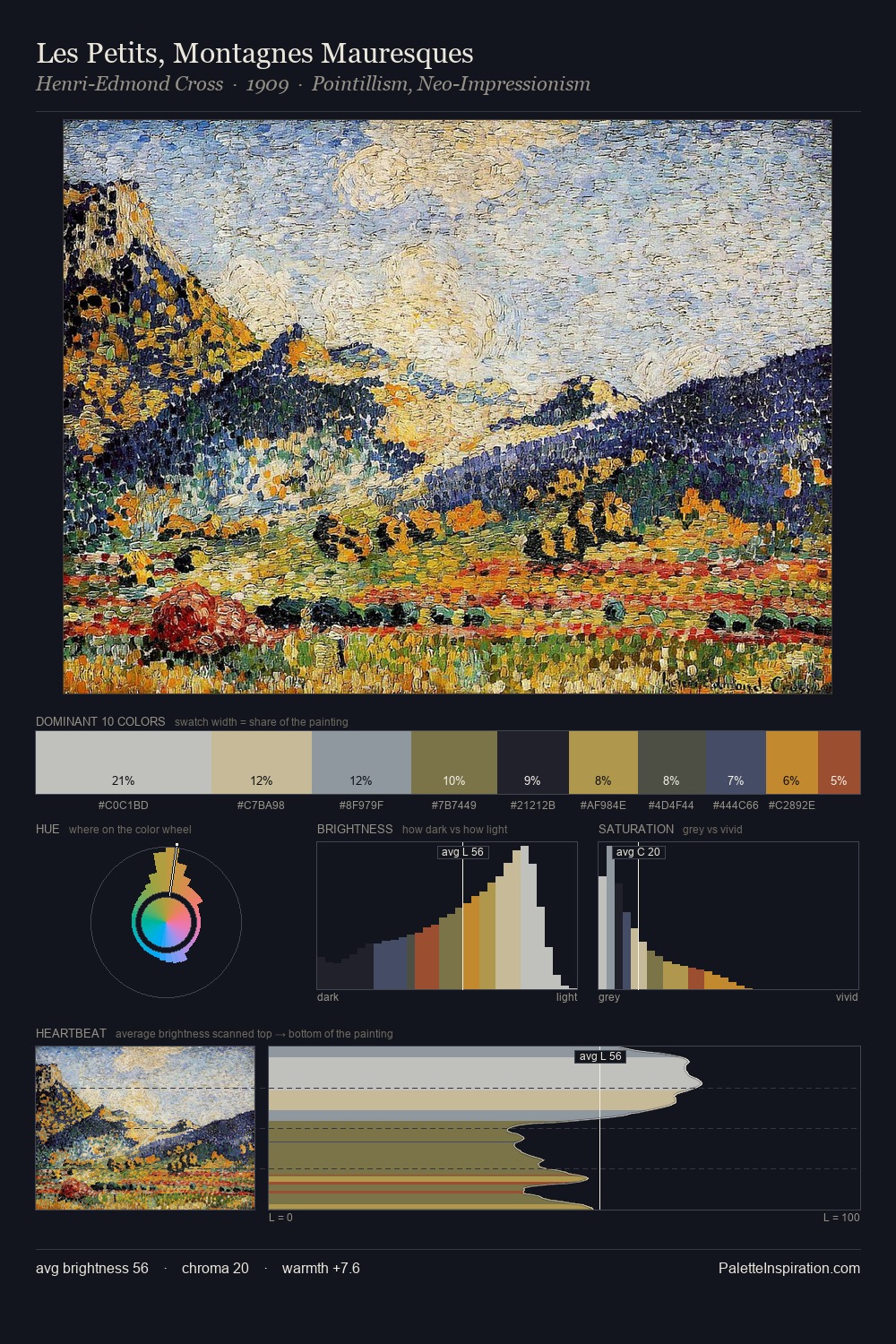
Values in Joseph Stella tilt decisively toward white, giving the palette its luminous character. Cool hues prevail: blues, greens, and greys anchor the palette's emotional temperature. Chroma hovers near zero; colour declares itself through subtle shifts in hue rather than outright saturation. Only 3.9% is devoted to #A45B40, yet that small allocation delivers the palette's entire chromatic tension. From deepest dark to palest light, the palette traverses 68 units of the value scale - a span that creates natural depth. High luminosity and cool temperature suggest the plein-air condition: unfiltered daylight and open sky. Joseph Stella's palette 3 carries its own internal logic while remaining in conversation with the artist's broader colour intelligence.
Example use cases
- publishing
- corporate identity
- consumer apps
- hospitality
- design agencies
I Love This!
Copy, export, or download for your project