Josef Krachkovsky Palette 1

Palette Analysis
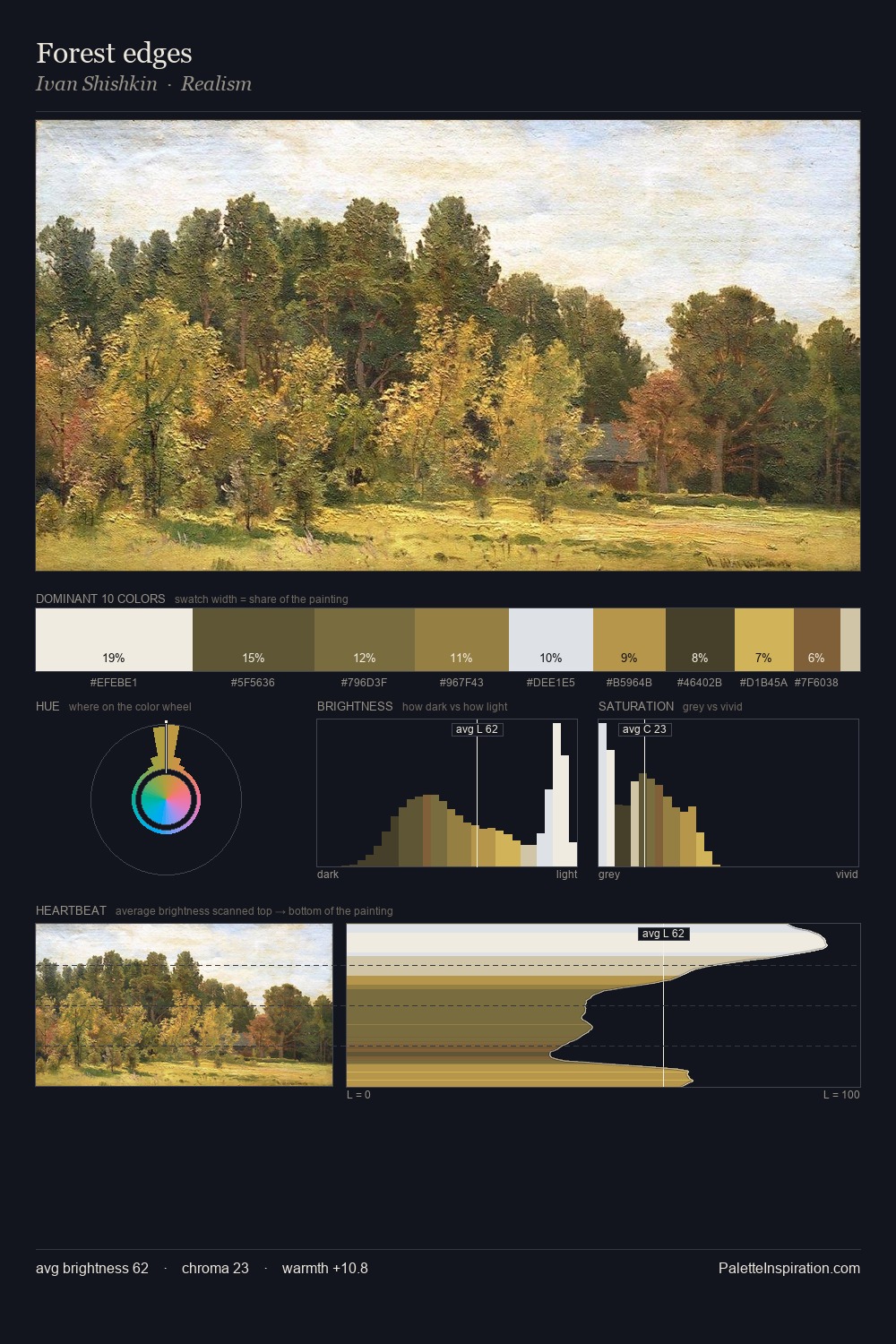
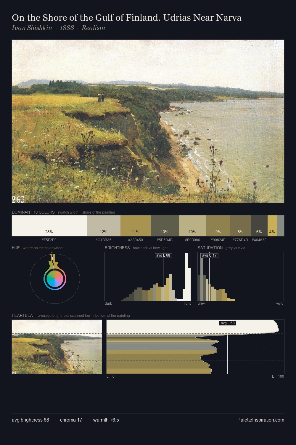
Josef Krachkovsky is strongly light-biased - shadow is suggested rather than declared. Temperature is cool-dominant, with blue and green families claiming the largest areas. Saturation is deliberately withheld - the beauty here lies in the near-monochromatic gradations rather than colour difference. At 42.0%, #FFFFFF functions less as a colour accent and more as a complete atmospheric environment. Only 3.0% is devoted to #C8AF5C, yet that small allocation delivers the palette's entire chromatic tension. 62 units of value range underpin the palette's structural clarity: the eye always knows where light falls. The mid-to-high key, cool bias, and moderate chroma point to outdoor observation - sky and diffused daylight as the dominant light source. Josef Krachkovsky's palette 1 carries its own internal logic while remaining in conversation with the artist's broader colour intelligence.
Example use cases
- florist branding
- event design
- real estate
- jewelry retail
- hospitality branding
I Love This!
Copy, export, or download for your project