Josef Danhauser Master Palette
Shadowed Gamboge
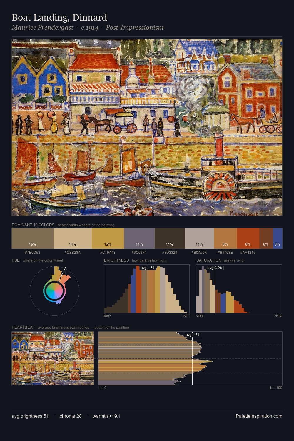
Shadowed Low-key - values weighted toward shadow, the palette of dim interiors and overcast skies.
Gamboge Deep golden yellow - a traditional warm pigment, rich amber-gold.

Palette Analysis
Josef Danhauser distributes its values across the middle register, creating harmony without high contrast. The palette achieves thermal balance - reds and blues, ochres and greens, each holding the other in check. Every colour is desaturated; the palette proceeds through near-neutrals and gently-coloured greys. Only 2.5% is devoted to #D19F3B, yet that small allocation delivers the palette's entire chromatic tension. At 53 units across the value scale, the palette keeps contrast readable without letting it dominate. The palette is a signature: Josef Danhauser's particular sense of value, warmth, and colour weight made legible.
Example use cases
- music labels
- luxury hospitality
- editorial photography
- leather goods
- premium streaming
I Love This!
Use This Palette
Copy, export, or download for your project
Copy, export, or download for your project
Copy:
Download:
Share: