Josef Carl Berthold Puttner Palette 2

Palette Analysis
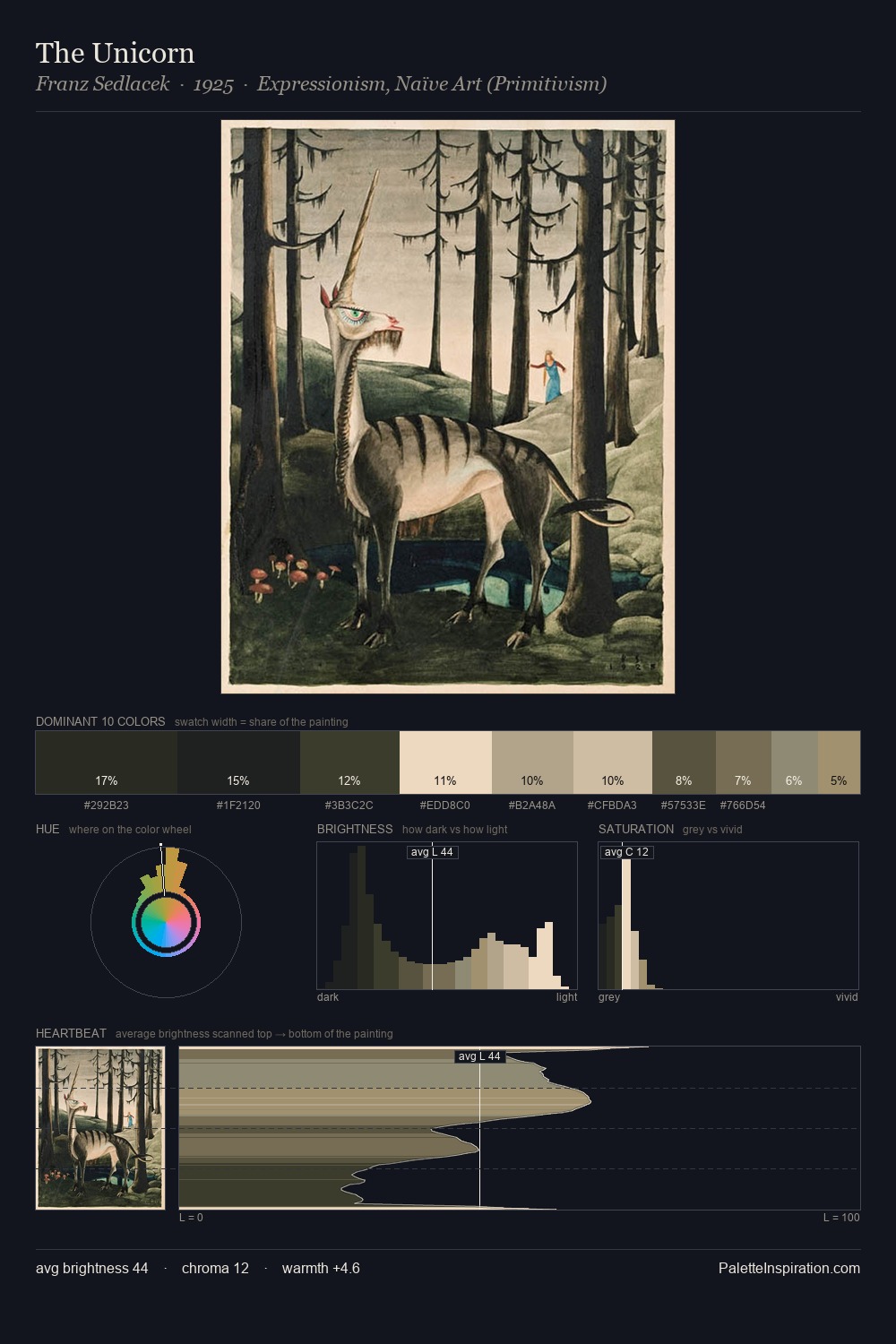
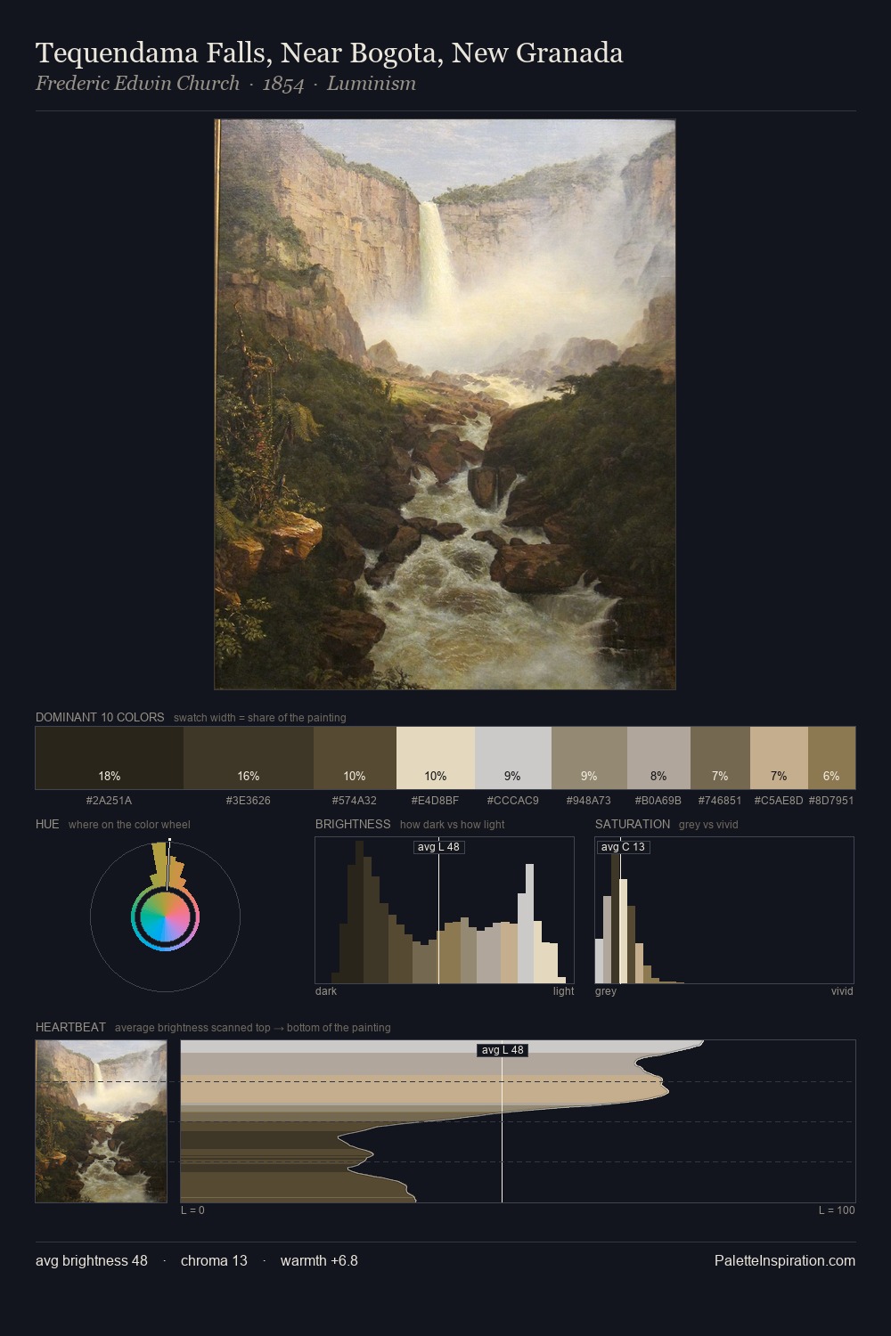
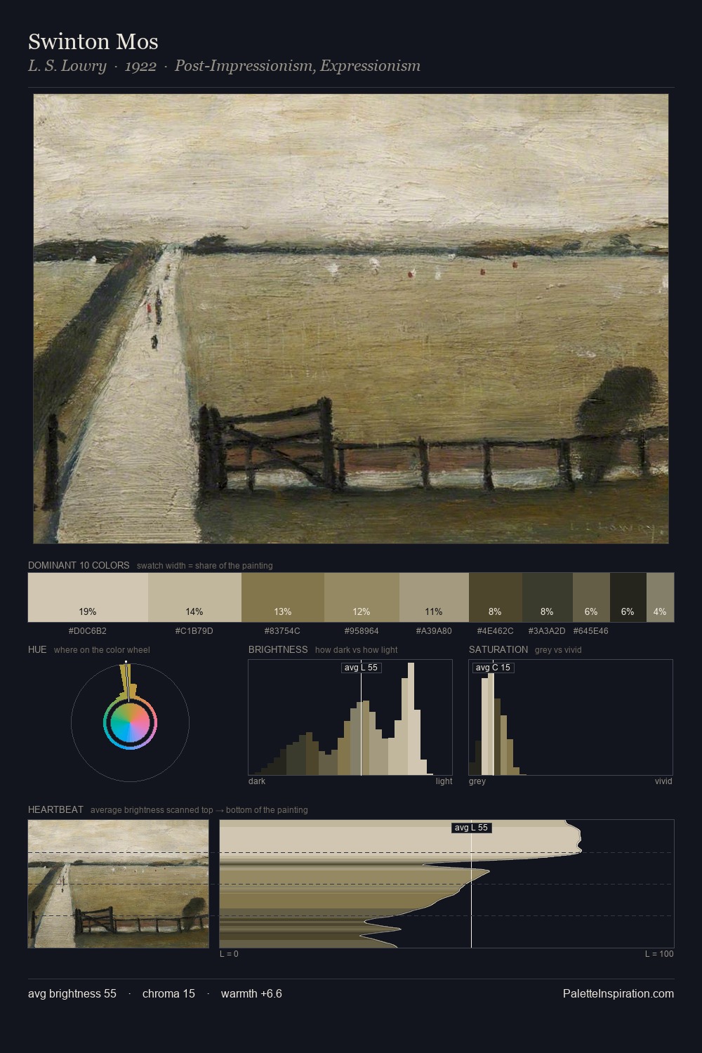
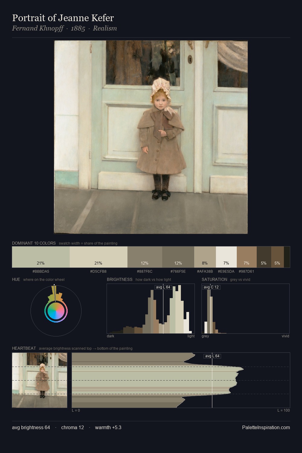
Values in Josef Carl Berthold Puttner rest in the mid-range - neither dramatically lit nor steeped in shadow. Cool hues prevail: blues, greens, and greys anchor the palette's emotional temperature. All colours lean toward grey, building depth through value rather than colour punch. At 2.1%, #997B5E carries the palette's sharpest chromatic charge: an accent that earns its place precisely because it is withheld. A value spread of 66 units gives the palette both depth and air - shadows are genuinely dark, lights genuinely light. The palette has the character of outdoor light: cool, mid-bright, with colour rendered faithfully rather than expressively. This is palette 2 of Josef Carl Berthold Puttner's sequence - a single chapter in a chromatic story told across many works.
Example use cases
- exhibition design
- foundation branding
- estate management
- art education
- museums & galleries
I Love This!
Copy, export, or download for your project